Importance of Typography in branding

The most noticeable feature of these logos is that neither heavily rely on the imagery rather they put focus on the typographic design itself. This is possibly due to the fact that lesser know indie companies need to make their name known hence the image isn’t centralised as much as the actual typography used to represent the brand.  Another important aspect to acknowledge is the usage of basic block colours and why this is an essential part in company branding. The general idea behind keeping a logo simplistic has a multitude of reasons, these tend to be: Clarity of message, Applicability across different forms of media, Expense and how Explicable it is. Understanding these key components allows for a brand to be created and represented in a quick, memorable manner.

Taking this research into account I will make further amendments to my logo’s and experiment with different ideas focusing around typography and how centric it is as a part of indie branding.
CSMojang-Logo

Naughty_Dog

Untitled-1


Workshop 12 – Finalised Infographic Layouts

During the final week before submission I created my final output formats for my Einstein brief. This included the Mobile application and a mock up website.

Final9


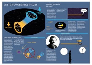
T
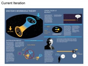
his image is my final rendition of the A2 poster, I’ve made slight tweaks to the information and I’ve also changed the standards graphic of Einstein and I’ve put him into a circle, this mirrors the running theme I have with Ovals and circular shapes and overall sits a lot better on the page than it did prior.


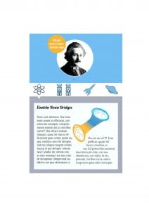
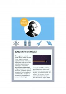
Final13 Final14

These two images are the mobile app, for the application I wanted something light-hearted and fun, although it looks quite separate and out of place in comparison to the A2 poster I feel as though the Application works better as a standalone piece. The application however also goes well with the website created to support the other formats.


web

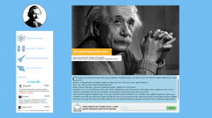
The final output is the Website. Although there isn’t much development on the side of the application and website I feel as thought it came out at the best standard I could’ve hoped for, making the need for further iterations somewhat redundant. Overall I’m happy with how there’s an overall theme with: Colour, graphics and overall presentation. I feel as though the running theme with the blue complimenting the orange works extremely well.


Workshop 11 – Presentation of Finalised Ideas

During week 11 there was an assessed presentation on my final design and intended outputs for typography. The Einstein brief was also assessed.

For this I created a Pdf from an indesign file and presented my near finished design product.

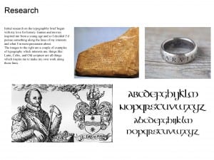
Presentation valyrian ting2 Presentation valyrian ting3

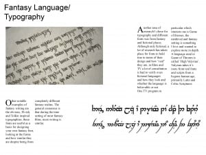
Presentation valyrian ting4 Presentation valyrian ting5

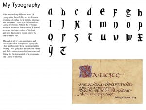
Presentation valyrian ting6 Presentation valyrian ting7

Presentation valyrian ting8 Presentation valyrian ting9

Presentation valyrian ting10 Presentation valyrian ting11


In this presentation I’ve shown my research from prior and the development of my ideas towards final hand in standards, at this point the only outputs that are missing are my website and my Mobile applications.

Workshop 10 – Completion of Typeface

After getting part of my infographic to a near finished standard I wanted to finalise my typeface and work on getting it to a standard where it’s near the ability of practical usage. After creating some new letter forms a few weeks prior to this I decided I wanted the overall theme to match the new letters I made.

I also made slight alterations to previous letters which didn’t match the standards I wanted.


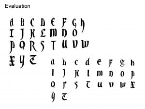
Final4

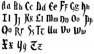
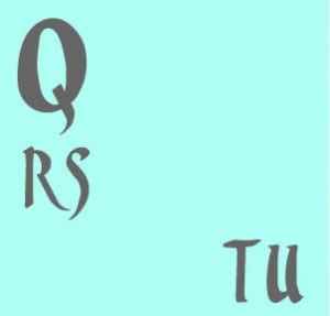
After creating the letters: Q rs tu, prior I wanted to focus on the sharp flicks on my letters, I also focused on creating letters as descenders and Ascenders, similar to what you’d expect from old scribe writing.

As an overall typeface I’m really happy with how it turned out, and I feel as though I gained a great understanding of the software through trial and error.

Workshop 8 – Revisiting Typography

During the 8th workshop I decided to revisit my typeface a little bit before the week 12 deadline. I had an idea of creating a full working typeface in order to create a product for my final hand in. The idea I had was to create a scroll with my letters on it addressed to a character from Game of Thrones which is what the font is from.

I created a few more letters and generally started to get a feel for an overall theme with my type. Because I only made 6 letters prior it felt incomplete and almost as if there was nothing aesthetically pleasing about it, so I created the letters Q, rs, tu.

random play

These letters in comparison to my others felt a lot better, visually speaking I like the smoother curves and more prominent and sharp flicks.

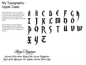
Uppercase


Upon creating my new letters I feel as though I’m going to revise the letter forms I’ve already made in order to keep it more thematic.