During the final week before submission I created my final output formats for my Einstein brief. This included the Mobile application and a mock up website.
This image is my final rendition of the A2 poster, I’ve made slight tweaks to the information and I’ve also changed the standards graphic of Einstein and I’ve put him into a circle, this mirrors the running theme I have with Ovals and circular shapes and overall sits a lot better on the page than it did prior.
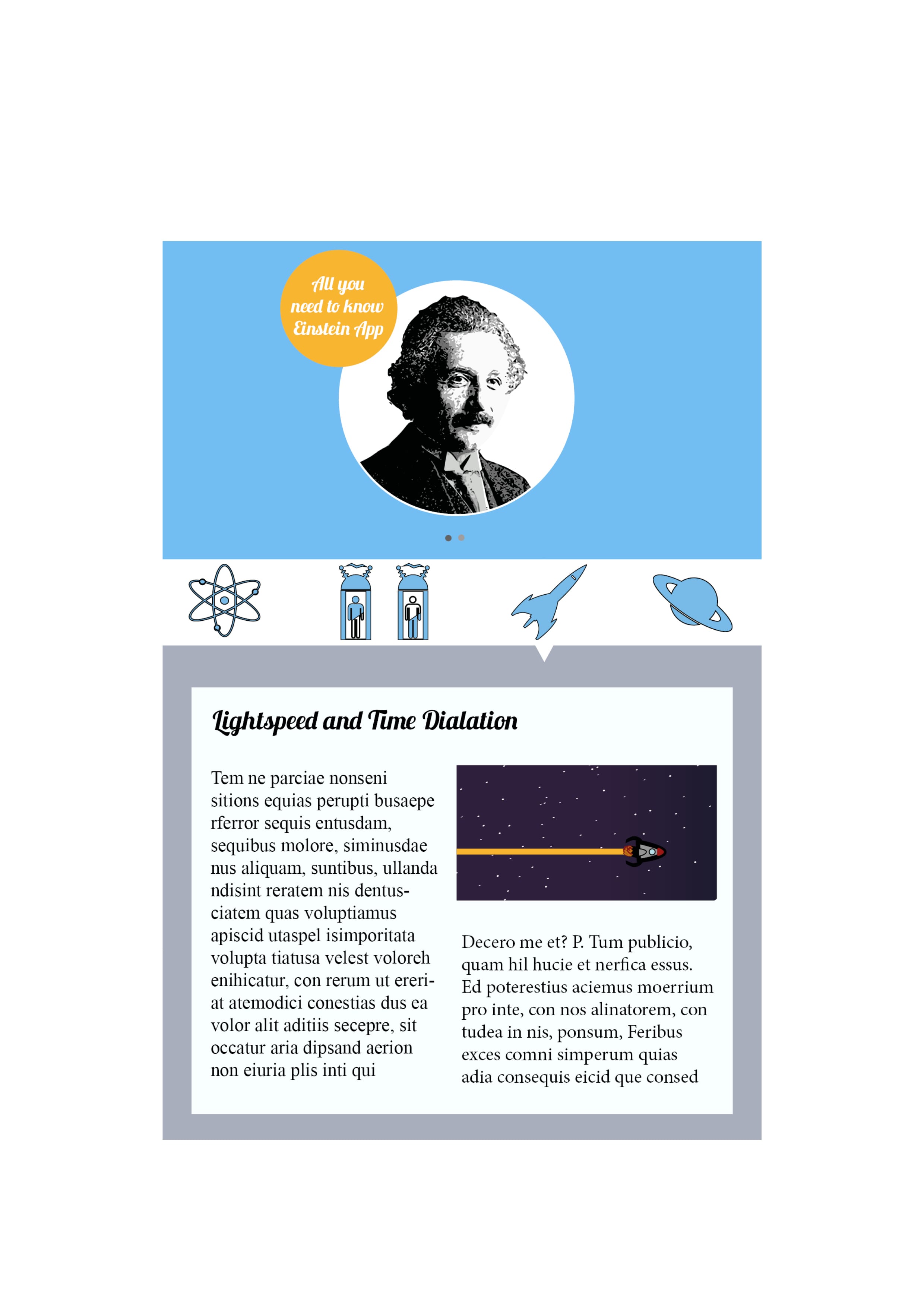
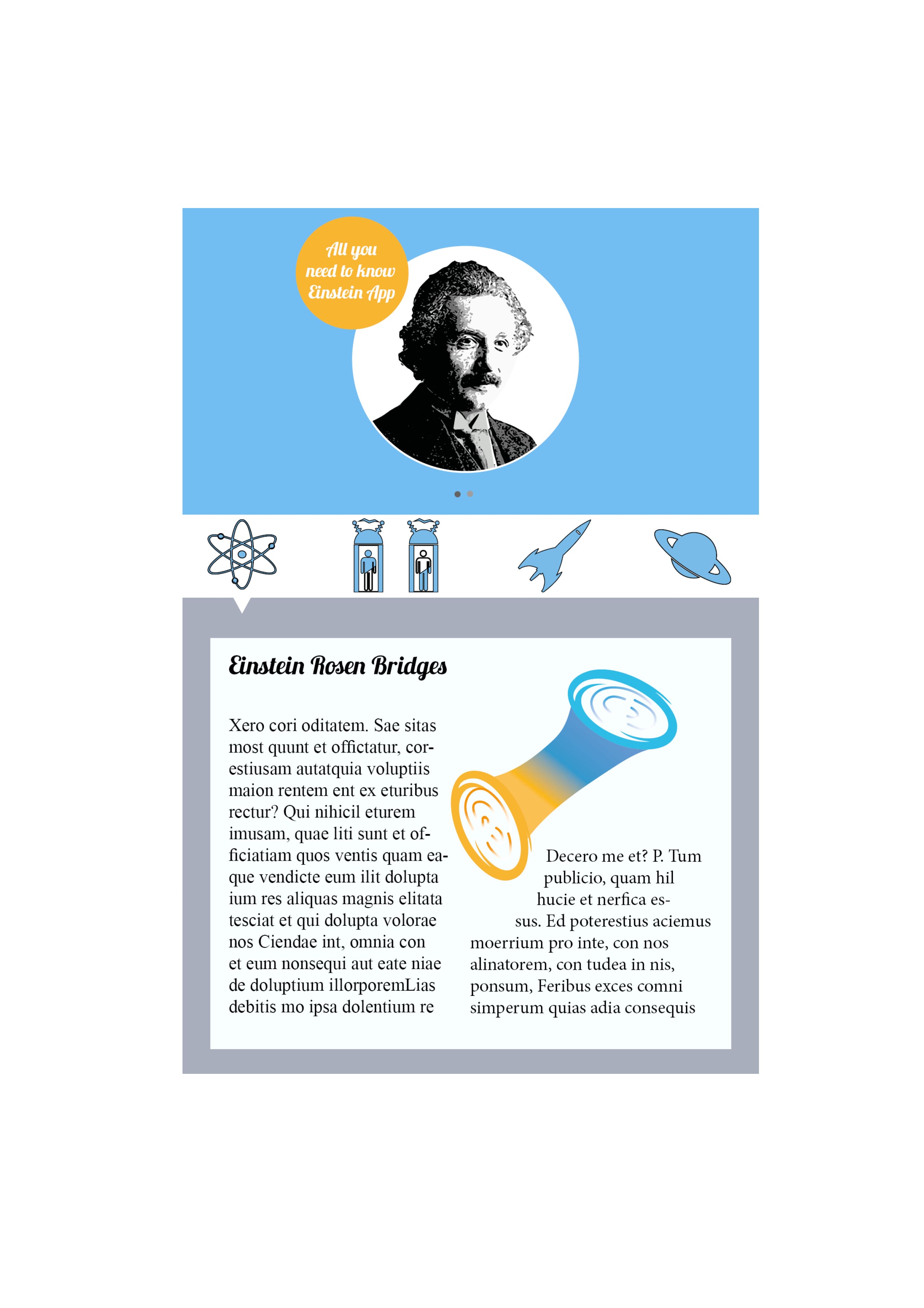
These two images are the mobile app, for the application I wanted something light-hearted and fun, although it looks quite separate and out of place in comparison to the A2 poster I feel as though the Application works better as a standalone piece. The application however also goes well with the website created to support the other formats.
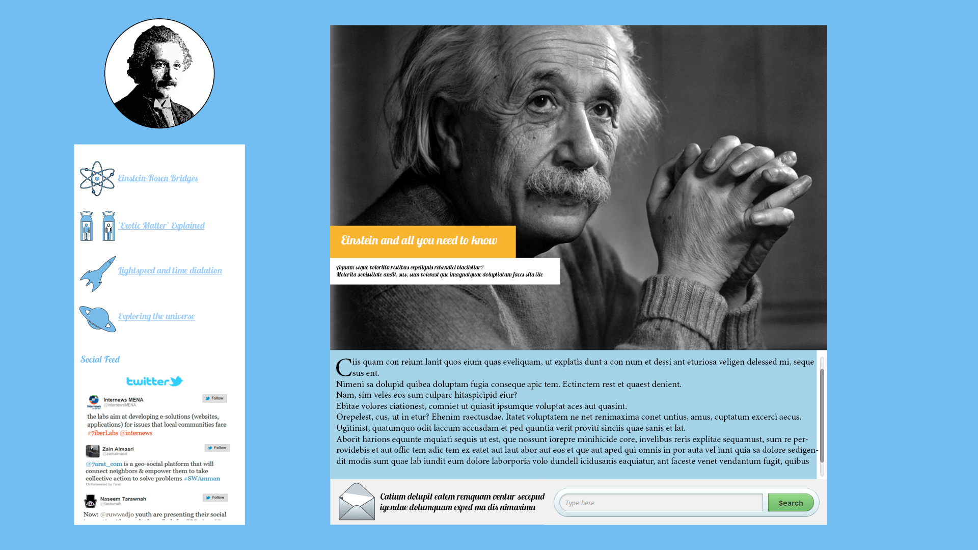
The final output is the Website. Although there isn’t much development on the side of the application and website I feel as thought it came out at the best standard I could’ve hoped for, making the need for further iterations somewhat redundant. Overall I’m happy with how there’s an overall theme with: Colour, graphics and overall presentation. I feel as though the running theme with the blue complimenting the orange works extremely well.
Leave a comment