Workshop 10 – Research and New Branding Book Iteration

During the workshop this week I decided to make a new iteration of my branding booklet, the content I had prior didn’t feel very professional, nor did it feel very experimental, it was to the book and very bland hence wanting to change it up. I decided to look at other branding booklet examples online and try and get a feel for how creating a branding outline for a video games company differs from standard commercial work. I went to http://www.behance.net and looked at versions submitted by games companies as opposed to generic design companies. There were a lot of good examples of branding booklets, ranging from indie game companies to big corporations like Sony and Microsoft, overall the insight into how different companies operate was very useful and informative for my own design.

Whilst the branding booklet still isn’t finished and needs a lot of work doing in order to make it look and feel more interactive, it feels a lot better compared to the other version I made simply because of the choice of layout and typography I used, also the colours of this book feel much more professional and subdued whereas before it was too vibrant and flashy.


corporate brand 2corporate brand 22corporate brand 23corporate brand 27
corporate brand 28corporate brand 24 corporate brand 26 corporate brand 25corporate brand 210


Bibliography:

https://www.behance.net/gallery/14637893/Child-of-Light-Logotype-Guideline

https://www.behance.net/gallery/12061387/Brand-Identity-Process-Book

https://www.behance.net/gallery/23465727/2013-2015-ePortfolio

Colour Research for Picture Book

After researching the artist who I wanted to influence my own work I decided that the next logical step from here was to research a colour palette and how to apply it to my character illustrations. The style for the picture book that I’m aiming to achieve is flat basic colours for the characters, and simple block colours for a background. Because the theme of my book is Loneliness, I researched colours which were associated with this.

“The meanings of blue are often associated with serenity, calm and spirituality. But colour symbolism can be strangely contradictory and Blue is no different. Blue also brings to mind sadness and loneliness for many.” Colour-Wheel-Artist [2008]
(http://color-wheel-artist.com/meanings-of-blue.html)

The obvious colour I associated from Loneliness was Blue/Grey, and to justify this I found some research online, however these are only 2 colours out of a potential big range for the book. Using the colours below I searched for complimentary colours using the software built in to Adobe Illustrator, in doing so I found other colours like shades of Green and Yellow to complete my palette for the Picture Book.

blue2color-01


Research for Picturebook

After researching some illustrators briefly, I decided to narrow my focus in finding an artist whose style I liked and wanted to inform my own work. After searching through examples on pinterest and google image search, I came across an Illustrator called Anita Jeram. Jeram is an illustrator of children’s books and some of her work focuses on simplistic flat colours with heavy hand-drawn characters, the style I found was something similar I wanted to replicate which I felt was achievable despite my own abilities within illustrating to be lacking.

aj9102_large
book 1
f2bd7607a9d76f31f341a3a77a157ebe


Overall the illustrations seem simplistic, whilst maintaining an element of design which can be conveyed easily into telling a narrative for children, so I feel as though this is the most appropriate for the style I’m trying to achieve.

Picturebook Development Plan

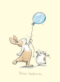
During the workshop of week 6 the group was given a new brief simply called “Picturebook Brief” the brief requires us to create a minimum of 8 pages regarding themes which children may find hard to deal with, the idea behind this is to get us to think about how we can deal with diffcult subject matter, and make it applicable through illustration and Typography making the topic more digestible for children.

Before setting out and creating the brief there was an obvious learning curve of what’s expected from us, and how we can tackle this. There was obviously an emphasis on some components which at first seemed somewhat commonplace and easy to overlook, however paying close attention to what’s expected, I now know that there should be a lot of attention paid to Typography and Colour, focusing on these two elements gives the book more visual coherence and overall makes the end product a lot better.
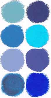
During the early stages of the brief I will focus on colour palettes and typography research, this should help inform the end product and make it a lot more professional. One final element I will look at will be the ability to rework and change ideas, a lot of the time designers think what they’re doing is final and good enough to submit as an end product, this is something I want to avoid unless I’m 100% certain of my own ideas.

Development Plan

The development plan for this brief will detail a time schedule of all the elements I’m working towards and when I want them completed by. I feel as though time plans are a good tool to use and stick to so as you understand how to spend on each component.


Week 6 – Research/Project Planning Stage

  • Name for the PictureBook
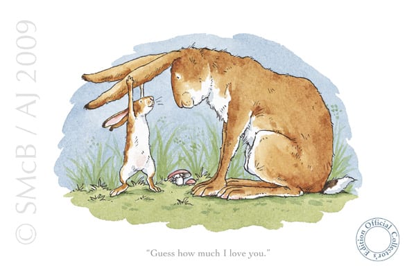
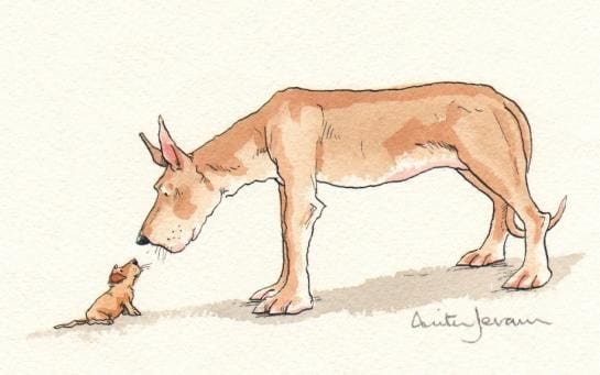
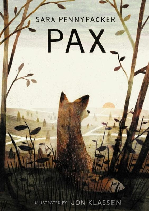
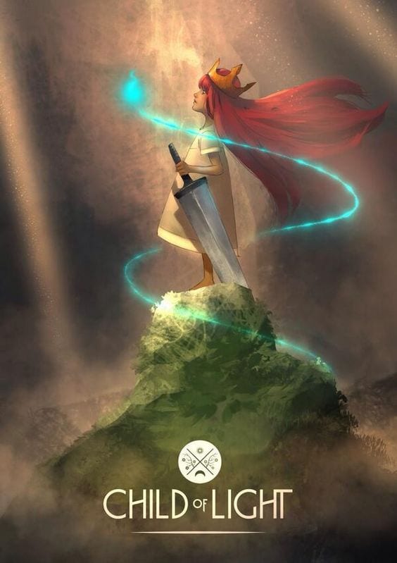
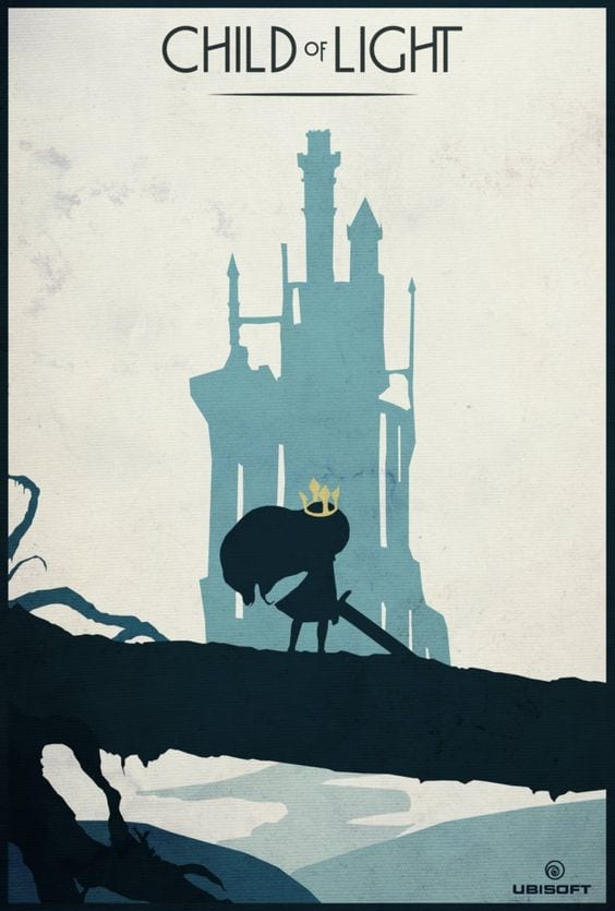
  • Research on inspirations (Artists, Authors)
  • Look at examples I want to influence my work on
  • Progression with the Design/Overall Branding

Week 7 & 8 – Concept art and further ideas development

  • In-depth picturebook research (What conventions do I follow, examples of how to compose a narrative for kids, how to make the end product look/feel thematically appropriate? )
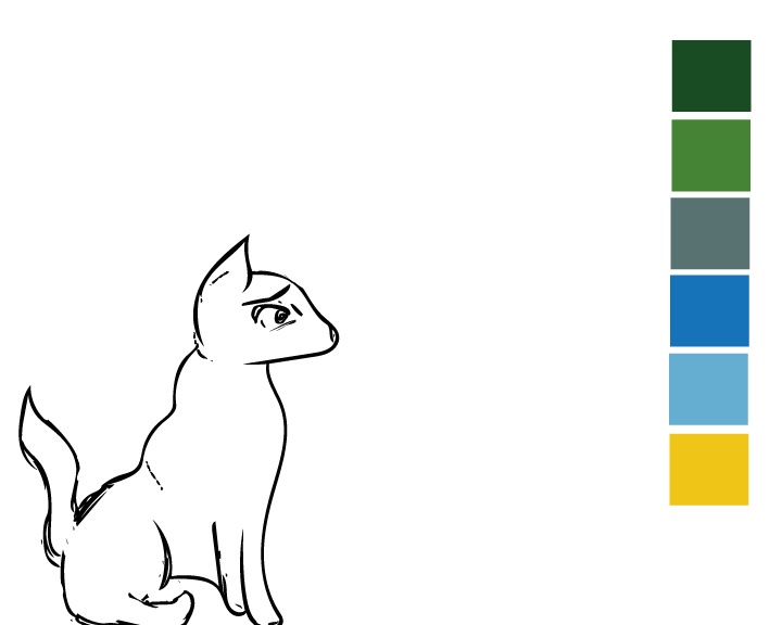
  • Rough sketches (Concept art, Character art)
  • Experiment with Typography (how does it look/feel with supporting illustrations)


Week 9- Further Illustration Exploration 

  • Finalised Title (Reach a point where I know what I can improve for the cover/title)
  • Typography evaluation, new choices from old, variations and how well it works
  • Further Character concept art, Settings for the book, Environments Etc.
  • Upload Sketches – Evaluate Likes/Dislikes
  • Further develop environments, showcase potential settings for the character


Week 10 & 11 -(Easter) Final Tweaks

  • Finalised Illustrations (What character am I using? What Environments/Themes?)
  • Room for improvements (Are the sketches representing of the book enough positively? Room for tweaks?)
  • Finalised Colour Palettes

Week 10 onwards – Polishing final output

  • Have a finalised booklet 8/10 pages
  •  Character development finalised uploaded to blog separately
  • Colour Palette and supporting work uploaded to blog
  • create final Pdf for the semester, uploading both projects.


Research & Source Material

https://uk.pinterest.com/search/pins/?q=illustration&rs=typed&0=illustration%7Ctyped

Workshop 6 – Picture Book Research

During the workshop this week I was working on research for the picture book brief, the brief outline is to create 12 pages or more including illustrations and a typeface which compliments the style and aesthetic of the book. The aim of the picture book is to make a serious subject matter digestible and appropriate for children, these subject matters can be current in media and the news, or could cover other topics for children to make them understand serious issues from a young age like: Global Warming, Terrorism  and Online Safety.

Overall I feel as though the picture book brief is a great way of working to a project with a more unique age group compared to other modules set prior.

The research I did this week was primarily just what I found and liked the look of on Pinterest.

2d641c1980c3c728abd317b16bb525e0 51a6ec224e616d38887ac2b807f7102a (1)
1657bd4793f8c54c395a2fcb0ab0ad7b c455be19db5bd8f6932c1b9af921f492


The general aesthetics and feel of these books is something similar to what I’d like to mirror, I like the usage of both collage and flat, but vibrant colours to illustrate themes for children. It’s my personal belief that so long as the visual representations of the themes within the book are engaging and vibrant then anything can be made digestible for children regardless of the topic.