Corporate Branding Identity Book – Final

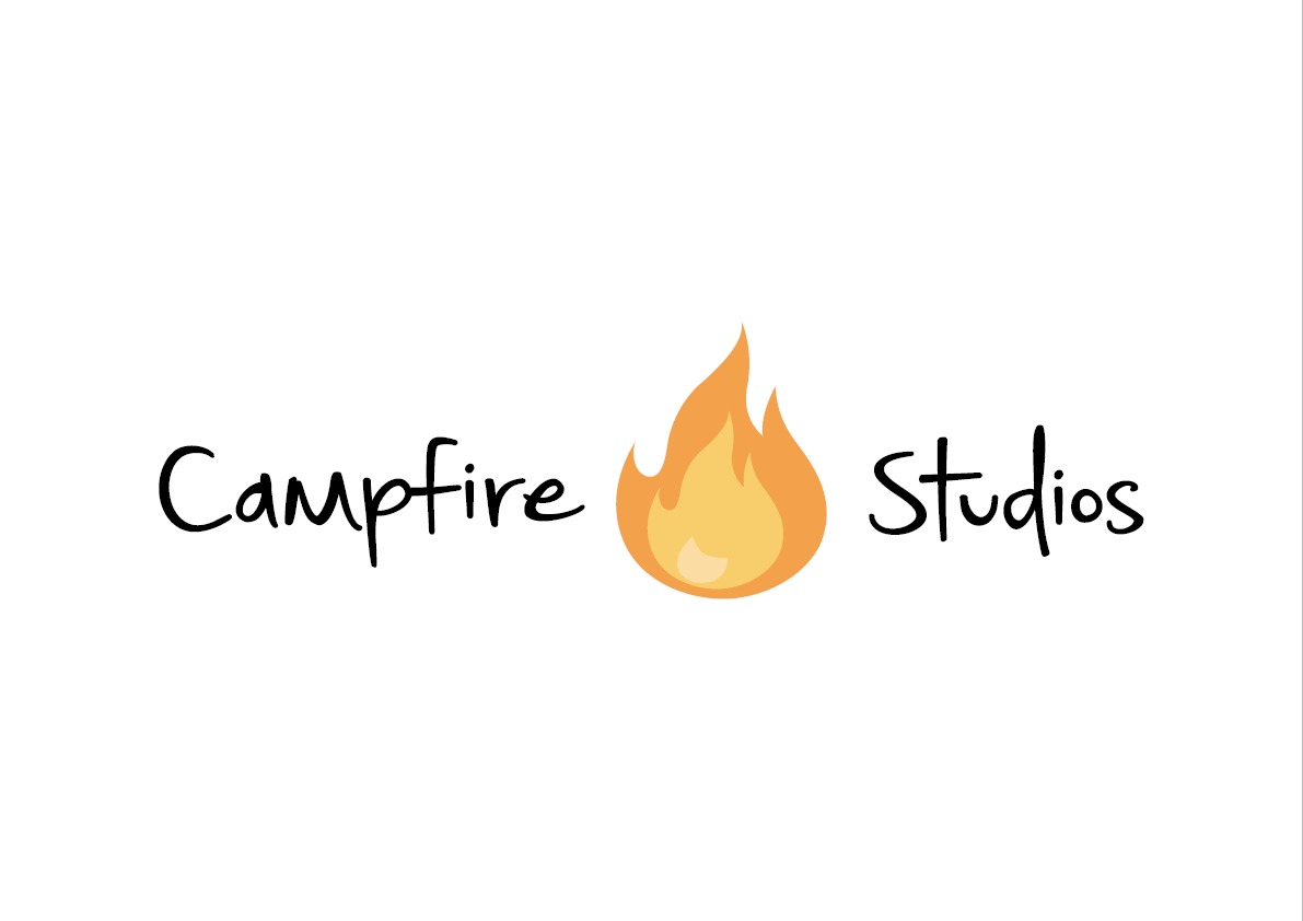
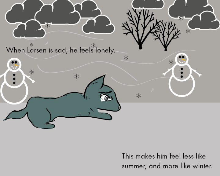
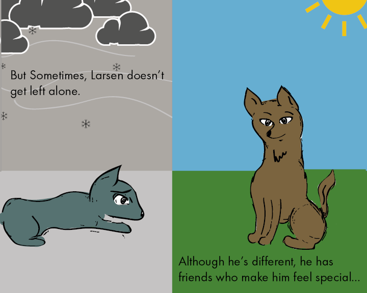
After a few iterations and varying designs, I decided to take a different approach in finalising my corporate branding brief. After receiving feedback on my booklets prior I decided to try and give the book more flow and something worth looking at, in doing so I looked at other examples of corporate branding for games and I came away with an end product looking and feeling much more responsive than before.
Overall I feel as though I have taken a lot away from the branding brief, I get a sense of how meticulous you can become over displaying the products you have created, it also feels a lot better explaining to others how to use your own created vision. As a whole this brief in particular has been my favourite as a designer, learning new exciting things and experimenting and challenging my own abilities.


EXP

EXP2

EXP3

EXP4

EXP5

EXP6

EXP7

EXP8

EXP9

Workshop 11 – Final Touches to the Picture Book

The workshop this week marked the relative completion of the picturebook brief, with a few minor tweaks only needed. During the workshop this week I had made significant progress towards the completion 0f the picture book, after finalising a colour palette weeks prior, this week was the final week in making a few slight adjustments towards the end product. Overall I feel as though the picture book has fulfilled its role in what it set out to do. Despite my initial thoughts on how I wanted my book, and how it actually turned out, my vision took a drastic change at one point along the line, however I feel as though the change from how it was envisioned to the final product is positive and something I’m proud of.


final book final book2 final book3 final book4 final book5 final book6 final book7 final book8

Picture Book Draft – Without Text

This is the version of the picture book prior to having text added within indesign. Overall I feel as though the research taken prior towards a decisive colour palette has proven beneficial in order to get started straight away with injecting more life to the book, the theme’s running with blue and grey relating to Loneliness is very prominent I feel, and the other colours used to compliment them adds so much more than just having a plain white background.
Supporting elements on the pages such as the grass, trees and clouds were all copyright free vectors downloaded from http://www.thenounproject.com

page 1 final-01-01
page 2 final-01-01

Page 3 final-01-01

page 4 final-01-01

page 5 final-01-01

page 6 final-01-01

page 7 final-01-01

final page-01-01

Workshop 8 – Corporate Branding Booklet

During the workshop this week I made further progress with my branding brief, in particular the Corporate branding identity booklet. The branding book consists of 16 pages detailing how the brand I have created should be used, this includes: Colour Detailing, Typography and Sizing Instructions.

This booklet is the finalised output format for the overall module and in effect wraps up all the loose ends with the other output formats I have created.


Corporate Branding Identity Details
Corporate Branding Identity Details2
Corporate Branding Identity Details3
Corporate Branding Identity Details4
Corporate Branding Identity Details5
Corporate Branding Identity Details6
Corporate Branding Identity Details7
Corporate Branding Identity Details8
Corporate Branding Identity Details9
Corporate Branding Identity Details10
Corporate Branding Identity Details11
Corporate Branding Identity Details12
Corporate Branding Identity Details13
Corporate Branding Identity Details14


The current document only contains placeholder text and a very sparse amount of imagery, this is currently just to work out a theme and an overall document which has flow and movement, whilst staying informative by detailing the specifics of the brand.

Whilst the branding booklet is still in the early stages of development I feel as though this as my final output format ties the brief up as a whole. After this is complete my aim is to make some concept art and finalised sketches for my game.

Overall I feel as though there is some strong development, and sticking to a coherent theme makes the overall product have more visual strengths and strengthens the brand as a whole.

Picture Book First Draft

After all the illustrations had been drawn and converted to vectors I created a mini storyboard on how to apply them for the picture book, the layout below is how I want the story to progress, although it’s currently very early in terms of completion, I believe this will be the final story layout with only minor details that may change along the way.
The illustrations I made turned out a lot better than I initially expected, and although they looks somewhat rough, I feel as though this style will benefit the story I aim to make with it. The next stages are to work out a colour palette and add supporting graphics to progress from this current stage.

page 1-01


page 3-01

page 4-01 page 5-01page 7-01page 6-01page 2-01