Corporate Branding Identity Book – Final

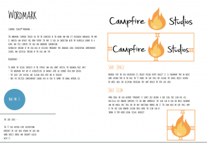
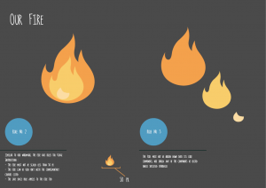
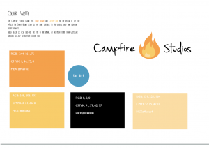
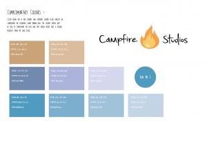
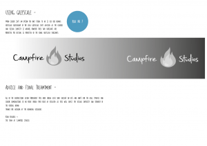
After a few iterations and varying designs, I decided to take a different approach in finalising my corporate branding brief. After receiving feedback on my booklets prior I decided to try and give the book more flow and something worth looking at, in doing so I looked at other examples of corporate branding for games and I came away with an end product looking and feeling much more responsive than before.
Overall I feel as though I have taken a lot away from the branding brief, I get a sense of how meticulous you can become over displaying the products you have created, it also feels a lot better explaining to others how to use your own created vision. As a whole this brief in particular has been my favourite as a designer, learning new exciting things and experimenting and challenging my own abilities.
 

EXP

EXP2

EXP3

EXP4

EXP5

EXP6

EXP7

EXP8

EXP9

Workshop 7 – Further Website Development and Merchandise Mock Ups

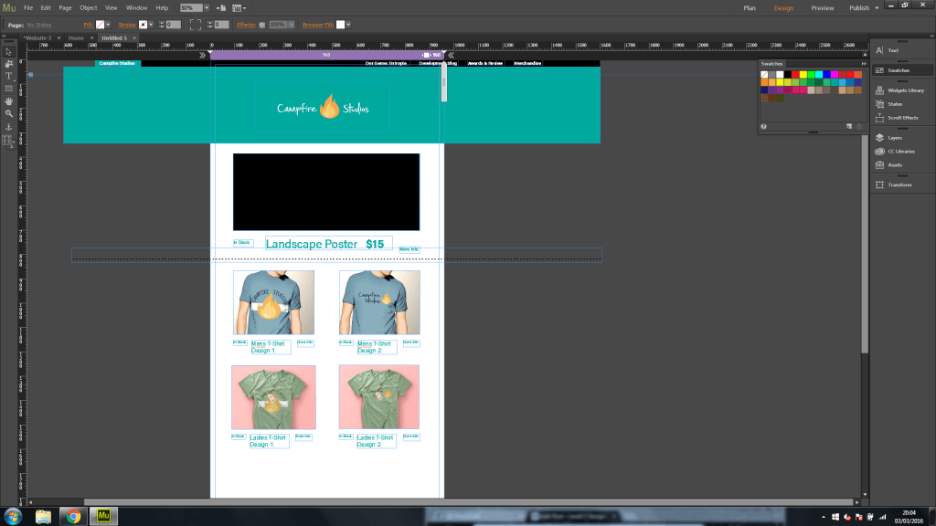
During the workshop this week I decided to make further progress and development with my branding brief, more so with the website itself. I decided to add some of my designs to the merchandise page, and experiment with the layout some more. After focusing quite heavily on how the website would fundamentally operate I realised that I lost sight of the actual theme and aesthetic I was going for, so I decided to start from scratch and create a new merchandise page.

When thinking about the design I wanted the page to be a constant scroll rather than having it link to numerous other pages, it keeps the flow of  content and organisation consistent it also  allows the user to look at multiple designs without needing to leave the page.
Overall I like how the website is coming along and being more coherent to an overarching theme, the placement of the logo is the same on each page and the colour scheme with the Turquoise/Blue compliments the orange flame which just makes the overall theme visually appealing.

Untitled


Also during this workshop I decided to make another mock-up of where my logo could be applicable, for this mock-up rather than a T-Shirt I decided to apply it to a rucksack. the PSD files used in my mock-ups all come from https://www.piexeden.com it’s a fantastic website where free PSD files can be downloaded, and you can convert your standard SVG files into an operational design.

preview


Campfire Studios – Final Logo and Variations

After a lot of development and constant iterations I reached my final design. My reasoning behind choosing this design in particular is because of its strong visual appearance throughout wherever the logo is placed. Unlike other logo variations the font is consistently legible, whether it’s on a black background, or if there’s no colour for the logo it works wherever it’s placed.

The factors I took into consideration more so than a visually appealing design was it’s practicality. Whilst most of the people I received feedback from preferred other designs I feel as though my choice with this particular logo type was justified solely because it meets the criteria of a logo and it’s the most consistently practical and operational design regarding: font, legibility and colour scheme.

The alternative versions I created were simply to showcase how the existing logo on white would transfer across different backgrounds, I also added a greyscale filter to 2 of the designs to showcase how printed documentation may look without coloured ink. Overall I feel as though I have now reached a strong visual identity I can carry forwards and begin to assemble to rest of the branding portfolio with.


white one


greyyy yoooo

Black and white

Untitled-2

Further Logo Development

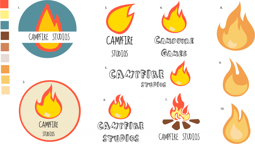
After the presentation during the week 5 workshop, the general consensus behind my current iterations and development was that more variations were needed. Before the presentation I felt as though I had reached my final stages of logo development, but after a more critical approach in evaluating my own work I felt as though I hadn’t fully scratched the surface on what it takes to create a finalized logo.

The different variations were all informed by prior iterations of the logo and were all thematically similar with slight changes in either the typeface, colour palette and composition as well as the shape of the flame.

The initial colour palette I started with felt quite harsh to look at with some variants of the logo, so I wanted to find a more subdued colour which still looked good with the flame, after experimenting with Adobe Illustrators Built in colour guide I found a new set of three complimentary colours which I applied to designs: 8, 9 and 10.

Overall I feel as though I underestimated how complex designing a good logo could be, and so I feel like more designs are needed before reaching a final conclusion. The current rendition I prefer the most is design 8, from here I’ll further explore what I can do with it and see where it takes the end conclusive design


CAMPFIRE VARIANTS

Logo Development (Final)

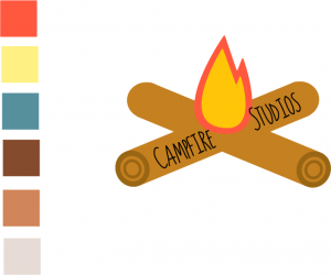
The first logo below was more of a direct translation towards my company name, compared to prior iterations it plays more with the idea of a literal campfire. Overall I feel as though this logo is weaker compared to previous versions, the design for the logs takes too much away from the central focus of the fire, it’s also quite distracting from the typeface too, which I feel works very well with the basic block colours of the fire.


new campfire

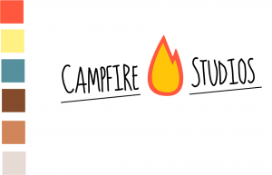
After evaluating what I disliked with the previous logo I decided I wanted to keep the fire and the typeface relatively similar, the type by itself felt very weak and looked out of place, however with even the small inclusion of the underlining the piece overall looks visually stronger.
As it currently stands this logo is my final piece I aim to use for the branding of the company. I feel as though it stays true to an imagined colour palette and general aesthetic I chose from the start also it  feels visually appropriate to the IP I propose to create.

new campfire 2