Workshop 3 – Further Logo Development

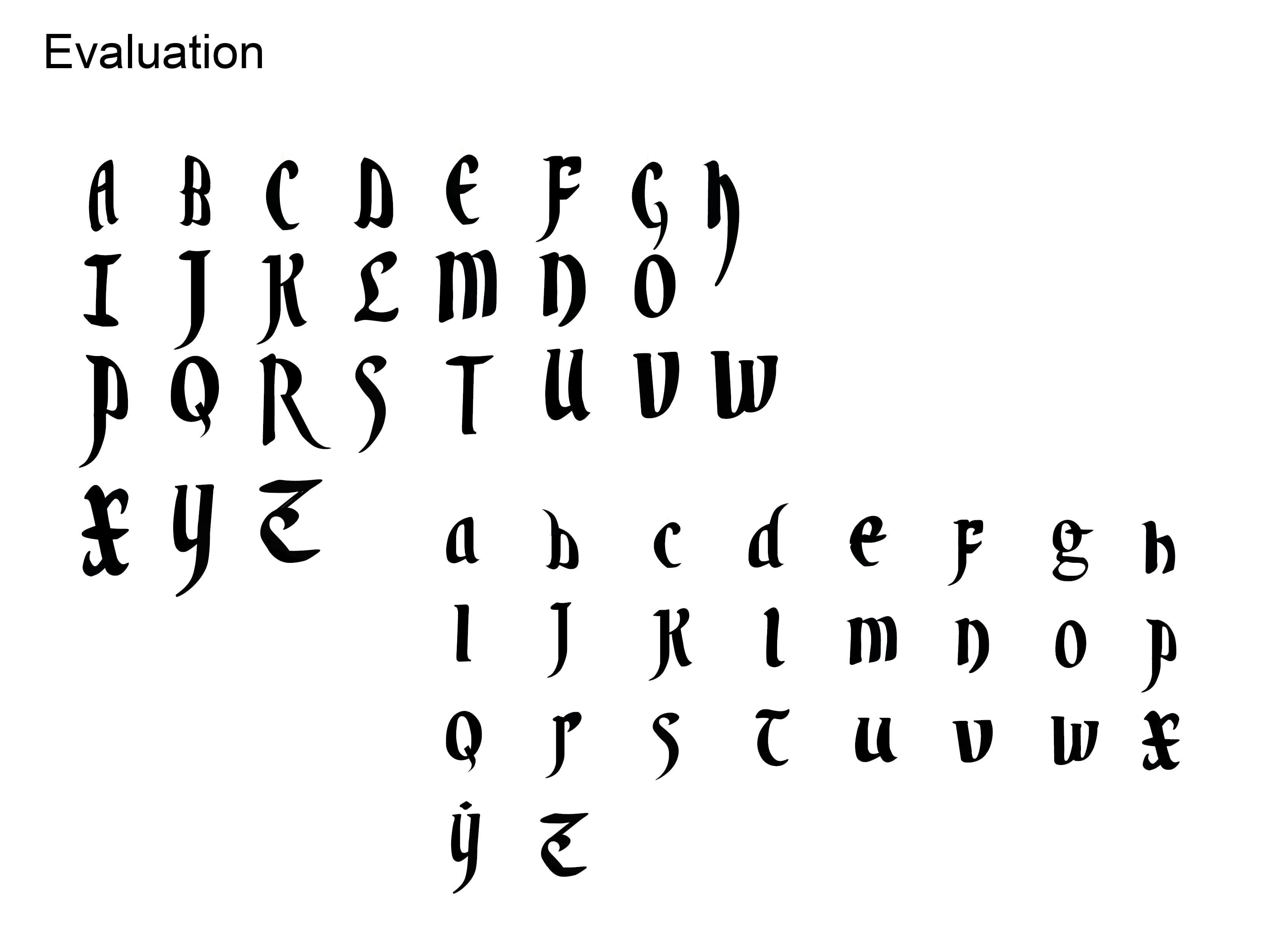
During my third workshop I decided to further explore logo variations, I tried to apply previous versions to some documentations and the shape and size of the logo wasn’t compatible with some of the output formats.

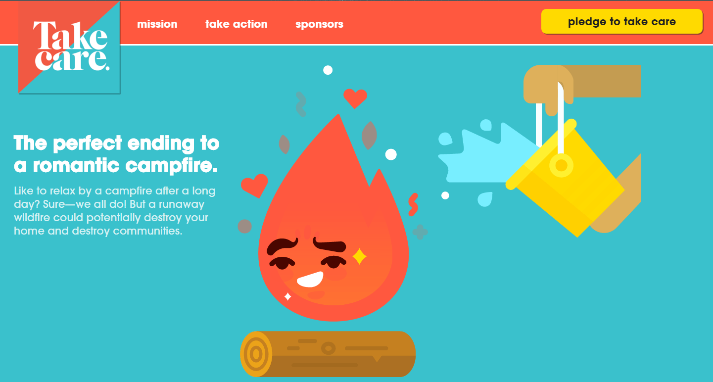
The element I decided to keep from my first logo was the typography, I felt as though this captured the feeling of the company I was going for, it felt rough and cartoony, similar to the proposed IP I would be creating. The new element to this logo was a vector created of a fire, I took inspiration from a camp-fire safety website, the symbol looked fun and something I could use an iteration of in my own work. After playing around with it though it felt too out of place and I personally didn’t like it.

I decided rather than keeping the features of the flame I would try removing them and play with the idea of typography around it. The new logo is a potential design out of more that I’ll make which I feel could be used or at least altered to be a final logo for my company. The next step I’ll take with my logo will be taking features from my first logo and trying to integrate them further with my new logo.


The inspiration for my fire sprite came from the website:

Fire

fire     Untitled-1


Logo Variations

After designing my first logo I wanted to continue on with the theme and idea of “Campfire Studios”. The very first logo I designed had a few elements I liked and wanted to further explore, but there were still a few things that bugged me, primarily the mountain not being central and the font feeling out of place and too confined within the bubble, taking this into account I made further alterations to it.

brand mock up

The second version I made I decided to add a banner which sits underneath the original circle frame, I felt as though this was a good addition for the logo, it felt thematically appropriate for the idea of camp-fires and  in my opinion just compliments the image overall. Another thing I changed was the font, I wanted something which felt more organic and appropriate with the image as a whole, the original font used felt too formal for the rough nature of the wilderness/camp-fire.


The final rendition of the logo I decided to add a few more features to make use of the empty white space, I slightly altered the position of the banner and made it smaller, and I also added some clouds to the mountain top, overall I feel as though this logo is almost finalised and can see it being used for the branding of my imagined company and  IP

v.2.1

Workshop 12 – Finalised Infographic Layouts

During the final week before submission I created my final output formats for my Einstein brief. This included the Mobile application and a mock up website.

Final9


T
his image is my final rendition of the A2 poster, I’ve made slight tweaks to the information and I’ve also changed the standards graphic of Einstein and I’ve put him into a circle, this mirrors the running theme I have with Ovals and circular shapes and overall sits a lot better on the page than it did prior.


Final13 Final14

These two images are the mobile app, for the application I wanted something light-hearted and fun, although it looks quite separate and out of place in comparison to the A2 poster I feel as though the Application works better as a standalone piece. The application however also goes well with the website created to support the other formats.


web

The final output is the Website. Although there isn’t much development on the side of the application and website I feel as thought it came out at the best standard I could’ve hoped for, making the need for further iterations somewhat redundant. Overall I’m happy with how there’s an overall theme with: Colour, graphics and overall presentation. I feel as though the running theme with the blue complimenting the orange works extremely well.


Workshop 11 – Presentation of Finalised Ideas

During week 11 there was an assessed presentation on my final design and intended outputs for typography. The Einstein brief was also assessed.

For this I created a Pdf from an indesign file and presented my near finished design product.

Presentation valyrian ting2 Presentation valyrian ting3

Presentation valyrian ting4 Presentation valyrian ting5

Presentation valyrian ting6 Presentation valyrian ting7

Presentation valyrian ting8 Presentation valyrian ting9

Presentation valyrian ting10 Presentation valyrian ting11


In this presentation I’ve shown my research from prior and the development of my ideas towards final hand in standards, at this point the only outputs that are missing are my website and my Mobile applications.

Workshop 3 – Vector Graphics

During the workshop this week I followed an instructional document on how to create vector graphics in Adobe Illustrator. Having not used illustrator much before it wasn’t a familiar platform, however the results achieved from it were second to none and the quality of the vectors are far superior to other raster graphics I always created prior.

lINC ARC

Overall I feel a lot more comfortable with the software and will make use of it for further experimentation before making my final design