Evaluation of Semester A

The first semester for Design was fantastic and challenging in places. I feel as though I’ve come away with a lot more technical know how regarding software, I’m also getting better at critically reviewing my own work, I feel as though reviewing my work and constantly arguing with whether it can be improved helps me to progress as a designer.


Typography –

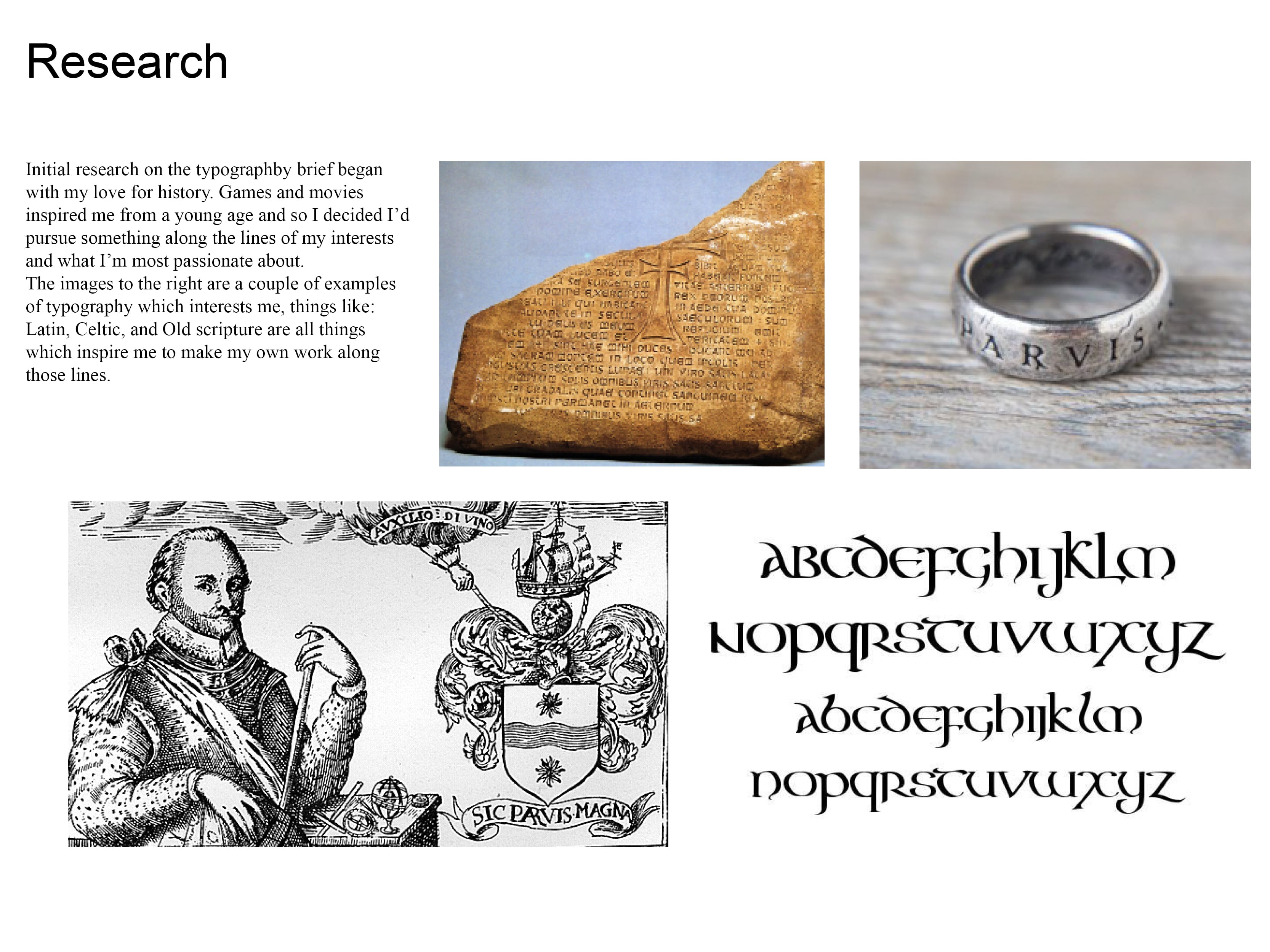
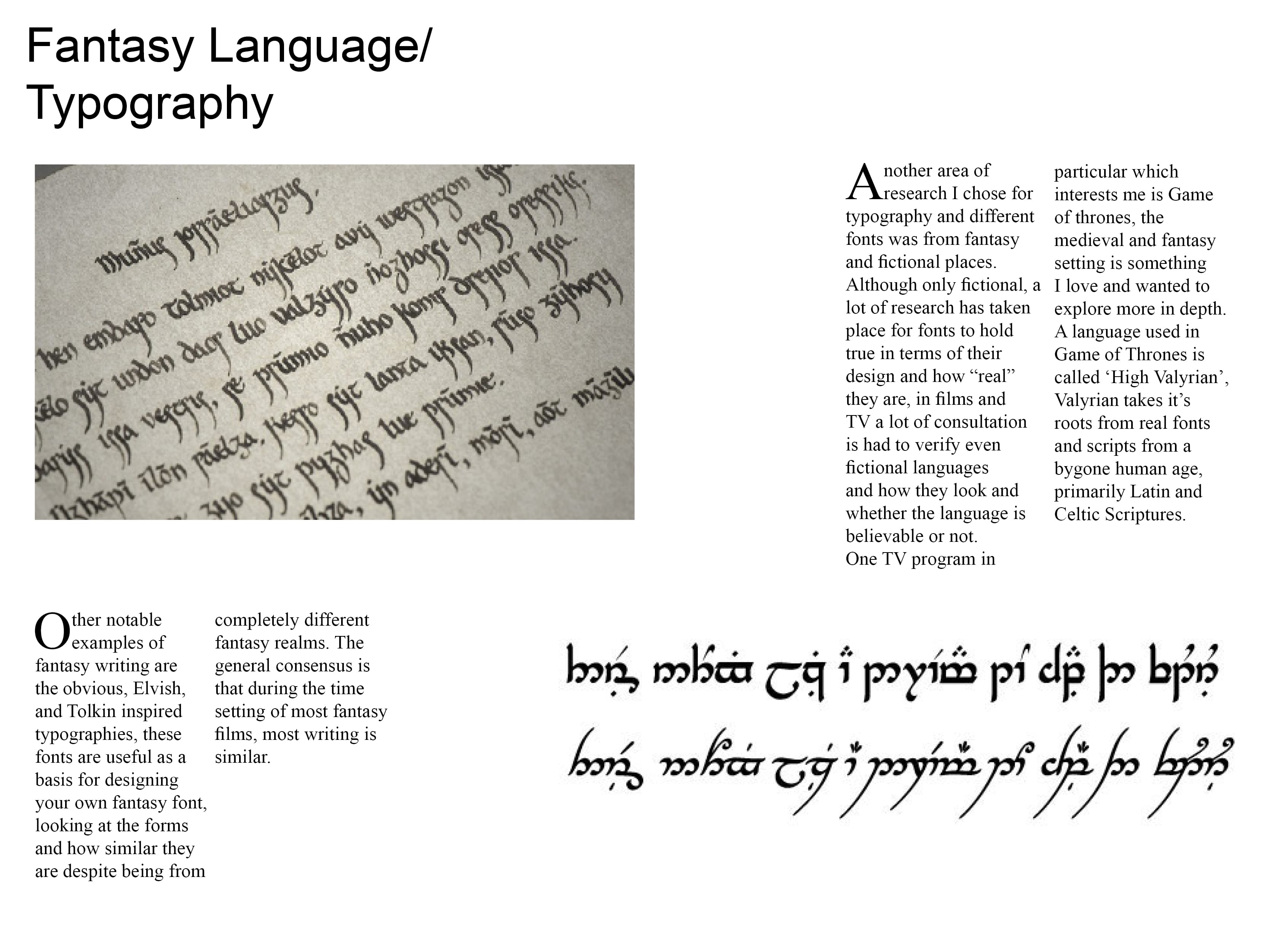
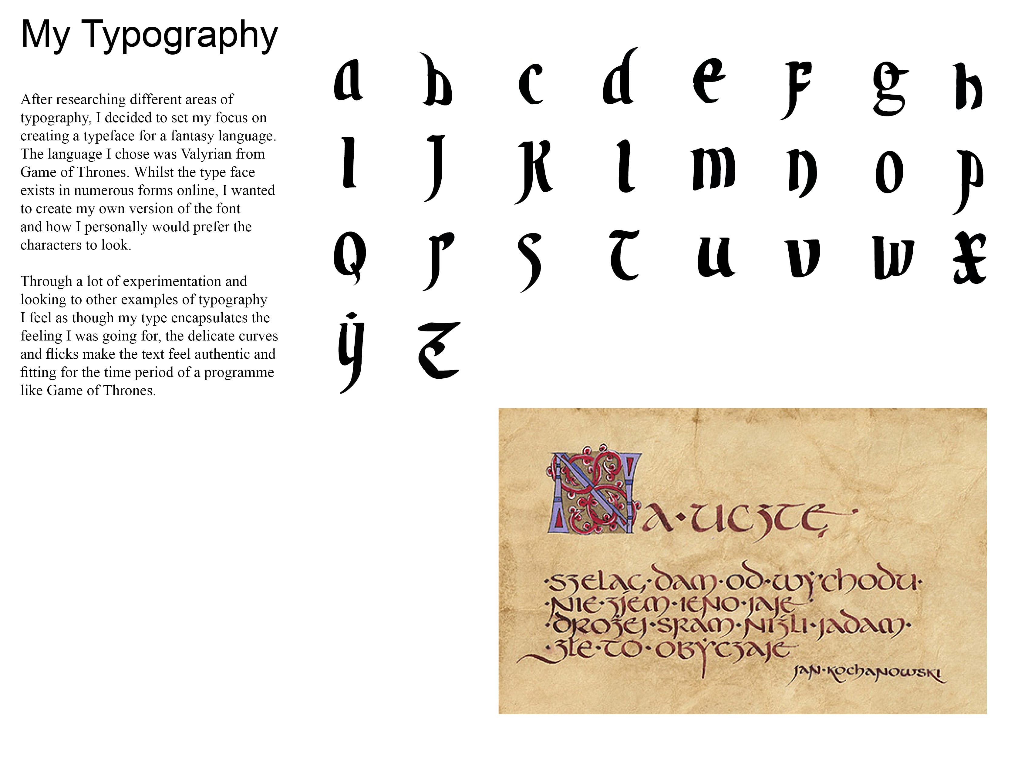
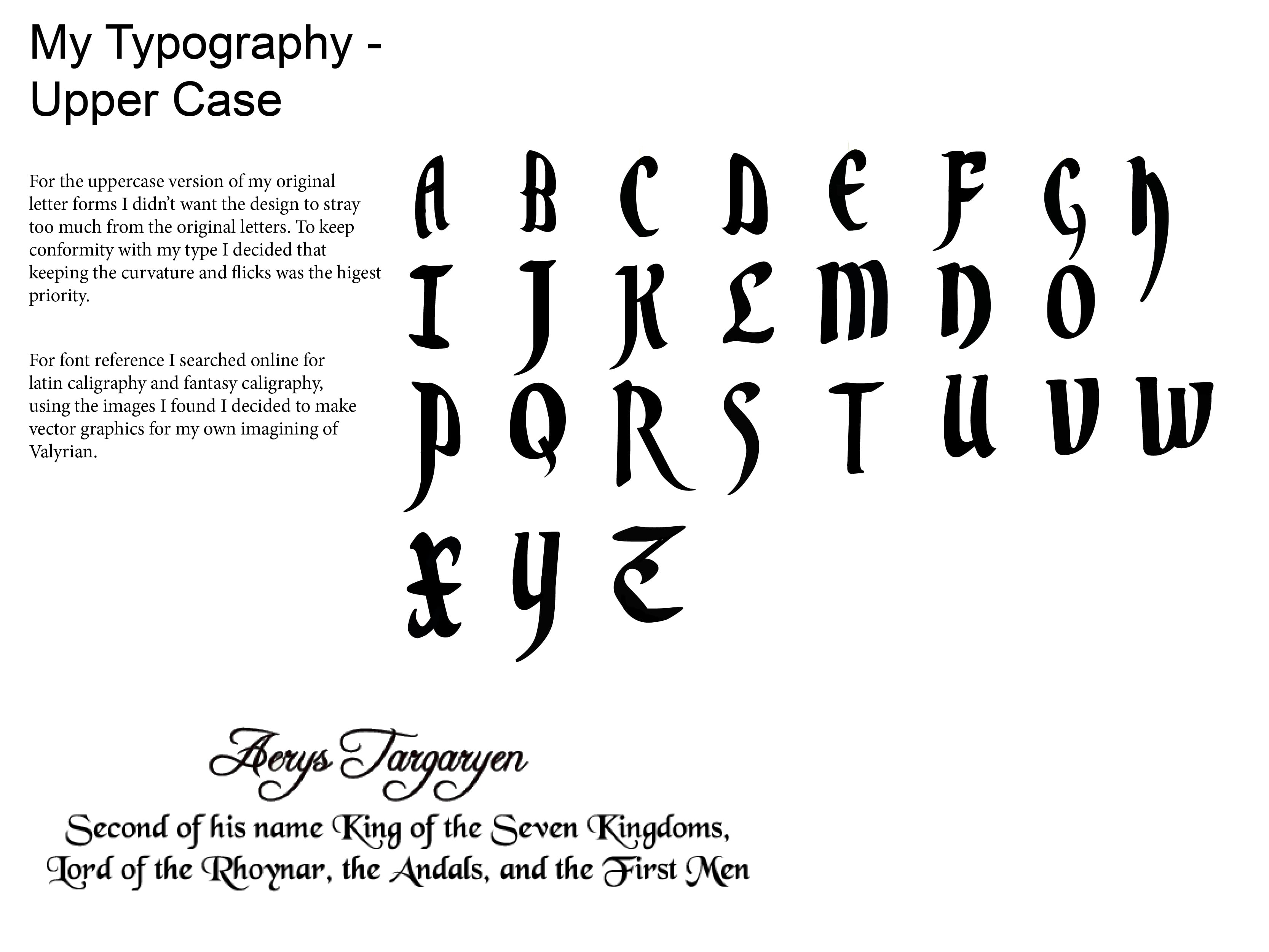
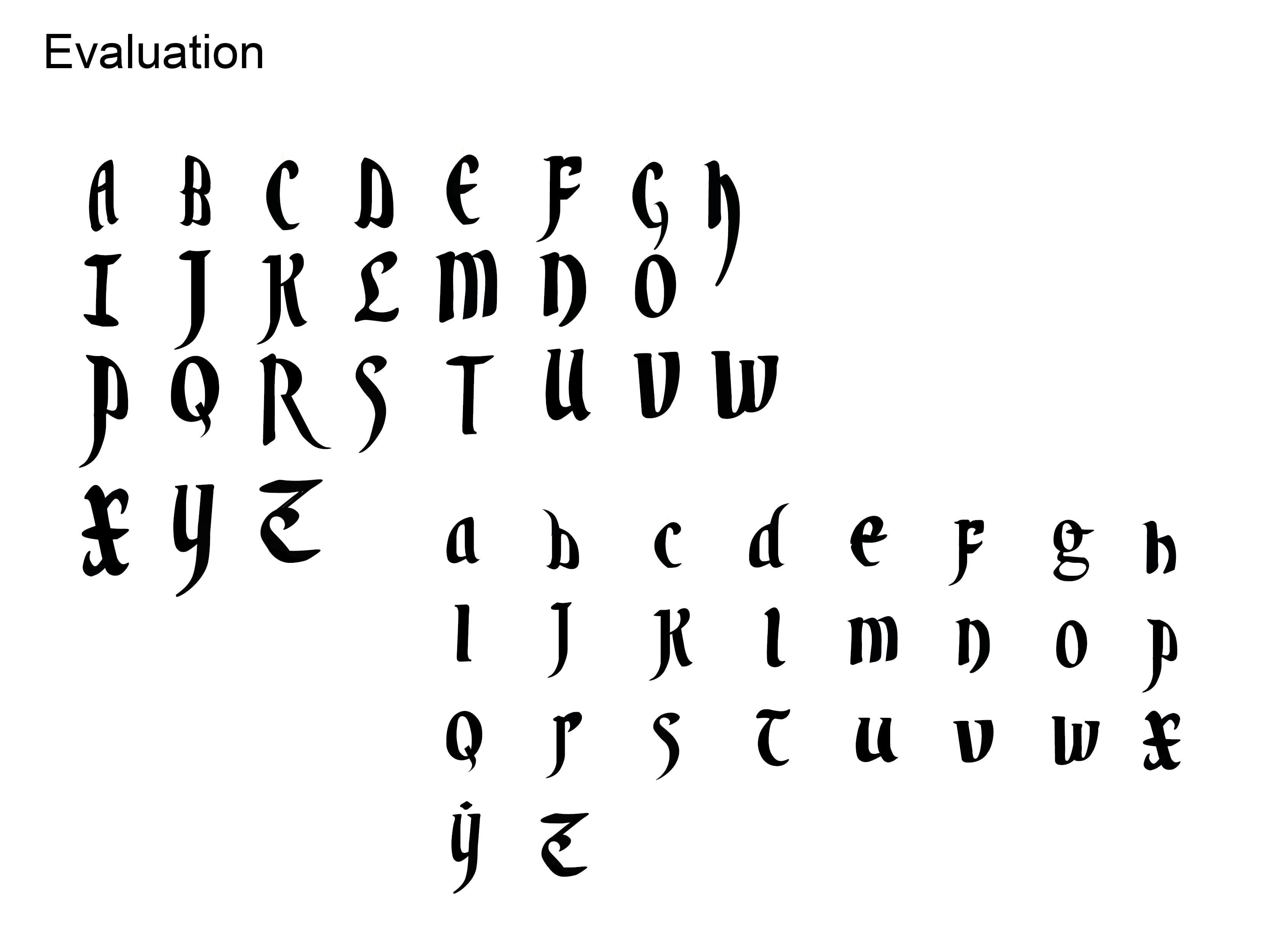
The Typography brief was the one that I personally preferred. I got to use new software I was unfamiliar with and create a functional typeface. During the early weeks of the semester it took a great deal of time and effort to get the results I wanted, however in the end everything worked out well.

Final4

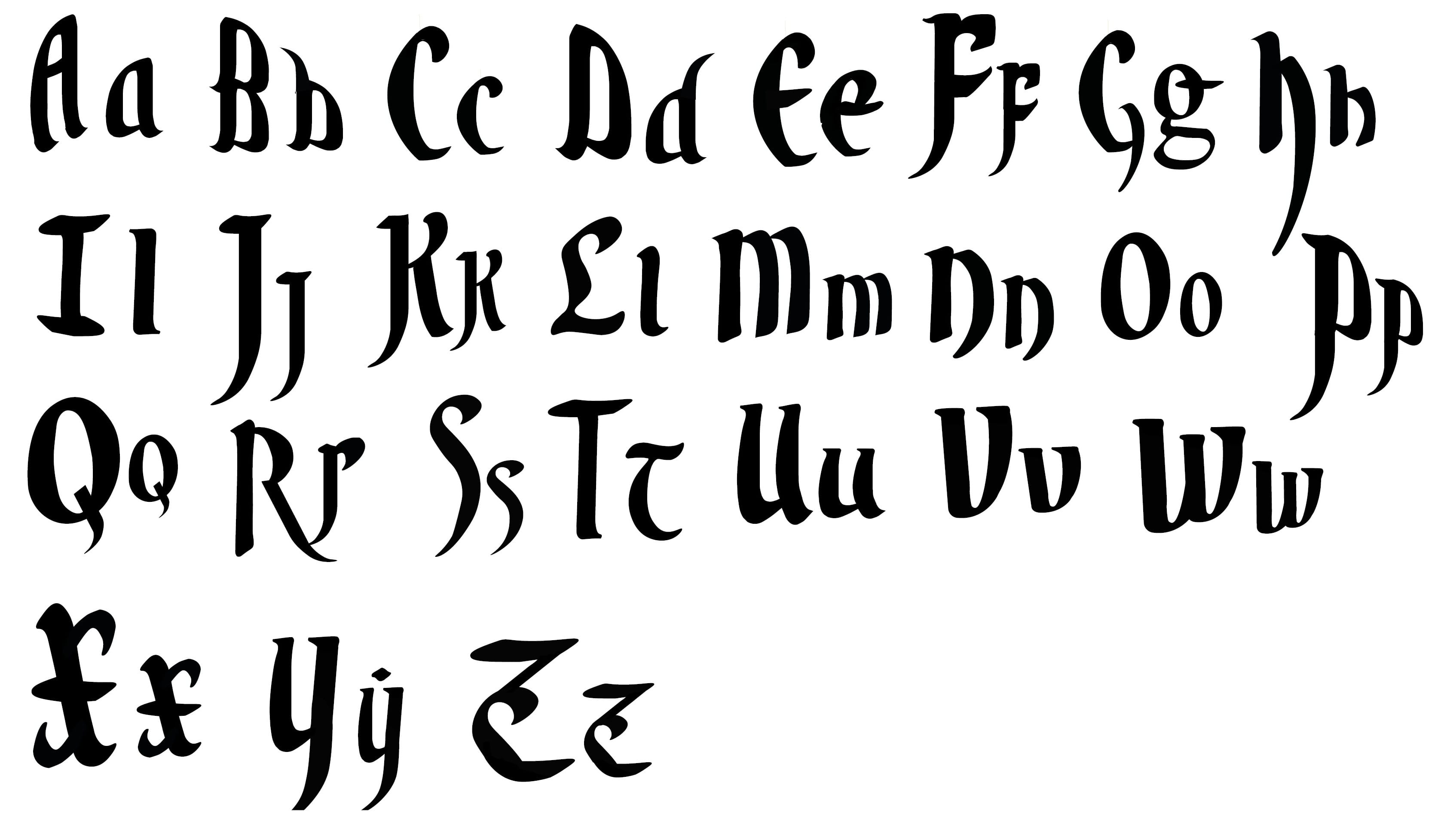
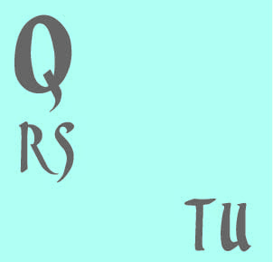
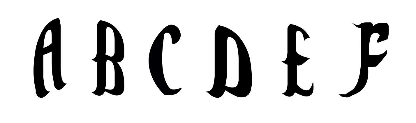
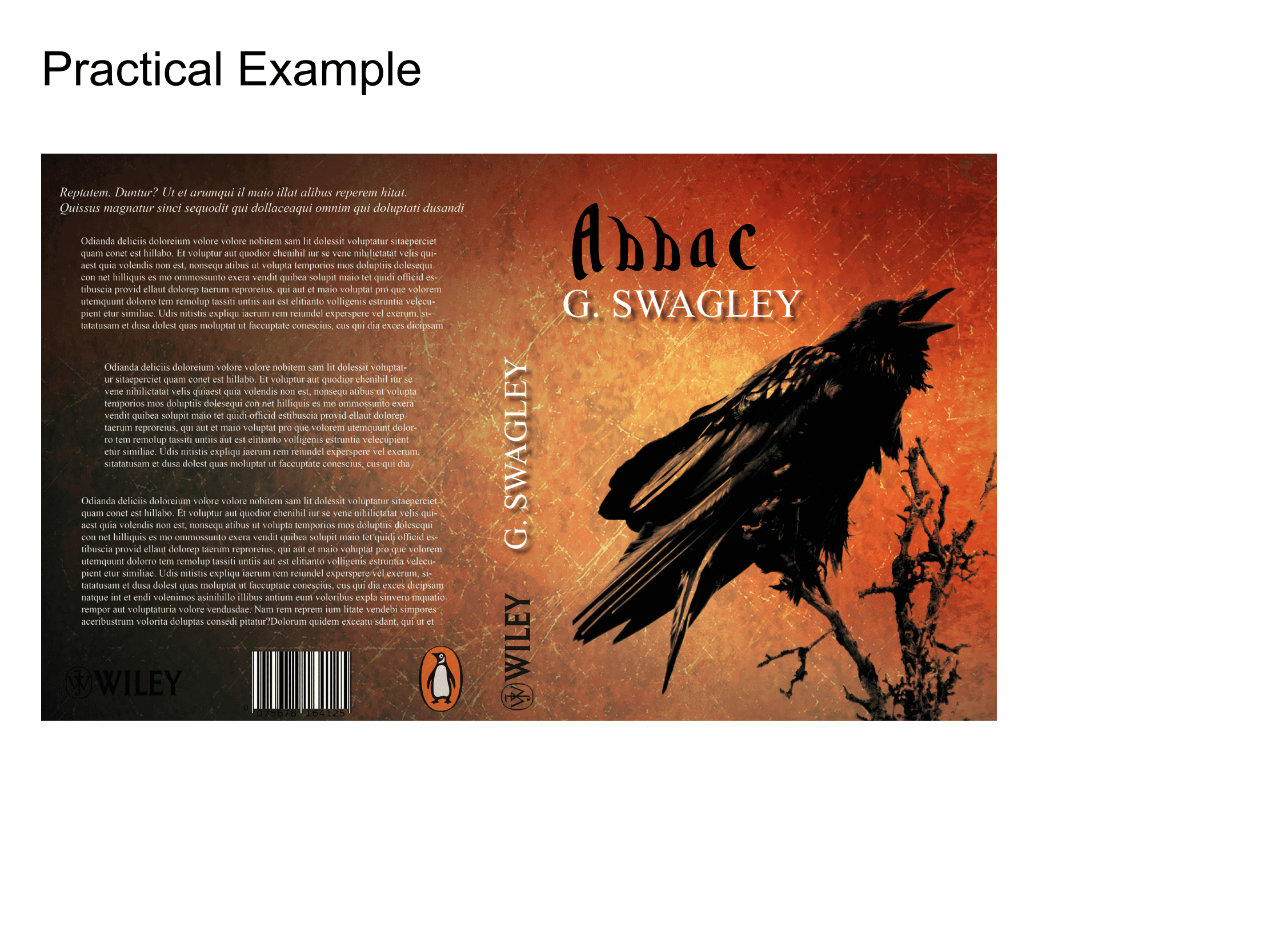
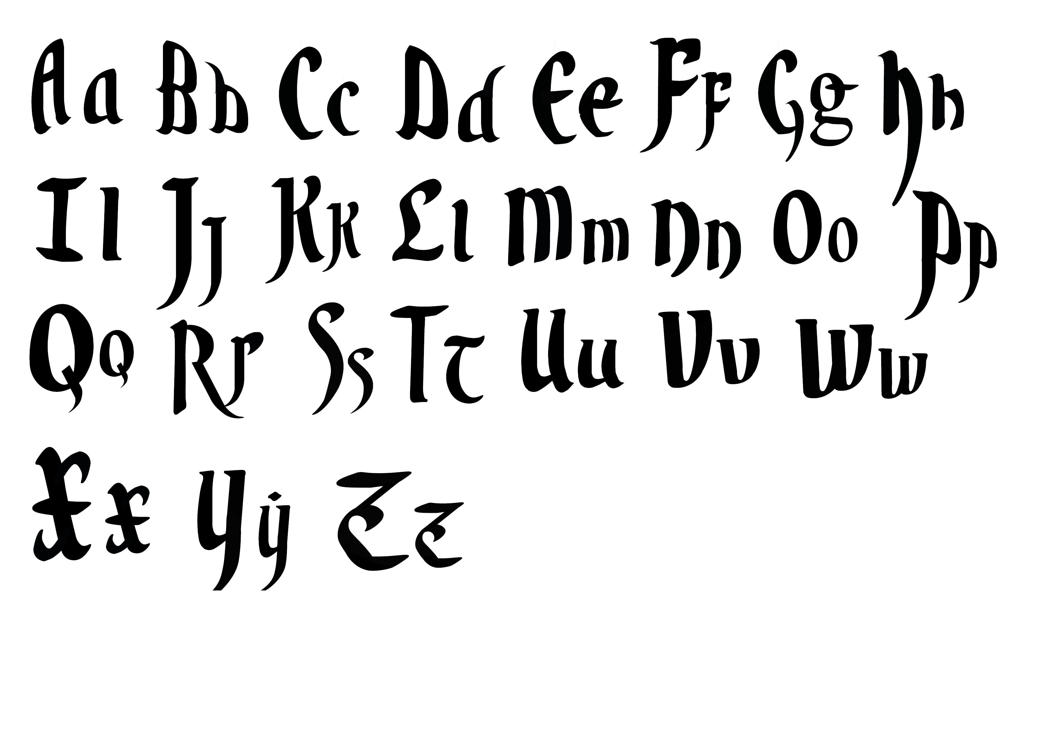
The image above is my final typeface, heavily inspired by Valyrian from Game of Thrones. It took a few iterations to get my letter forms to a standard I was happy with, but working meticulously in order to create a realistic font is something that I’m happy with.
For the practical usage my font found it’s place on a T-Shirt and Scroll, overall I feel as though the font can be quite versatile even for products you wouldn’t expect.

InfoGraphic –

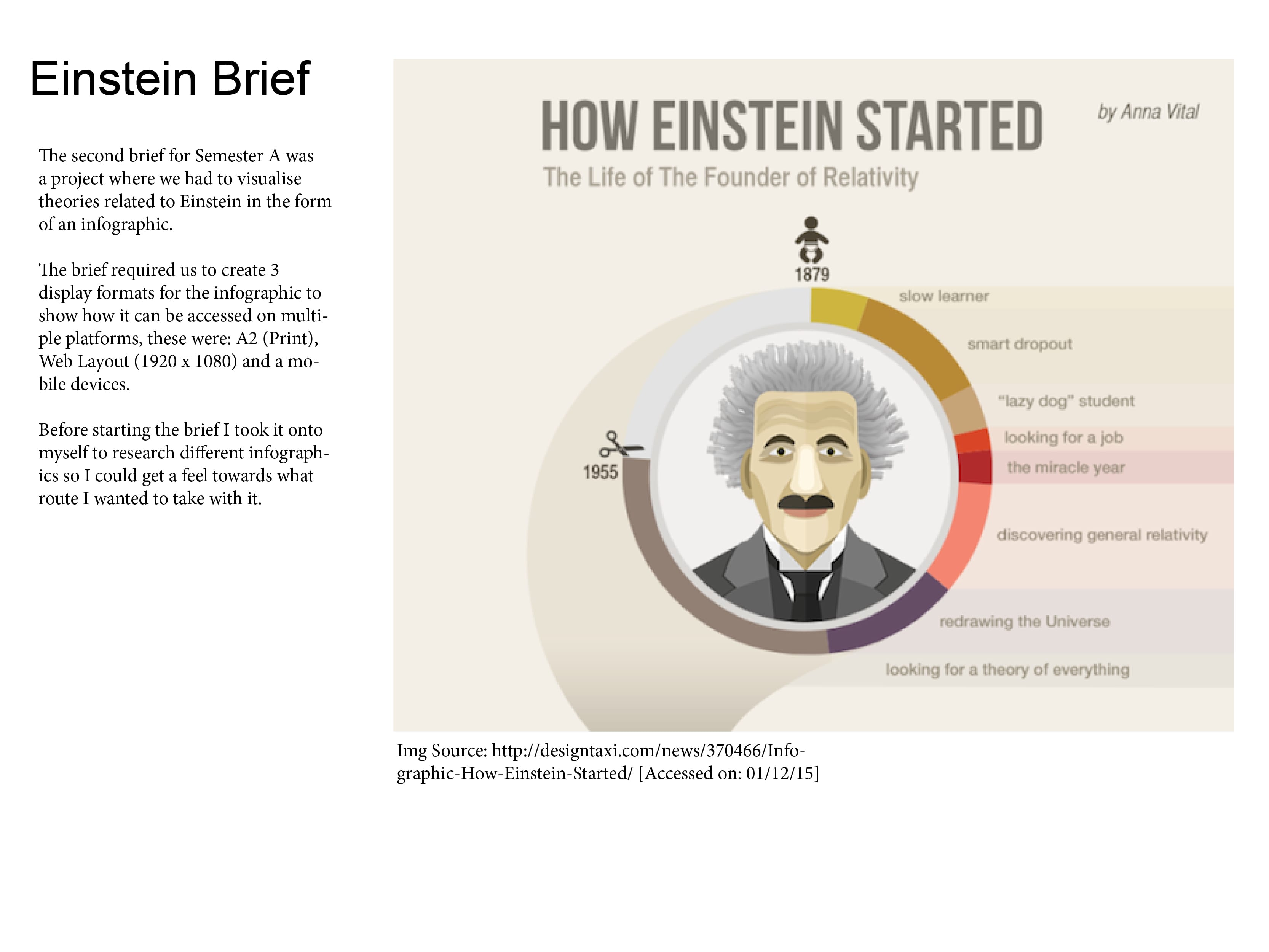
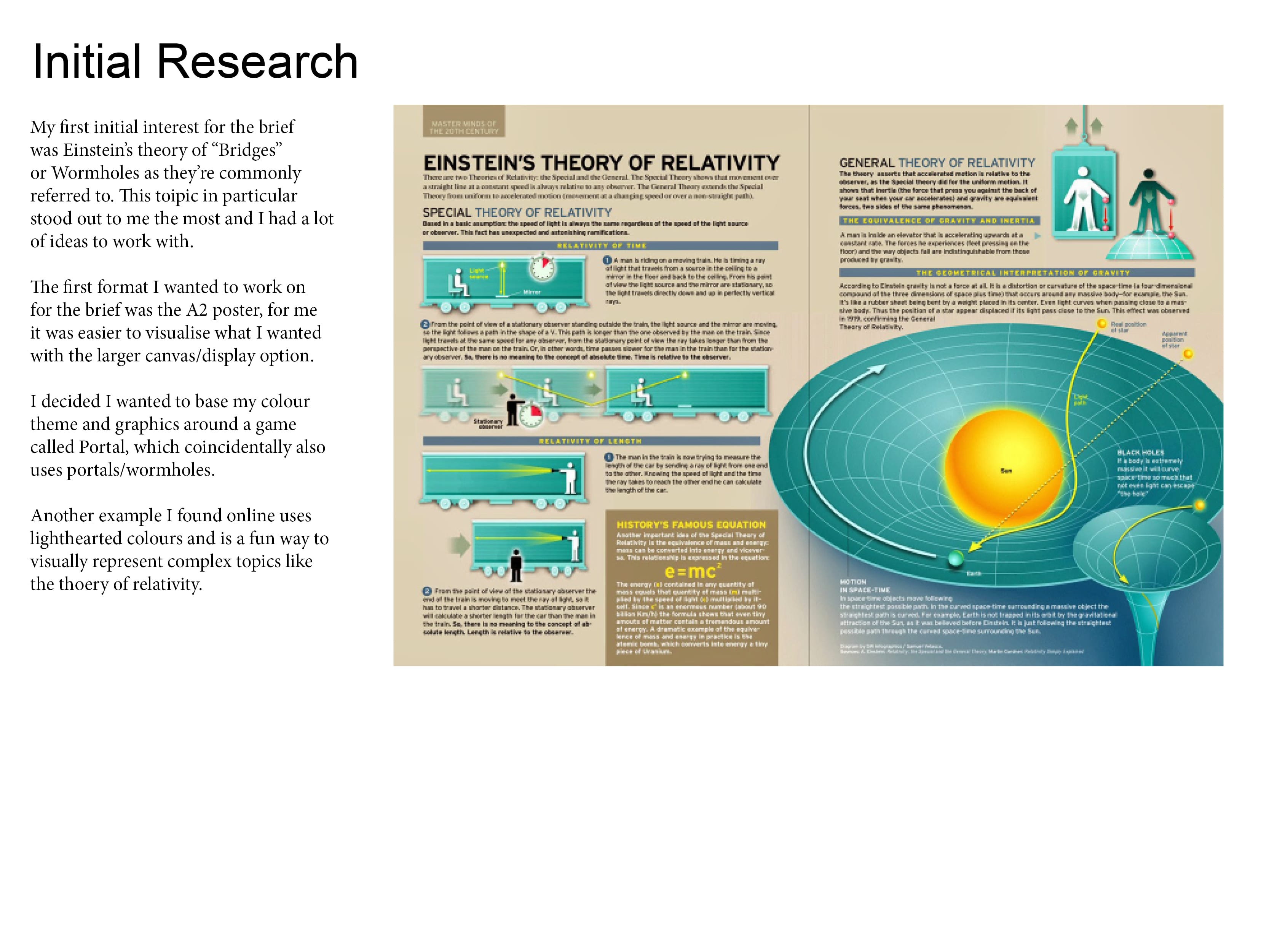
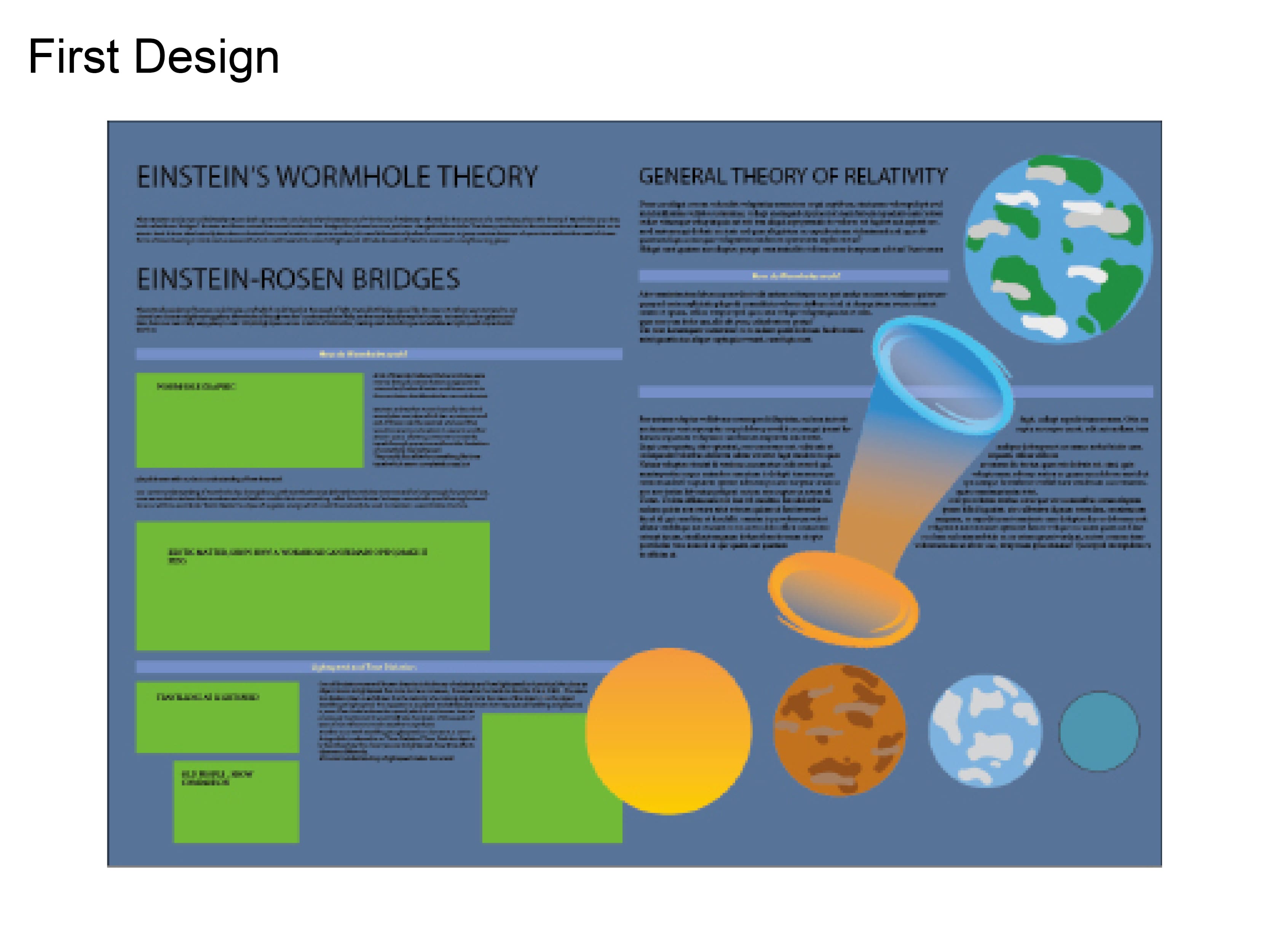
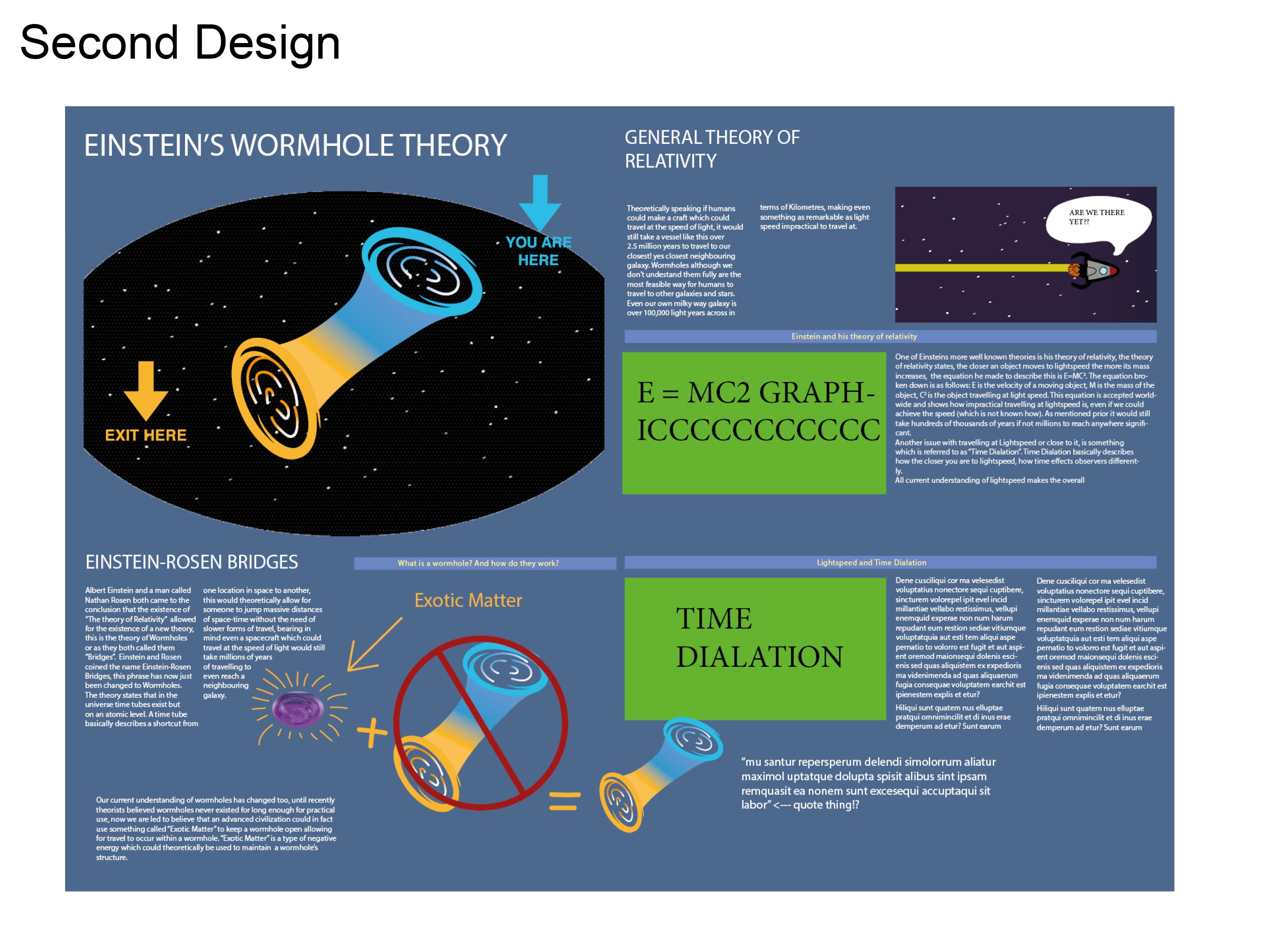
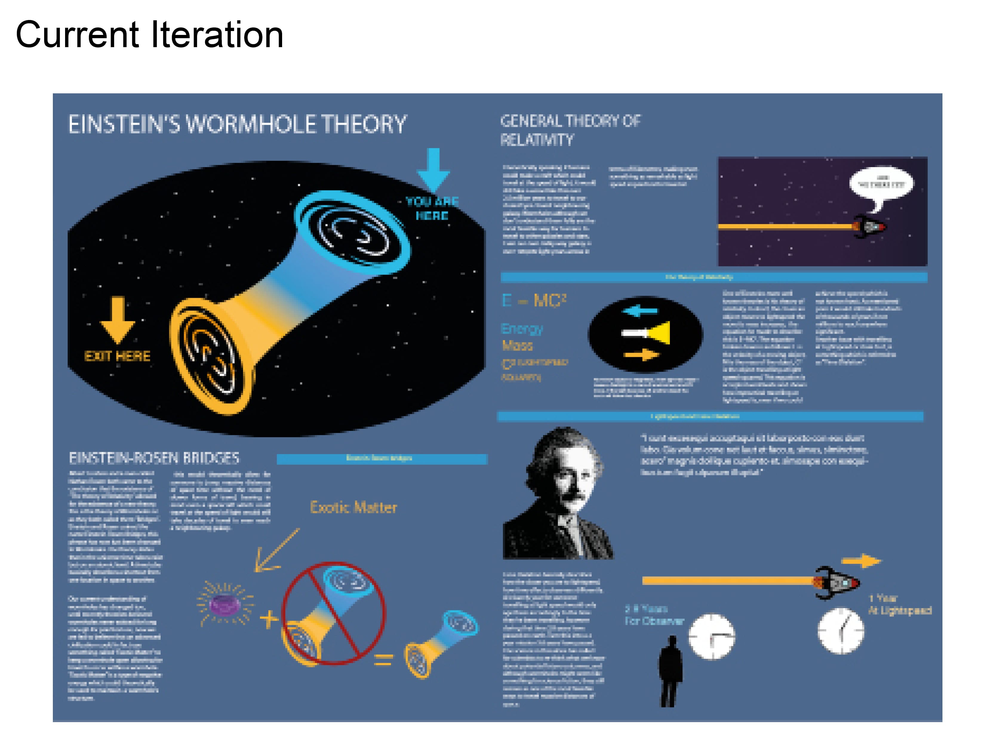
The infographic brief was something that personally took me a bit longer to adapt to. Understanding the direction I wanted to take for the infographic was a big deal  for me, I wanted it to be light-hearted, professional and informative at the same time. It was only until I had done some research and looked at other examples that I began to get an overall feel for the content I wanted to make. I started the brief with an A2 poster and eventually worked to create the other outputs when I knew the direction I wanted to take with it.

web


The focus for me next semester is to get to grips with the content quicker, and evaluate my work better throughout the process of creation.

Workshop 11 – Presentation of Finalised Ideas

During week 11 there was an assessed presentation on my final design and intended outputs for typography. The Einstein brief was also assessed.

For this I created a Pdf from an indesign file and presented my near finished design product.

Presentation valyrian ting2 Presentation valyrian ting3

Presentation valyrian ting4 Presentation valyrian ting5

Presentation valyrian ting6 Presentation valyrian ting7

Presentation valyrian ting8 Presentation valyrian ting9

Presentation valyrian ting10 Presentation valyrian ting11


In this presentation I’ve shown my research from prior and the development of my ideas towards final hand in standards, at this point the only outputs that are missing are my website and my Mobile applications.

Workshop 10 – Completion of Typeface

After getting part of my infographic to a near finished standard I wanted to finalise my typeface and work on getting it to a standard where it’s near the ability of practical usage. After creating some new letter forms a few weeks prior to this I decided I wanted the overall theme to match the new letters I made.

I also made slight alterations to previous letters which didn’t match the standards I wanted.


Final4

After creating the letters: Q rs tu, prior I wanted to focus on the sharp flicks on my letters, I also focused on creating letters as descenders and Ascenders, similar to what you’d expect from old scribe writing.

As an overall typeface I’m really happy with how it turned out, and I feel as though I gained a great understanding of the software through trial and error.

Workshop 8 – Revisiting Typography

During the 8th workshop I decided to revisit my typeface a little bit before the week 12 deadline. I had an idea of creating a full working typeface in order to create a product for my final hand in. The idea I had was to create a scroll with my letters on it addressed to a character from Game of Thrones which is what the font is from.

I created a few more letters and generally started to get a feel for an overall theme with my type. Because I only made 6 letters prior it felt incomplete and almost as if there was nothing aesthetically pleasing about it, so I created the letters Q, rs, tu.

random play

These letters in comparison to my others felt a lot better, visually speaking I like the smoother curves and more prominent and sharp flicks.

Uppercase


Upon creating my new letters I feel as though I’m going to revise the letter forms I’ve already made in order to keep it more thematic.

Workshop 5 – Presentation

During workshop 5 the group was asked to present their work and the research that had gone in to creating their letter forms. Using the skills learnt in the workshop prior I decided to use Indesign to create the presentation. My presentation mainly consisted of the same research that my blog had been keeping, so transferring and adapting it wasn’t difficult.

Presentation valyrian ting-1       Presentation valyrian ting-2

 Fantasy ting          Presentation valyrian ting-4

Valyrian Font       Uppercase

  Upper and Lower Case       Presentation valyrian ting-8

For my practical example piece of work I decided to pick a book cover, but I wasn’t too impressed with the overall result. After playing with different ideas I decided that I’m going to make a full alphabet and put it to use on a real product for my final hand in.