Corporate Branding Identity Book – Final

After a few iterations and varying designs, I decided to take a different approach in finalising my corporate branding brief. After receiving feedback on my booklets prior I decided to try and give the book more flow and something worth looking at, in doing so I looked at other examples of corporate branding for games and I came away with an end product looking and feeling much more responsive than before.
Overall I feel as though I have taken a lot away from the branding brief, I get a sense of how meticulous you can become over displaying the products you have created, it also feels a lot better explaining to others how to use your own created vision. As a whole this brief in particular has been my favourite as a designer, learning new exciting things and experimenting and challenging my own abilities.


EXP

EXP2

EXP3

EXP4

EXP5

EXP6

EXP7

EXP8

EXP9

Children’s Picture Book – Typography Research

After realising the importance of typography in branding with my first brief, I felt an evaluation and some research would be equally appropriate for a children’s picture book, which is my second brief for Semester B. After doing initial artist research I quickly discovered that the style of type used to compliment the imagery and illustrations is equally as important as the art itself .

After researching fonts, I found that a lot of childrens books use a font called Futura, which is coincidentally the same font used for the body copy of text throughout my branding brief, after applying it to my sketches I knew straight away that it’d be the font of my choice, however I still tried other fonts as comparison, these were:

Please Write Me a Song, PencilPete and CrackedCrayon.

All these fonts were found on  http://www.fontspace.com/category/children

Despite all the experimentation I felt as though these fonts didn’t quite capture the simplistic nature of my picturebook, the style I went for which was clean flat colours, was complimented best by an equally clean font, which in my opinion was Futura Book only.


FONT

final book


Typography for Entropia

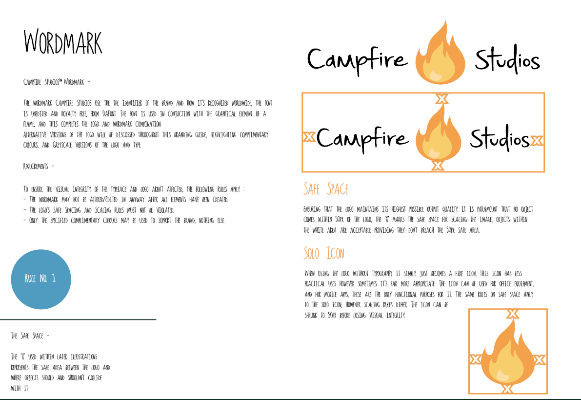
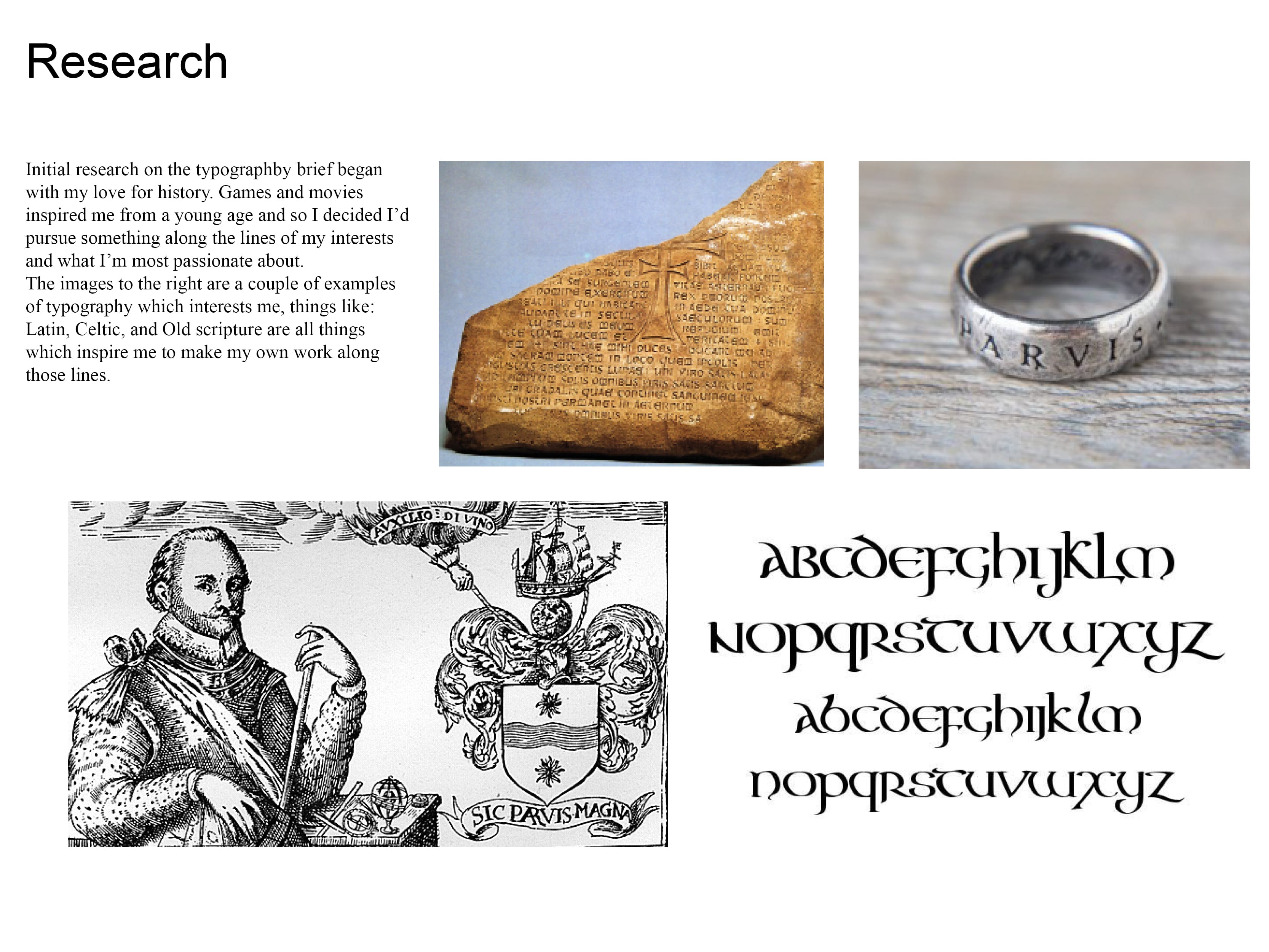
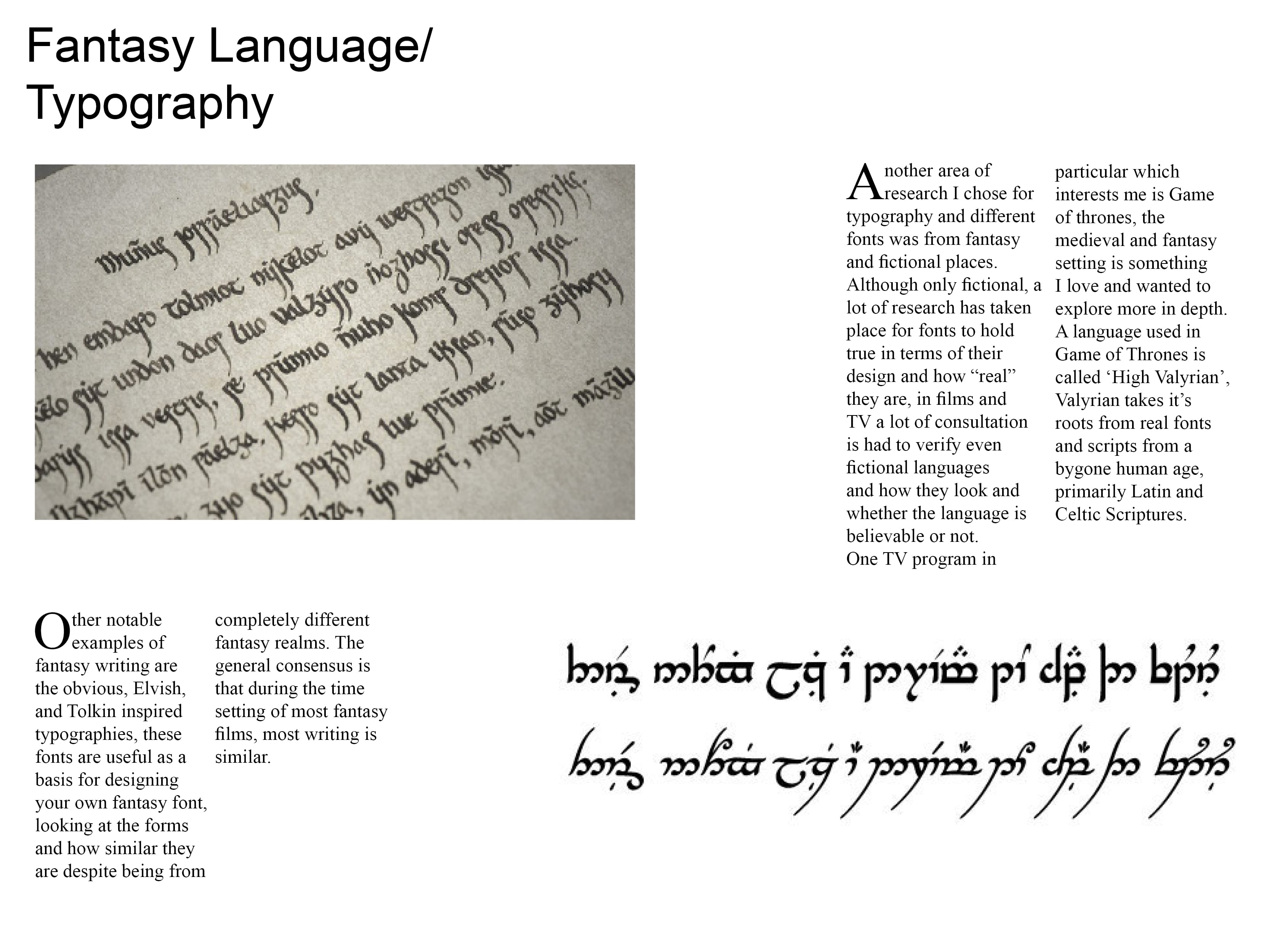
Creating the initial brand and name for my company I took it upon myself to research typography and the importance of said type, this was vital in being able to create a concise brand with high attention to detail by seeing how it’s done in industry. The same thing applies to creating a game and any other medium which requires Type to convey a message, which is why I’m further researching typography which can be applicable to Entropia my proposed IP for Campfire Studios.

I decided to look at free fonts relating to the theme’s my game will deal with. Entropia as mentioned before will be focused around a sole survivor of an unspecified pandemic whereby the world is in a post-apocalyptic state, the games theme’s will highlight the beauty of nature reclaiming what was once dominated by people along with various other elements. The focus however will mainly be nature reclaiming the world, using this knowledge I decided to look for natural/nature fonts.

I used the website http://www.fontspace.com and just searched the key term, Nature Fonts. I found 4 good examples which all have strengths of their own, I aim to evaluate them and decide on at least 2 to try and apply them to work on my game poster.

Untitled-1

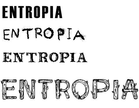
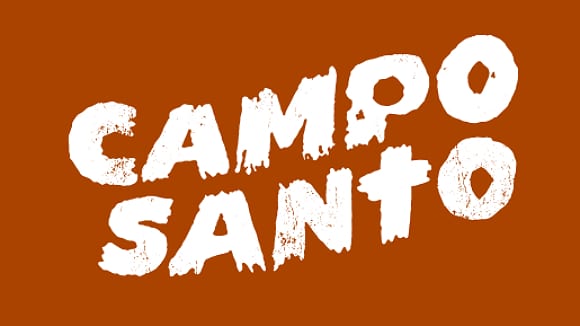
The 4 fonts I picked all have different qualities to them which I like, the first font Instinto is very reminiscent to me of the font used in the game The Last of Us. It’s clear, concise and bold, it feels like a stamp marking the authority of the game without the need to look fancy or try too hard, it’s also easily legible on any background which is a huge benefit without the need to take too much extra consideration on the overall look of the poster.

The 2nd font in the list is Ashes-Ashes, it has a rough look to it which is somewhat burnt out, it could be thematically appropriate for the game and some of the themes within it which is why I chose it. The negatives to a font like this are that it’d have to fit with the poster of the game, the visual themes within the poster will have to reflect why I chose this font meaning extra consideration will have to be given towards my concept art and sketches for the game.

The 3rd font is called Rustic, overall I prefer the look and feel of this font to the others. The font is made to look similar to foliage and flowers but it’s still concise and gets the message across. The font will also look good with the idea I had for the poster where a person is emerging from a crumbling city where plants and tress are growing in the city. This font is the most likely contender to be used as my final choice, but without a comparison I’m still undecided.

The final font is called Logs, it uses a similar theme to Rustic however it looks far too cartoony and out of place for its application, I chose it at first for some variation in typography, but in comparison to the others it looks the most out of place.

The next step to take with the typography is to apply it to some concept art and see whether it flows as an overall piece or whether it looks jarring. If any of  the fonts works then I wont have the need to do further research, however if not I’ll look at further examples which may be more applicable.

Bibliography:-

http://www.fontspace.com/lj-design-studios/instinto

http://www.fontspace.com/icedragon/ashes-ashes

http://www.fontspace.com/intellecta-design/rustic

http://www.fontspace.com/character/sketch-logs

Importance of Typography in branding

The most noticeable feature of these logos is that neither heavily rely on the imagery rather they put focus on the typographic design itself. This is possibly due to the fact that lesser know indie companies need to make their name known hence the image isn’t centralised as much as the actual typography used to represent the brand.  Another important aspect to acknowledge is the usage of basic block colours and why this is an essential part in company branding. The general idea behind keeping a logo simplistic has a multitude of reasons, these tend to be: Clarity of message, Applicability across different forms of media, Expense and how Explicable it is. Understanding these key components allows for a brand to be created and represented in a quick, memorable manner.

Taking this research into account I will make further amendments to my logo’s and experiment with different ideas focusing around typography and how centric it is as a part of indie branding.


CSMojang-Logo

Naughty_Dog

Untitled-1


Workshop 11 – Presentation of Finalised Ideas

During week 11 there was an assessed presentation on my final design and intended outputs for typography. The Einstein brief was also assessed.

For this I created a Pdf from an indesign file and presented my near finished design product.

Presentation valyrian ting2 Presentation valyrian ting3

Presentation valyrian ting4 Presentation valyrian ting5

Presentation valyrian ting6 Presentation valyrian ting7

Presentation valyrian ting8 Presentation valyrian ting9

Presentation valyrian ting10 Presentation valyrian ting11


In this presentation I’ve shown my research from prior and the development of my ideas towards final hand in standards, at this point the only outputs that are missing are my website and my Mobile applications.