Workshop 10 – Research and New Branding Book Iteration

During the workshop this week I decided to make a new iteration of my branding booklet, the content I had prior didn’t feel very professional, nor did it feel very experimental, it was to the book and very bland hence wanting to change it up. I decided to look at other branding booklet examples online and try and get a feel for how creating a branding outline for a video games company differs from standard commercial work. I went to http://www.behance.net and looked at versions submitted by games companies as opposed to generic design companies. There were a lot of good examples of branding booklets, ranging from indie game companies to big corporations like Sony and Microsoft, overall the insight into how different companies operate was very useful and informative for my own design.

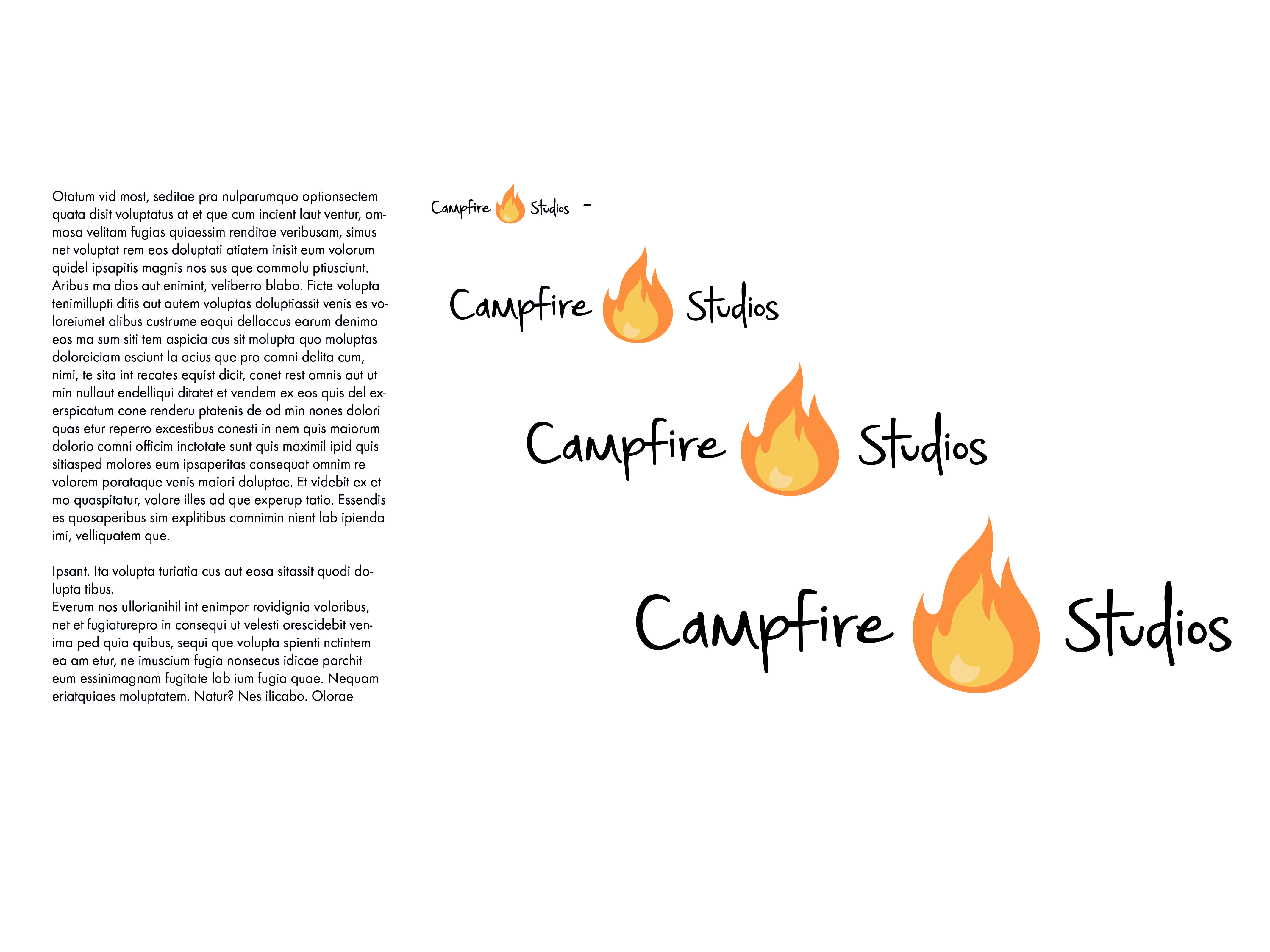
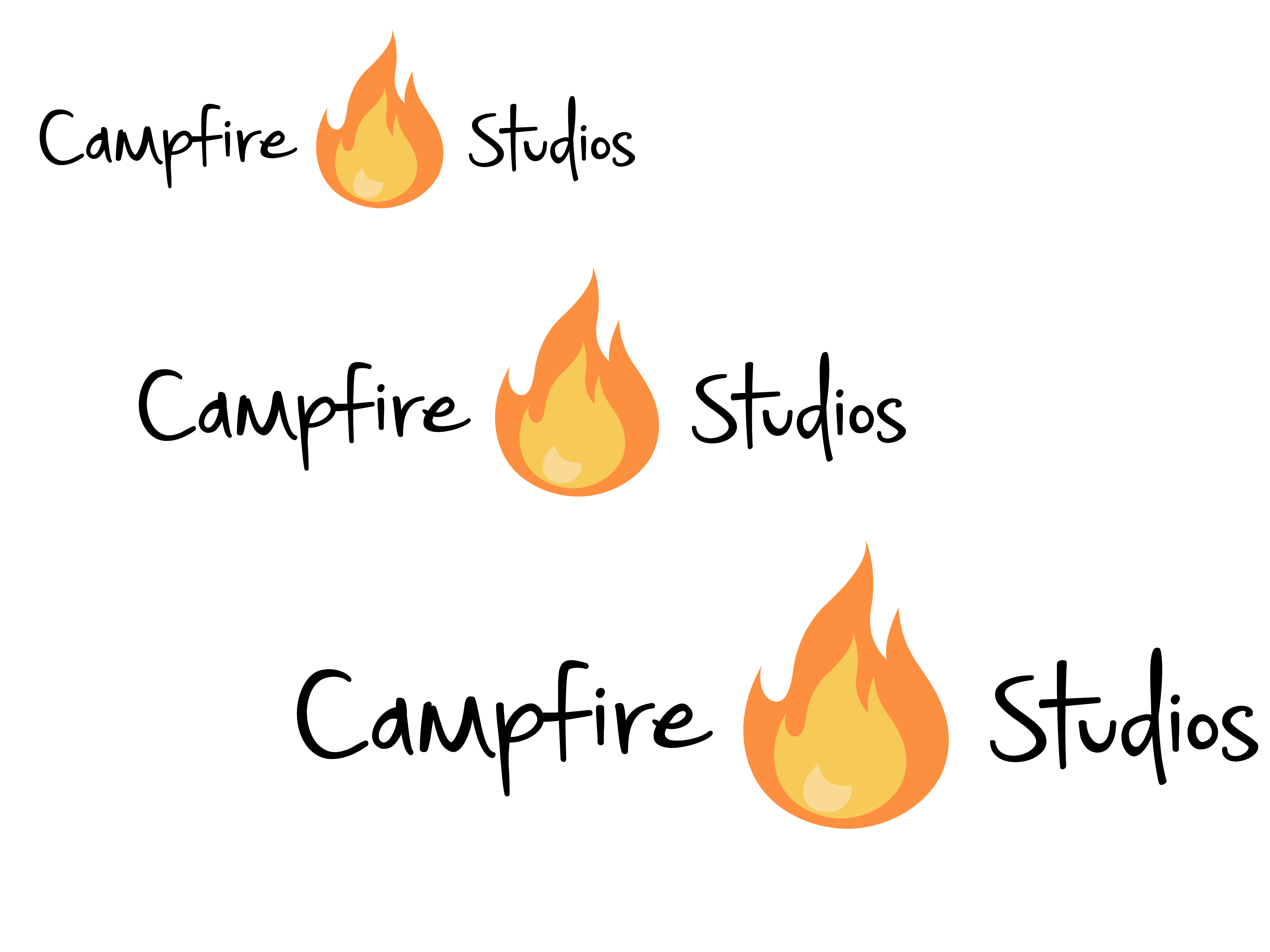
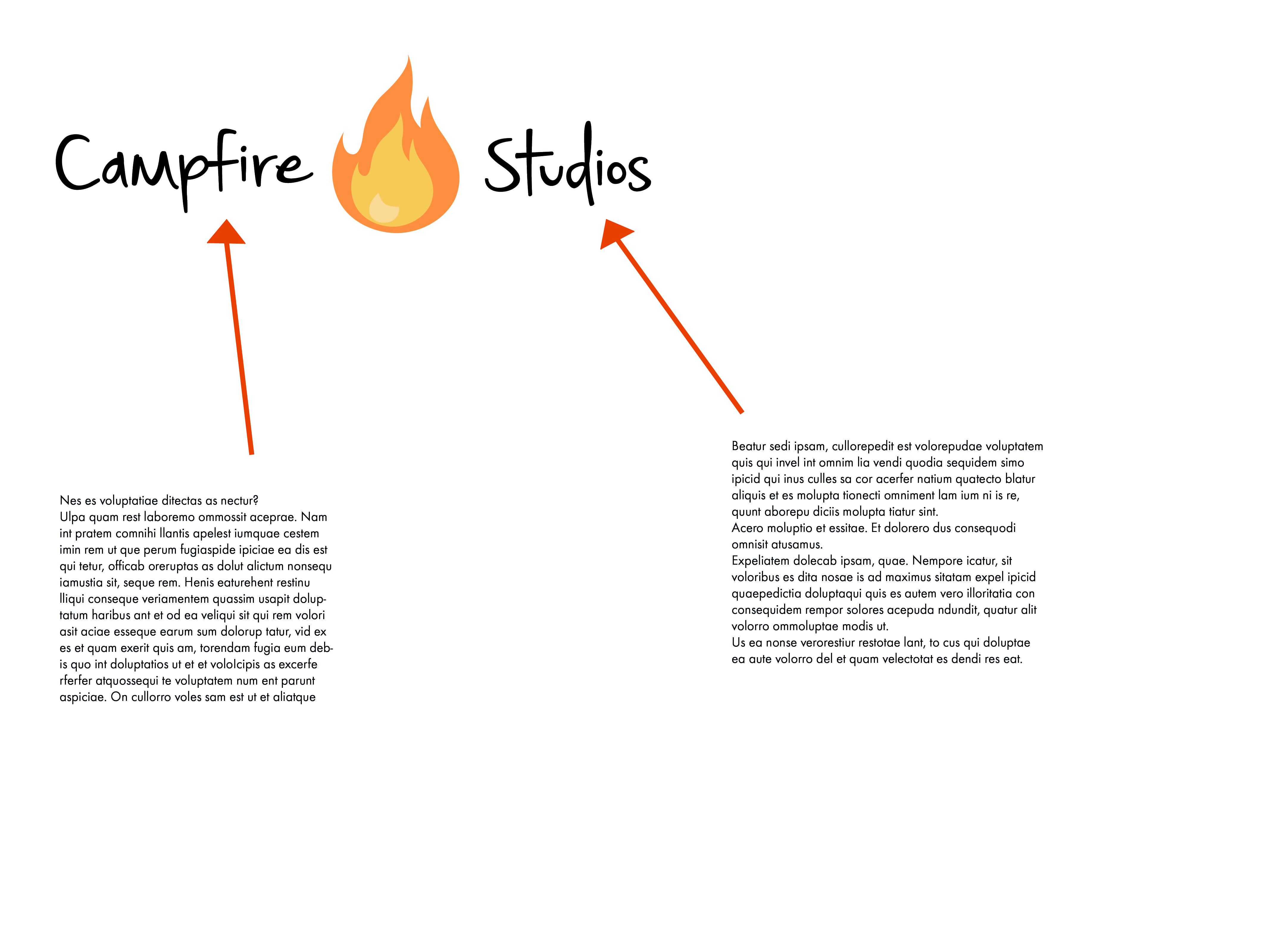
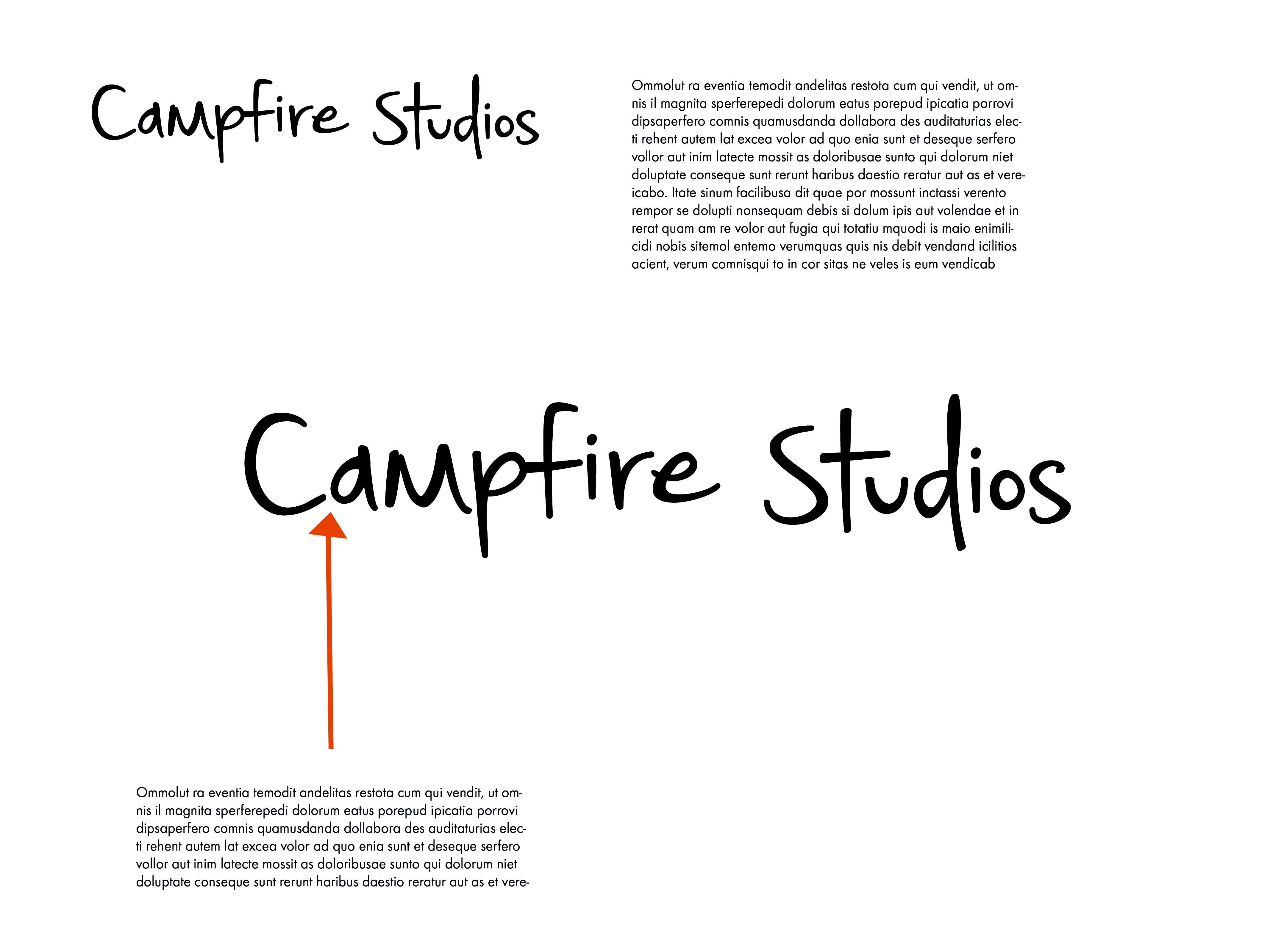
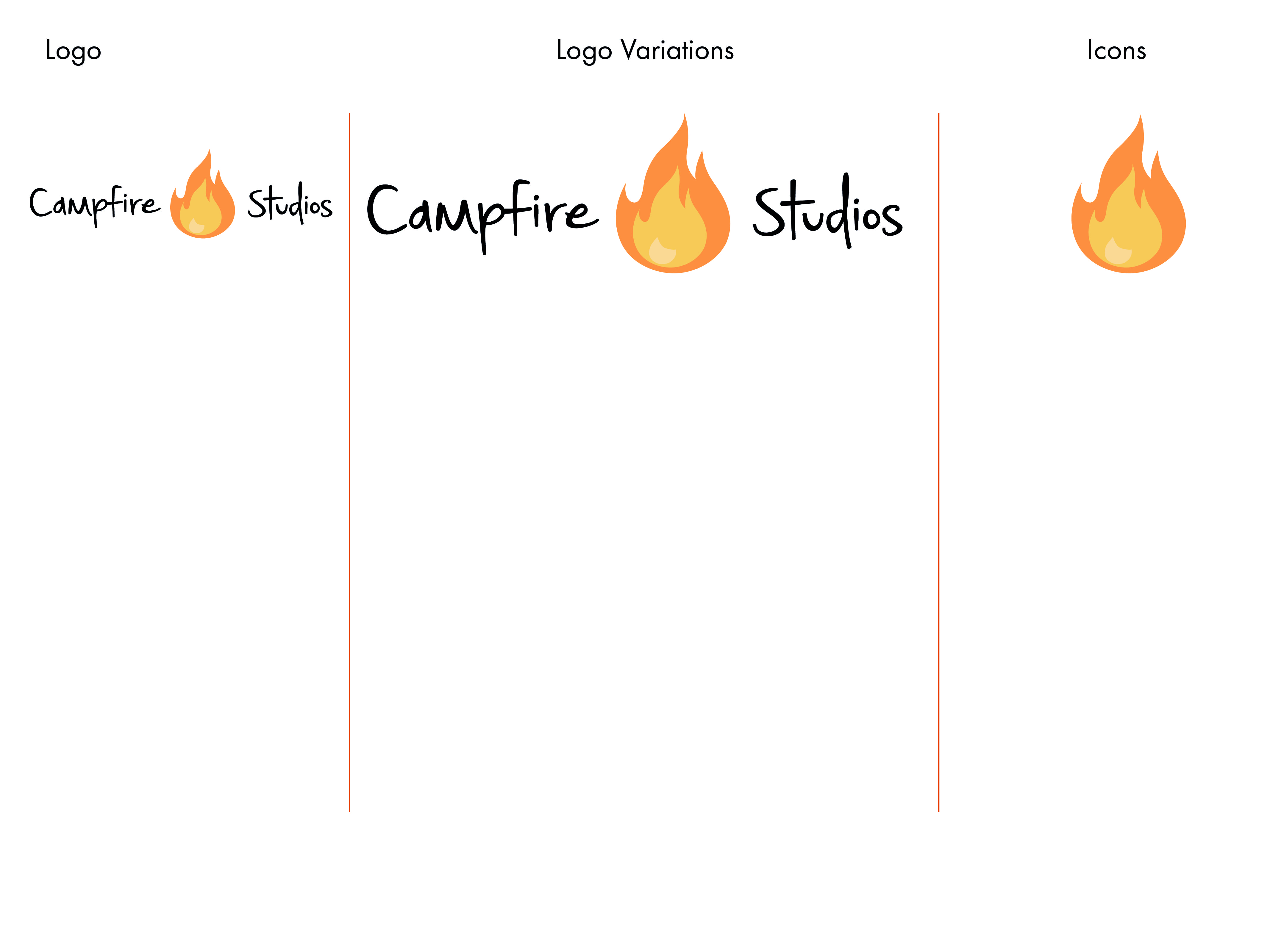
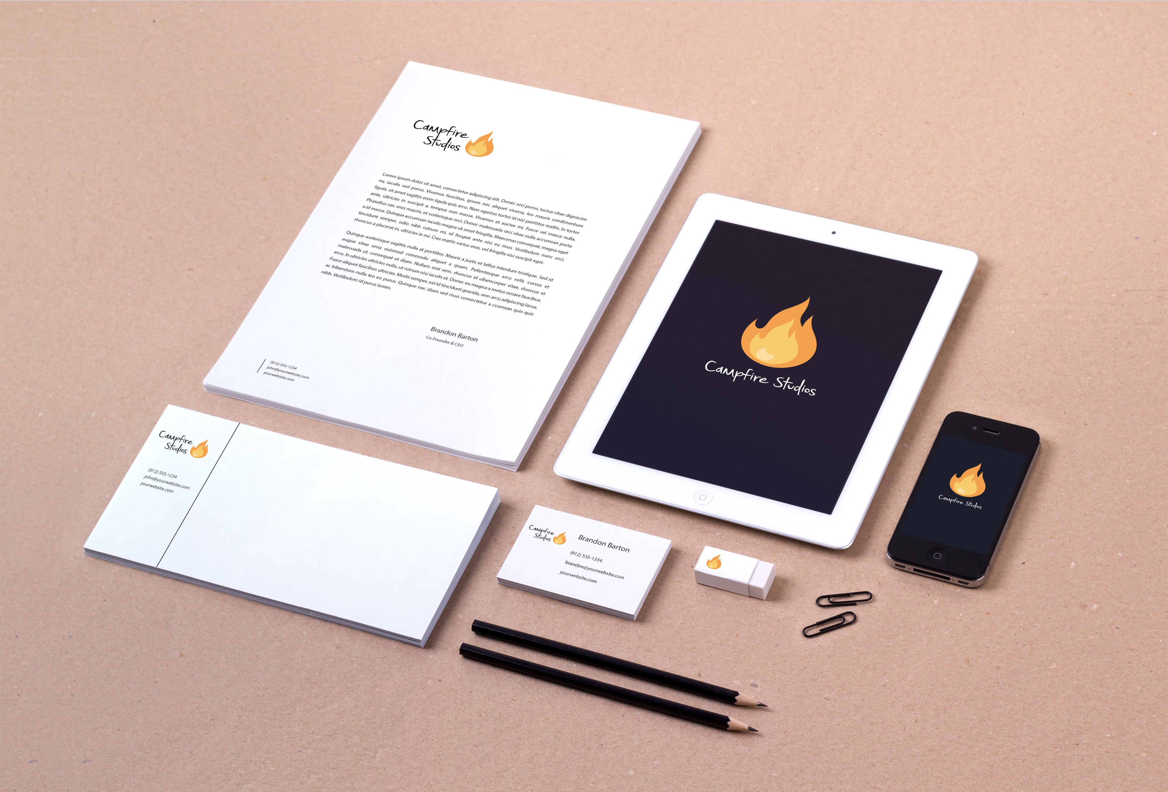
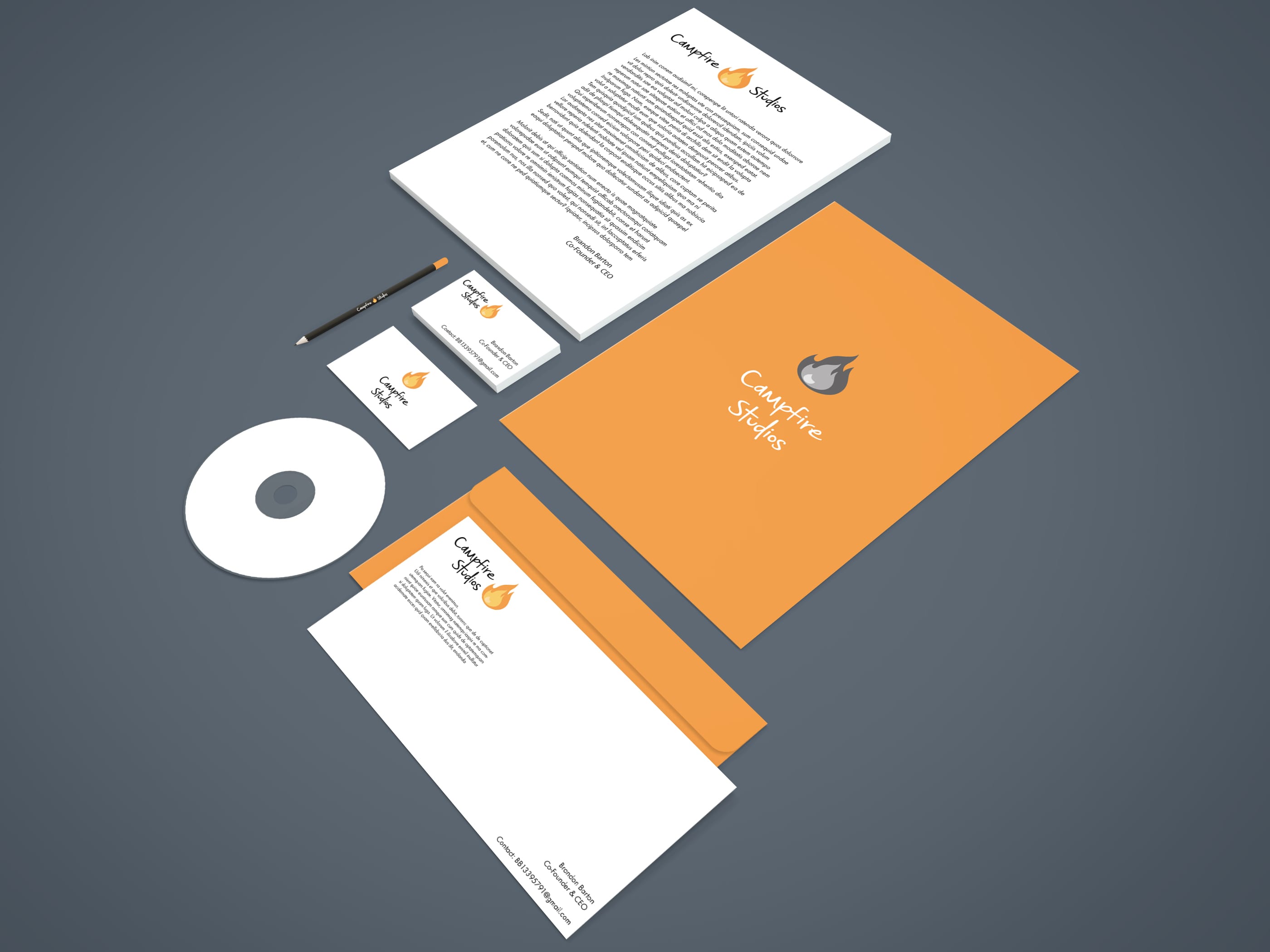
Whilst the branding booklet still isn’t finished and needs a lot of work doing in order to make it look and feel more interactive, it feels a lot better compared to the other version I made simply because of the choice of layout and typography I used, also the colours of this book feel much more professional and subdued whereas before it was too vibrant and flashy.


corporate brand 2corporate brand 22corporate brand 23corporate brand 27
corporate brand 28corporate brand 24 corporate brand 26 corporate brand 25corporate brand 210


Bibliography:

https://www.behance.net/gallery/14637893/Child-of-Light-Logotype-Guideline

https://www.behance.net/gallery/12061387/Brand-Identity-Process-Book

https://www.behance.net/gallery/23465727/2013-2015-ePortfolio

Workshop 8 – Corporate Branding Booklet

During the workshop this week I made further progress with my branding brief, in particular the Corporate branding identity booklet. The branding book consists of 16 pages detailing how the brand I have created should be used, this includes: Colour Detailing, Typography and Sizing Instructions.

This booklet is the finalised output format for the overall module and in effect wraps up all the loose ends with the other output formats I have created.


Corporate Branding Identity Details
Corporate Branding Identity Details2
Corporate Branding Identity Details3
Corporate Branding Identity Details4
Corporate Branding Identity Details5
Corporate Branding Identity Details6
Corporate Branding Identity Details7
Corporate Branding Identity Details8
Corporate Branding Identity Details9
Corporate Branding Identity Details10
Corporate Branding Identity Details11
Corporate Branding Identity Details12
Corporate Branding Identity Details13
Corporate Branding Identity Details14


The current document only contains placeholder text and a very sparse amount of imagery, this is currently just to work out a theme and an overall document which has flow and movement, whilst staying informative by detailing the specifics of the brand.

Whilst the branding booklet is still in the early stages of development I feel as though this as my final output format ties the brief up as a whole. After this is complete my aim is to make some concept art and finalised sketches for my game.

Overall I feel as though there is some strong development, and sticking to a coherent theme makes the overall product have more visual strengths and strengthens the brand as a whole.

Corporate Branding Packages

After finalising my logo I wanted to see how well it functioned as part of an entire package you would expect a company to use. I downloaded a free PSD mock up whereby you could apply your own vector graphics to a pre-made design to see how strong it’s visual appearance is, along with the practicality of the design itself .

Overall I feel as though the logo I chose is extremely versatile in how it can be displayed, when choosing my design initially I had no context of how it’d look on paper so to speak, so creating these mock up branding packages is a good exercise to check the visual appearance of the brand and logo I was creating.

Another interesting thing I found out along the way is that just because I settled on a finalised logo it didn’t make other variants redundant, if anything it made them more applicable across different output formats.

Branding Identity MockUp Vol8

The second branding package implemented a greyscale version of one of my logo’s and also implemented more of the orange which is present in the logo itself, overall I like the aesthetic of this package a little more through the implementation of colours and not just plain white paper, also experimenting with different logo versions is a great skill to practice when detailing how the brand/logo can be applied to different outputs.

I left the disk in this image blank simply because the digital art I’ll be creating for my IP hasn’t been finalised yet, when it has I will apply it to the disk to highlight the main goals of my company.


Branding-Stationery Mockup Vol