Workshop 8 – Corporate Branding Booklet

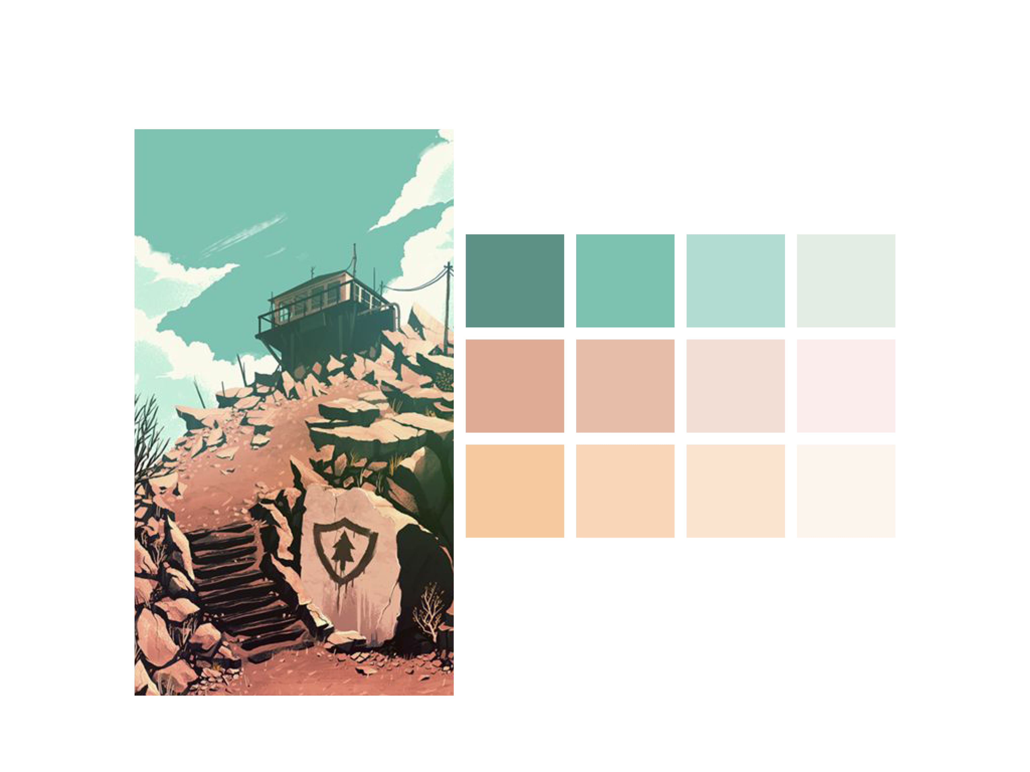
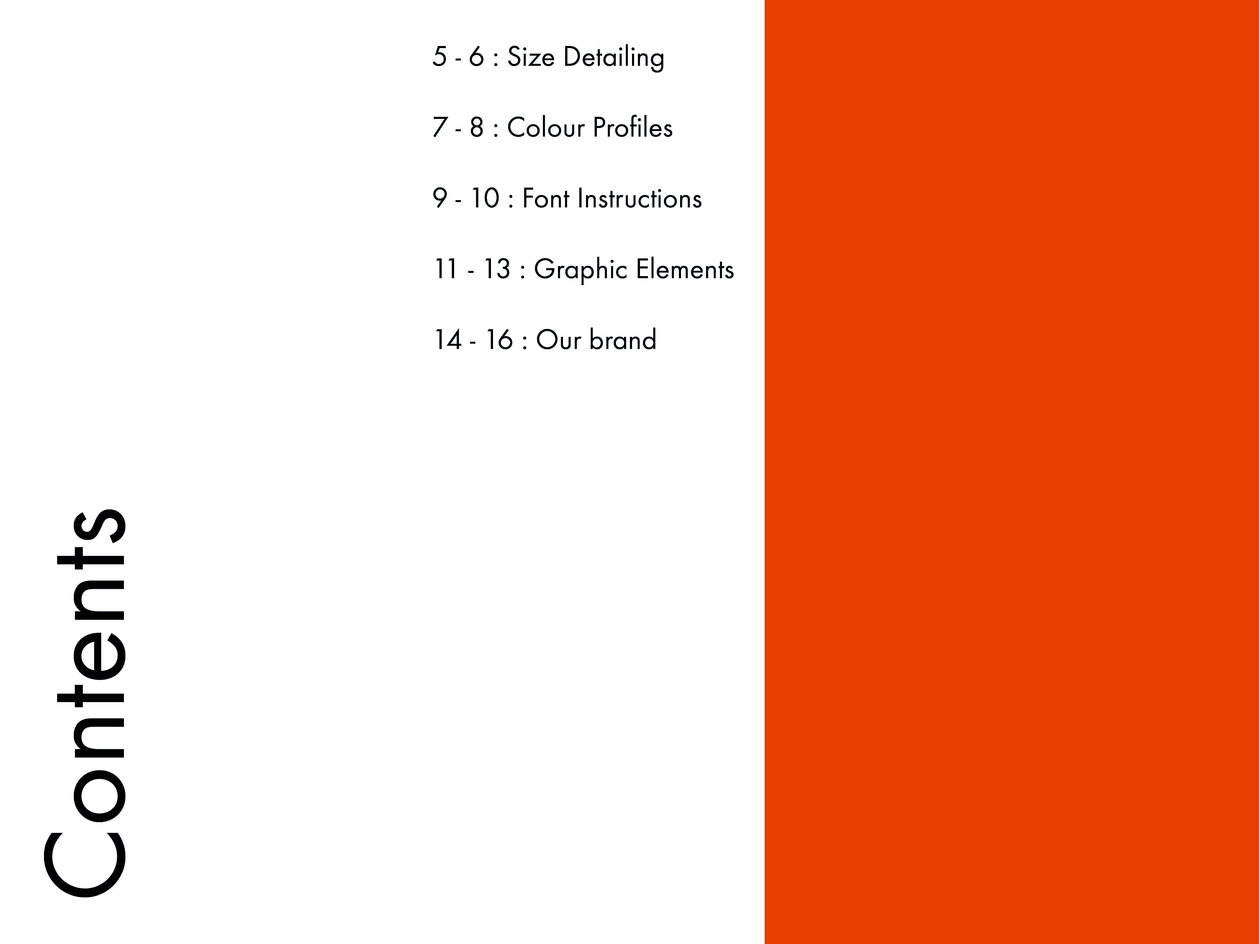
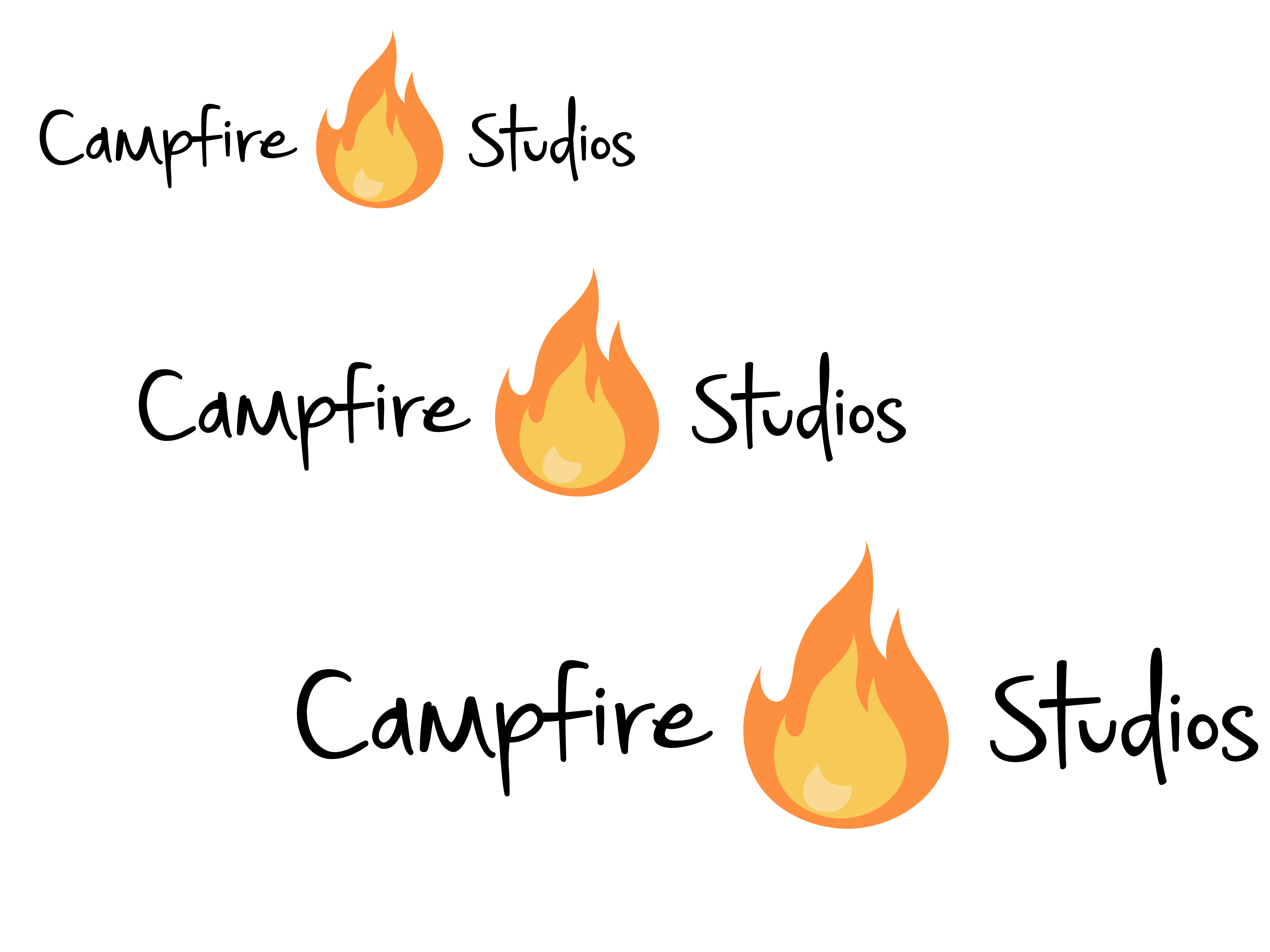
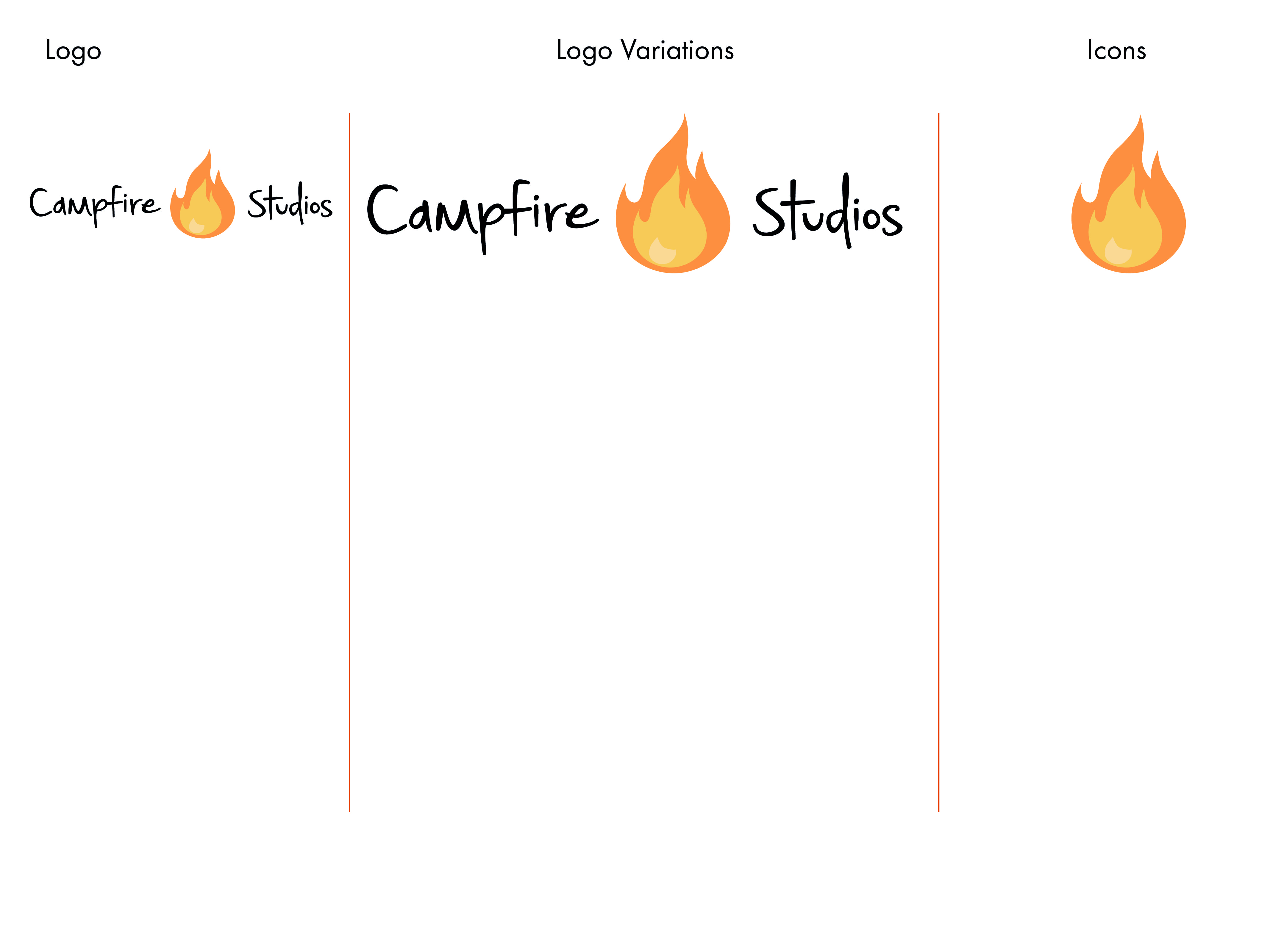
During the workshop this week I made further progress with my branding brief, in particular the Corporate branding identity booklet. The branding book consists of 16 pages detailing how the brand I have created should be used, this includes: Colour Detailing, Typography and Sizing Instructions.

This booklet is the finalised output format for the overall module and in effect wraps up all the loose ends with the other output formats I have created.


Corporate Branding Identity Details
Corporate Branding Identity Details2
Corporate Branding Identity Details3
Corporate Branding Identity Details4
Corporate Branding Identity Details5
Corporate Branding Identity Details6
Corporate Branding Identity Details7
Corporate Branding Identity Details8
Corporate Branding Identity Details9
Corporate Branding Identity Details10
Corporate Branding Identity Details11
Corporate Branding Identity Details12
Corporate Branding Identity Details13
Corporate Branding Identity Details14


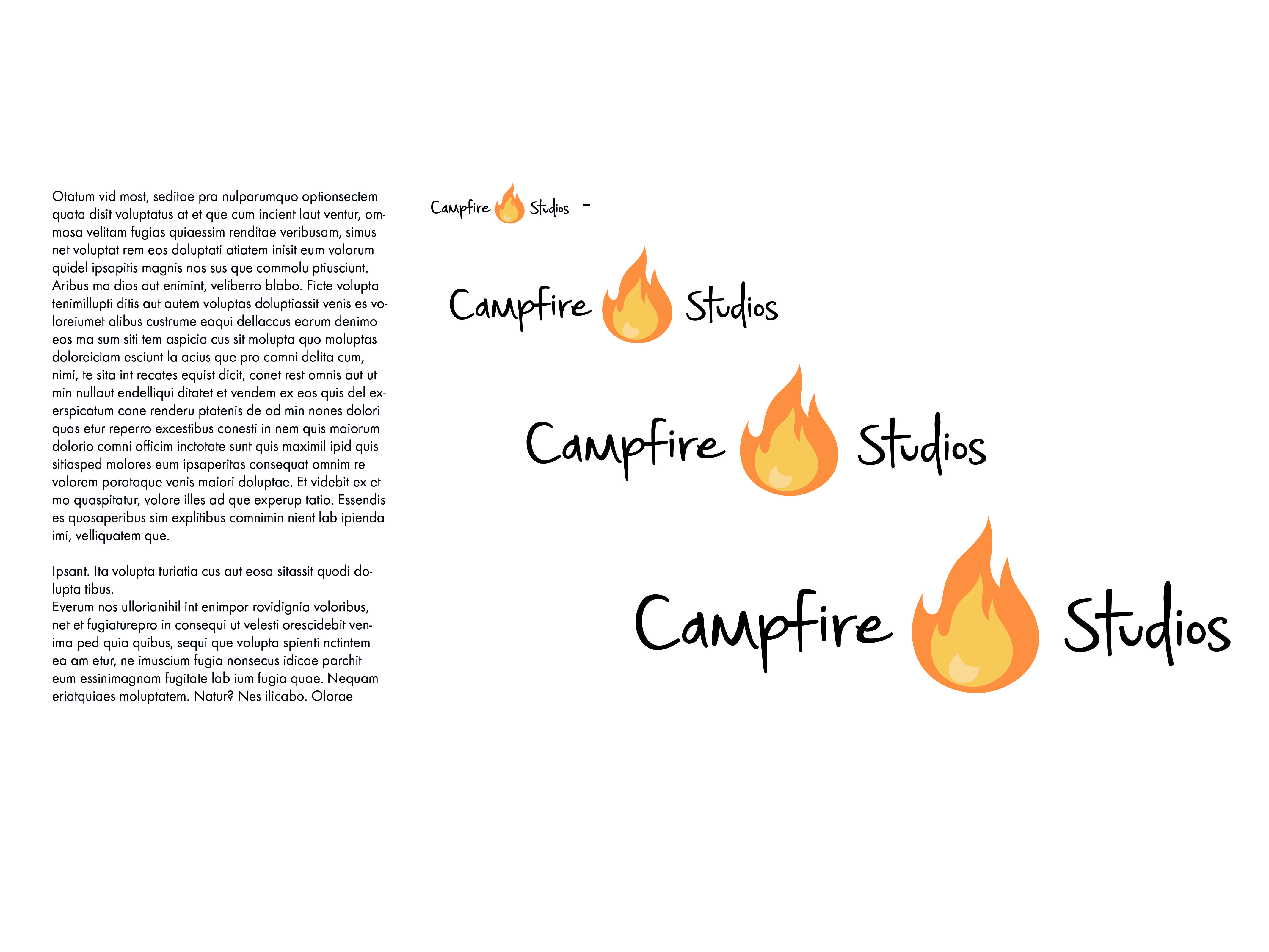
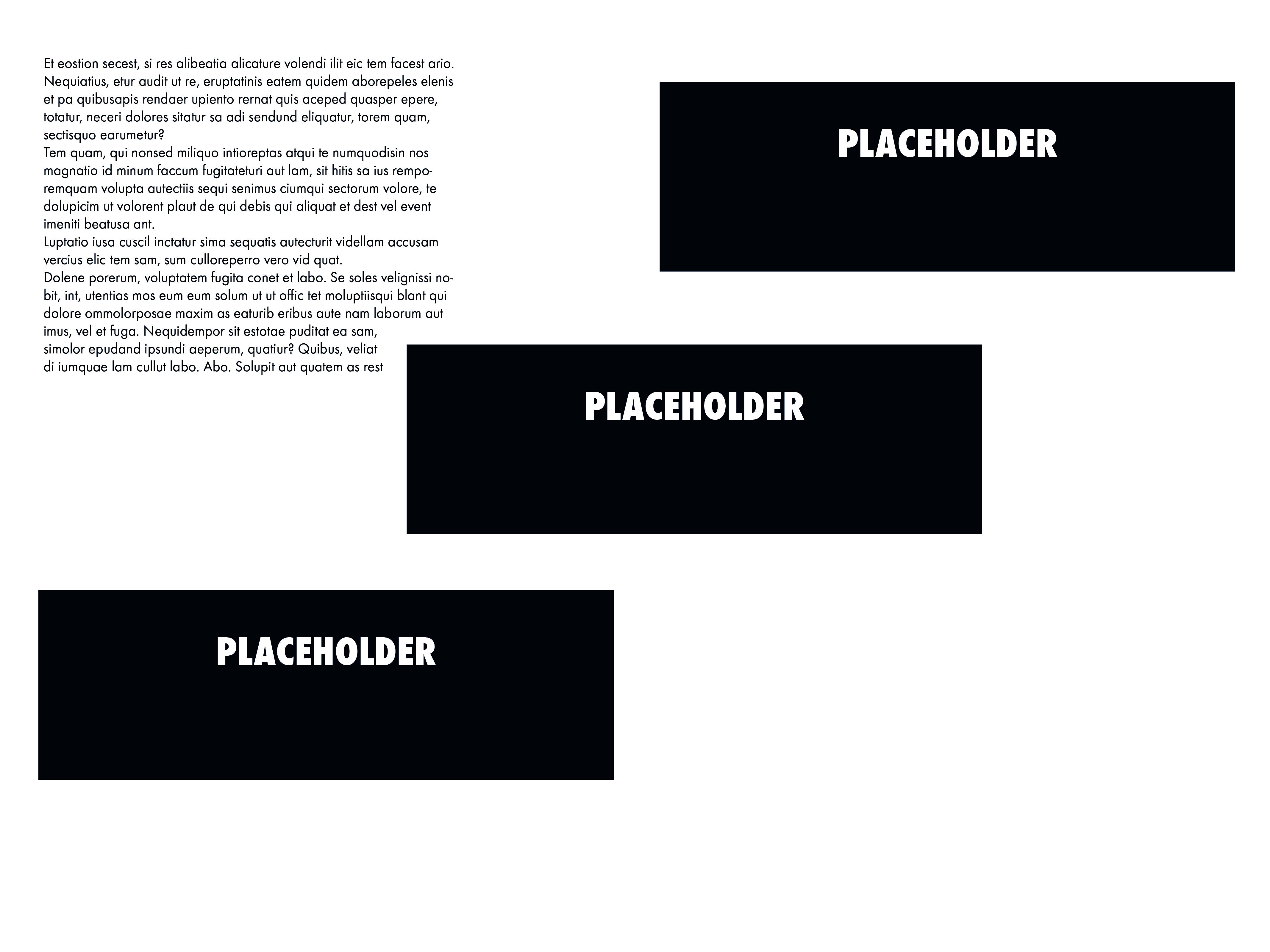
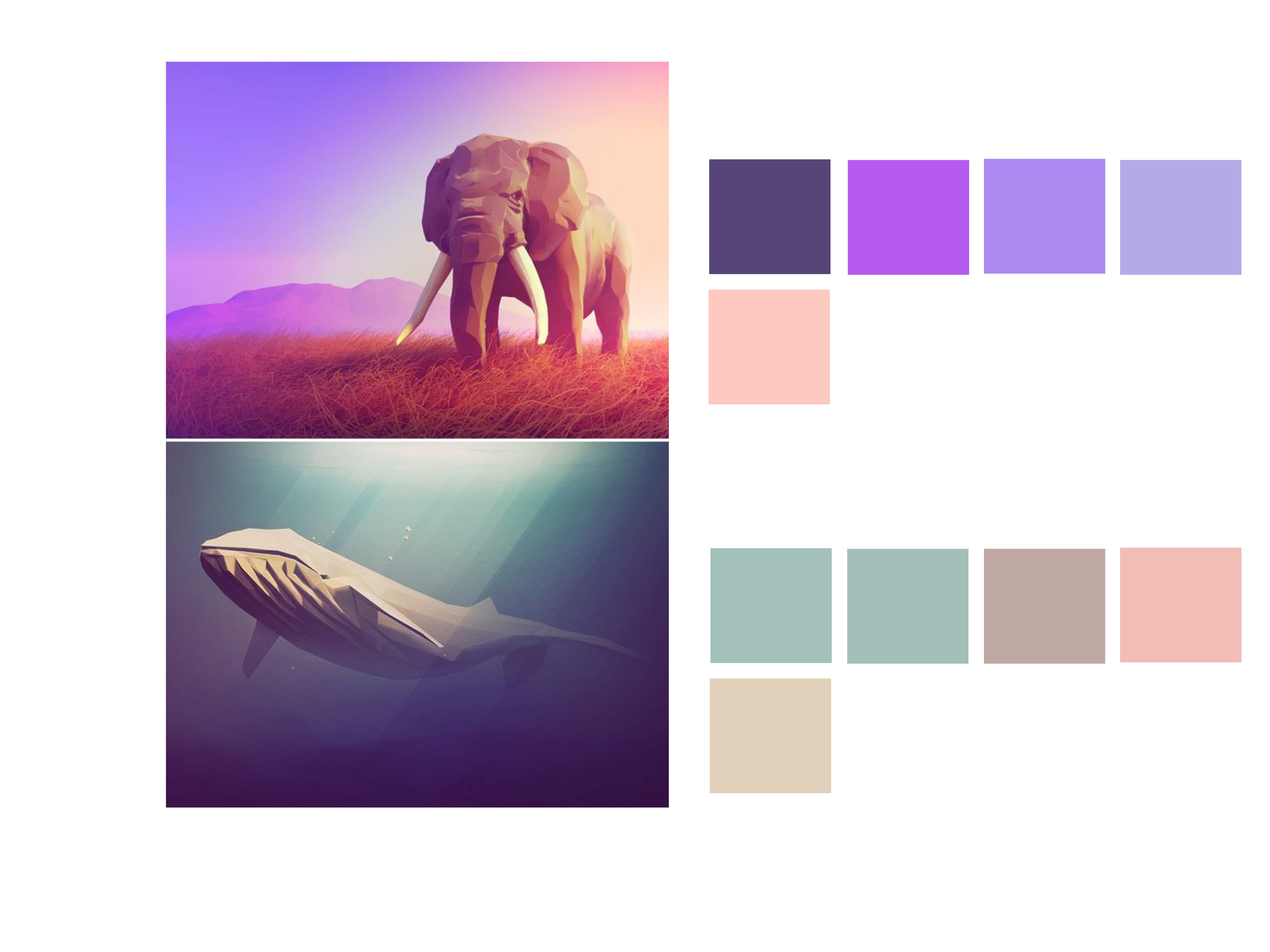
The current document only contains placeholder text and a very sparse amount of imagery, this is currently just to work out a theme and an overall document which has flow and movement, whilst staying informative by detailing the specifics of the brand.

Whilst the branding booklet is still in the early stages of development I feel as though this as my final output format ties the brief up as a whole. After this is complete my aim is to make some concept art and finalised sketches for my game.

Overall I feel as though there is some strong development, and sticking to a coherent theme makes the overall product have more visual strengths and strengthens the brand as a whole.

Colour Research for Picture Book

After researching the artist who I wanted to influence my own work I decided that the next logical step from here was to research a colour palette and how to apply it to my character illustrations. The style for the picture book that I’m aiming to achieve is flat basic colours for the characters, and simple block colours for a background. Because the theme of my book is Loneliness, I researched colours which were associated with this.

“The meanings of blue are often associated with serenity, calm and spirituality. But colour symbolism can be strangely contradictory and Blue is no different. Blue also brings to mind sadness and loneliness for many.” Colour-Wheel-Artist [2008]
(http://color-wheel-artist.com/meanings-of-blue.html)

The obvious colour I associated from Loneliness was Blue/Grey, and to justify this I found some research online, however these are only 2 colours out of a potential big range for the book. Using the colours below I searched for complimentary colours using the software built in to Adobe Illustrator, in doing so I found other colours like shades of Green and Yellow to complete my palette for the Picture Book.

blue2color-01


Logo development – Finalized Design

In my previous logo development blog post I explored a multitude of designs, with different colour palettes, typography and fire vectors. During that blog post I favoured one design above the rest and so I decided to further adapt it and use it to create some more designs which felt thematically appropriate.

After trying new fonts and playing with some ideas I had before I feel as though designs 3 & 4 are appropriate for my logo and branding of my company. The font used feels easy to look at, similar to the fire in the regards of the soft colour and smooth edges, the colour of the fire also works well with just solid black whereas other iterations try to include the same colour as the fire and it feels visually weaker with, and without the black.

I struggled to pin down my opinion to just one design, so I decided to ask friends and other designers which they preferred, the general consensus was actually between 1 & 5, both of which received around 10 or more people picking between the two. After trying those logo’s on documentation, making them larger and smaller, both of them failed the test of where they were appropriate, design 5 in this instance worked better on documents where it was larger, but when shrunk the black lines in the font made it look bold and too loud.
Design 1 also looked good at the size it was in this document, however when it was made larger or smaller it had the issue of taking up too much space, or becoming illegible.

Whilst design 4 didn’t have as many people comment on it, I feel as though after trying to apply other logo variations to documentation it’s  the most coherent design, which is applicable to most of the places I’ve tried to use it.

Overall I feel as though design 4 is the one I will choose as a finalized piece, the new typeface is visually stronger and the flame between both words works better than in previous renditions, also the new colour scheme feels a lot better to look at, the previous palette felt too harsh with the reds and yellows and the new subdued version is easier to look at.


final final

Workshop 2 – Colour Palettes

During the second workshop of Semester B I followed a tutorial on Colour Palettes and the importance of complimentary colours within design. For this exercise I started by visiting Pinterest and found images which I liked, from there the exercise continued in Adobe Illustrator and Indesign.

I found the exercise to be more informative than I first thought, and I found myself breaking down every image I liked to it’s Complimentary Colours and Shades. Overall I feel as though the exercise is a good skill to practice, not only does it look visually appealing and professional but it also changes mundane work to something you don’t mind examining further.


Colour palette Colour palette2 Colour palette3 Colour palette4 Colour palette5 Colour palette6 Colour palette7 Colour palette8


A link to higher resolution versions of these images is below.

Colour palette