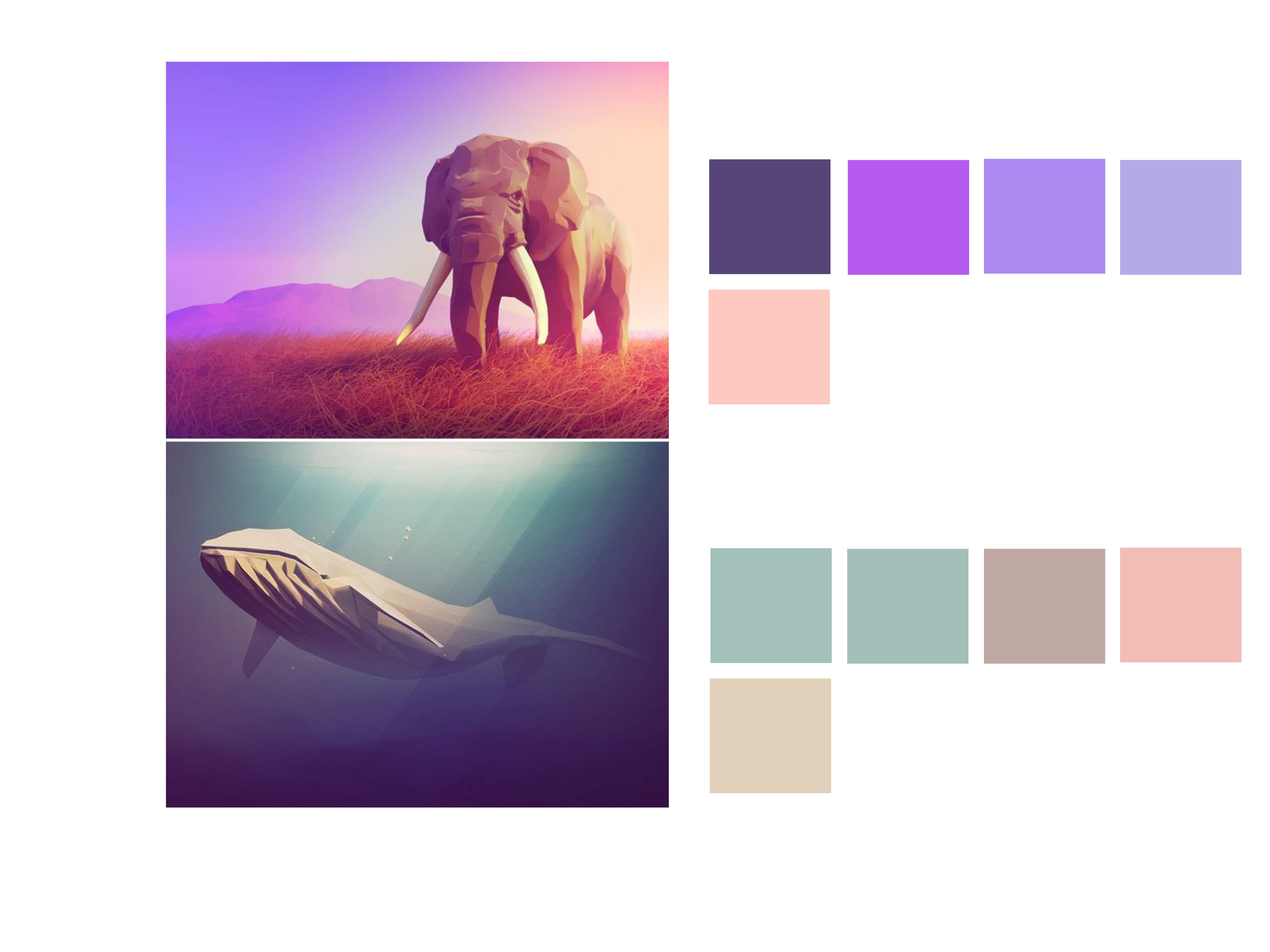
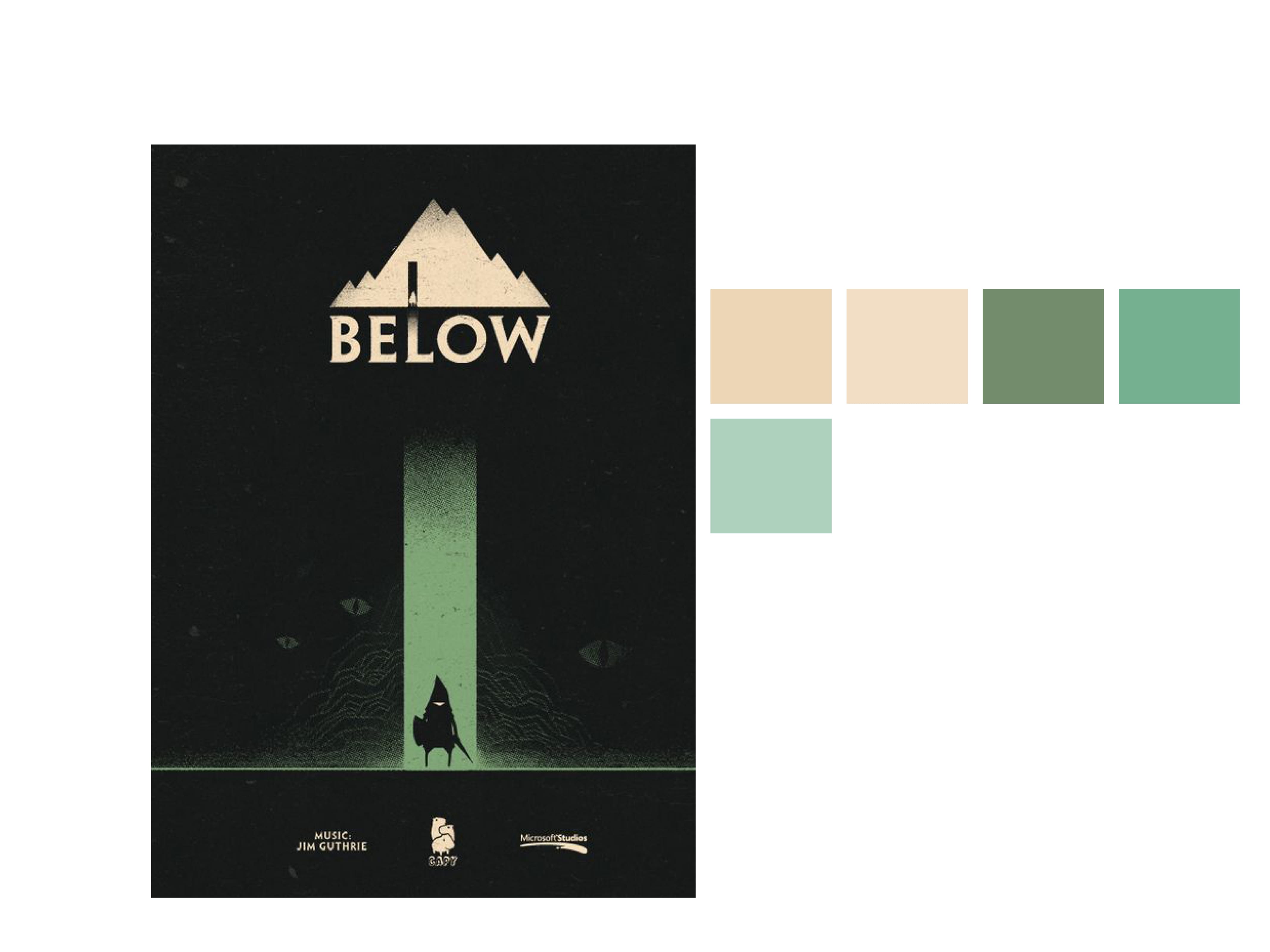
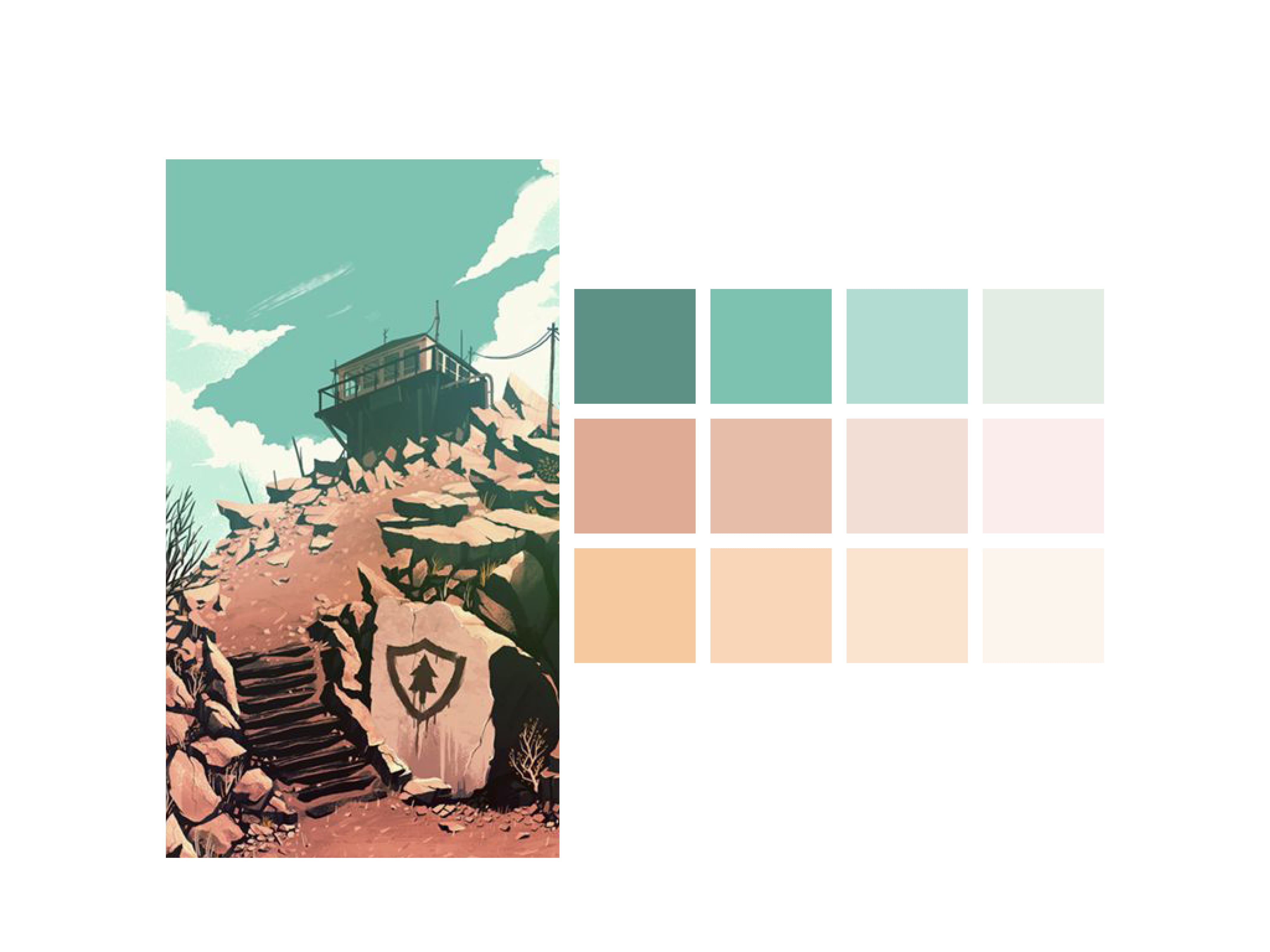
During the second workshop of Semester B I followed a tutorial on Colour Palettes and the importance of complimentary colours within design. For this exercise I started by visiting Pinterest and found images which I liked, from there the exercise continued in Adobe Illustrator and Indesign.
I found the exercise to be more informative than I first thought, and I found myself breaking down every image I liked to it’s Complimentary Colours and Shades. Overall I feel as though the exercise is a good skill to practice, not only does it look visually appealing and professional but it also changes mundane work to something you don’t mind examining further.


A link to higher resolution versions of these images is below.
Leave a comment