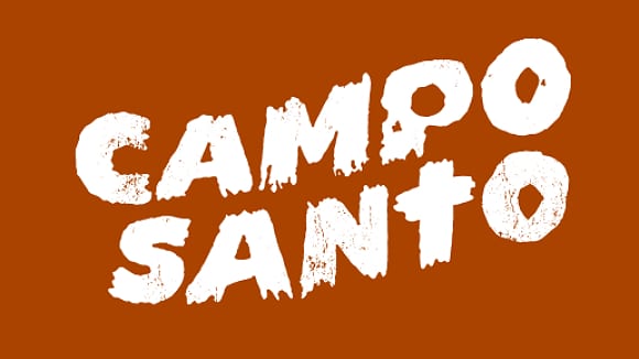
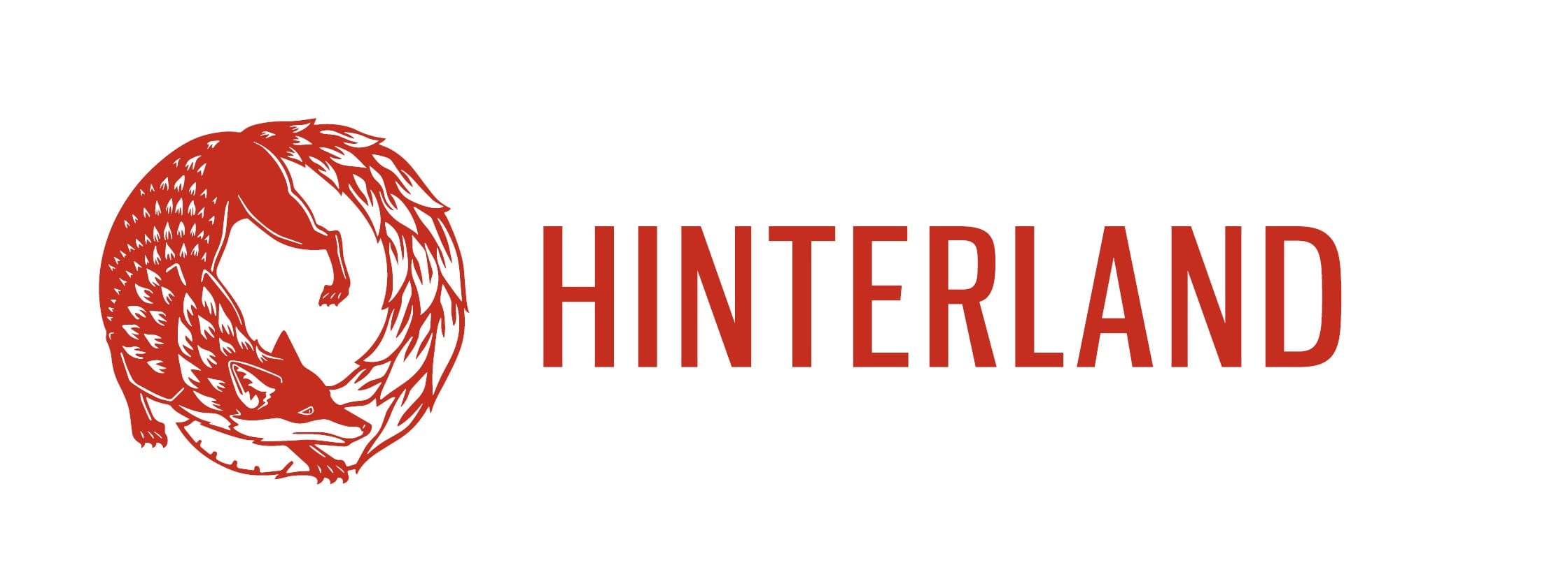
The most noticeable feature of these logos is that neither heavily rely on the imagery rather they put focus on the typographic design itself. This is possibly due to the fact that lesser know indie companies need to make their name known hence the image isn’t centralised as much as the actual typography used to represent the brand. Another important aspect to acknowledge is the usage of basic block colours and why this is an essential part in company branding. The general idea behind keeping a logo simplistic has a multitude of reasons, these tend to be: Clarity of message, Applicability across different forms of media, Expense and how Explicable it is. Understanding these key components allows for a brand to be created and represented in a quick, memorable manner.
Taking this research into account I will make further amendments to my logo’s and experiment with different ideas focusing around typography and how centric it is as a part of indie branding.

Leave a comment