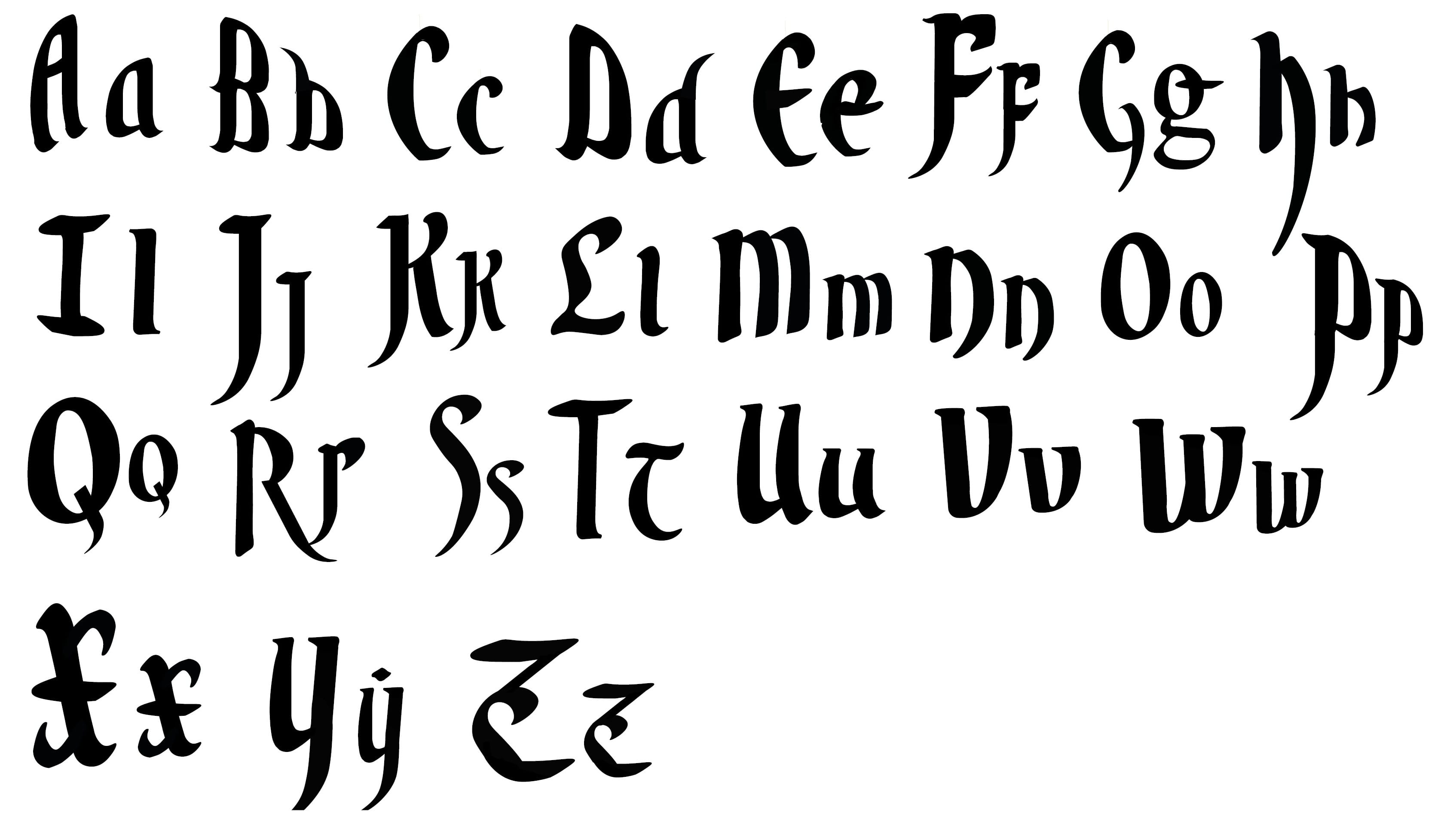
After getting part of my infographic to a near finished standard I wanted to finalise my typeface and work on getting it to a standard where it’s near the ability of practical usage. After creating some new letter forms a few weeks prior to this I decided I wanted the overall theme to match the new letters I made.
I also made slight alterations to previous letters which didn’t match the standards I wanted.
After creating the letters: Q rs tu, prior I wanted to focus on the sharp flicks on my letters, I also focused on creating letters as descenders and Ascenders, similar to what you’d expect from old scribe writing.
As an overall typeface I’m really happy with how it turned out, and I feel as though I gained a great understanding of the software through trial and error.
Leave a comment