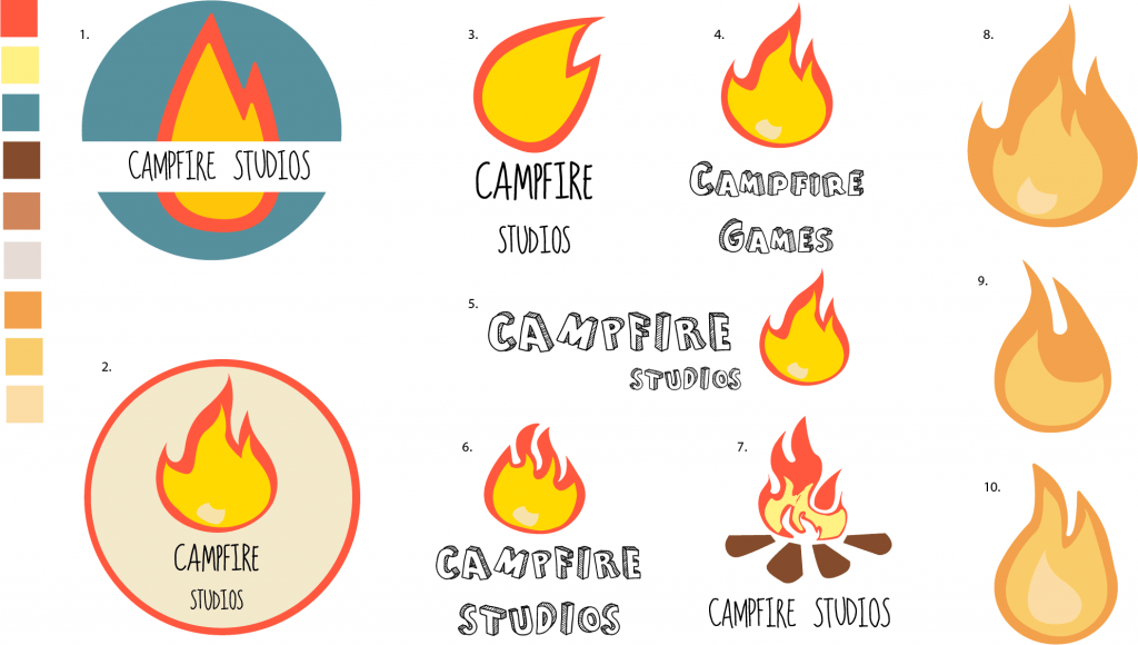
After the presentation during the week 5 workshop, the general consensus behind my current iterations and development was that more variations were needed. Before the presentation I felt as though I had reached my final stages of logo development, but after a more critical approach in evaluating my own work I felt as though I hadn’t fully scratched the surface on what it takes to create a finalized logo.
The different variations were all informed by prior iterations of the logo and were all thematically similar with slight changes in either the typeface, colour palette and composition as well as the shape of the flame.
The initial colour palette I started with felt quite harsh to look at with some variants of the logo, so I wanted to find a more subdued colour which still looked good with the flame, after experimenting with Adobe Illustrators Built in colour guide I found a new set of three complimentary colours which I applied to designs: 8, 9 and 10.
Overall I feel as though I underestimated how complex designing a good logo could be, and so I feel like more designs are needed before reaching a final conclusion. The current rendition I prefer the most is design 8, from here I’ll further explore what I can do with it and see where it takes the end conclusive design

Leave a comment