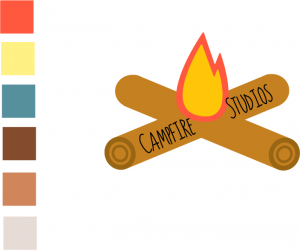
The first logo below was more of a direct translation towards my company name, compared to prior iterations it plays more with the idea of a literal campfire. Overall I feel as though this logo is weaker compared to previous versions, the design for the logs takes too much away from the central focus of the fire, it’s also quite distracting from the typeface too, which I feel works very well with the basic block colours of the fire.
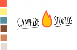
After evaluating what I disliked with the previous logo I decided I wanted to keep the fire and the typeface relatively similar, the type by itself felt very weak and looked out of place, however with even the small inclusion of the underlining the piece overall looks visually stronger.
As it currently stands this logo is my final piece I aim to use for the branding of the company. I feel as though it stays true to an imagined colour palette and general aesthetic I chose from the start also it feels visually appropriate to the IP I propose to create.
Leave a comment