Character Research – What makes a protagonist?

An import element in my game will be the protagonist, players of the game will have to feel some kind of emotion towards the protagonist, whether it’s positive or negative. A game with a blank protagonist tends to be less immersive, and users take less away from an experience like this, the aim of my game is a narrative driven adventure with free roam and open world possibilities, I feel as though defining a protagonist is an important part in shaping my vision for the game.

Two different approaches to protagonists are The Last of Us as opposed to Skyrim. One experience wants you to feel invested in a character and their own story, where-as the other wants you to craft your own story. Understanding this difference is vital in crafting an engaging believable narrative. Whilst it’s important to note that a believable protagonist is the drive for many narrative games, it’s worth mentioning that games which allow the user to shape their own experience are extremely popular also, some users prefer the open world and free reign over the character and what they choose to do. where-as other players prefer linear narratives.

Joel – The Last of Us

Joel01  Joel-Portrait-Last-Of-Us-by_gerry-arthur

the-last-of-us-beta-joel-concept

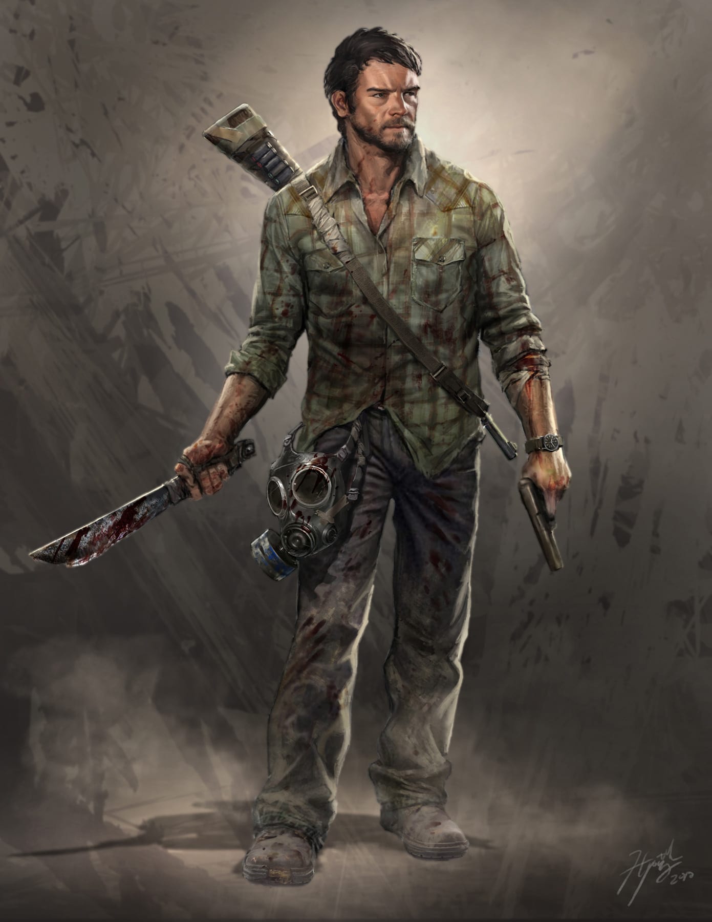
The last of us is highly regarding as one of the best narrative driven games of all times, selling over 3.4 million copies in a little over 3 weeks. The Last of Us is highly regarded for a few reasons, on the PS3 it pushed the boundaries that were possible for both a technological standpoint and a feat of storytelling unlike any other video game prior. The last of us makes use of motion capture technology to create the character models and most elements of the game. Before the game reaches this stage of development though conceptual art for the characters and setting is required. The directors Neil Druckmann and Bruce Strayley knew from the start how they wanted their protagonist to look, but like most aspects regarding design everything has more than 1 iteration, more so for characters and the development of a theme.

The character here had numerous changes before the directors settled on a final look for him, and even the finalised look for Joel is slightly different from his in game appearance, the only thing which stayed relatively true throughout was a consistent colour palette  and similar facial features.
Breaking down elements used for character creation in industry is a great way for me to learn and adapt my own skills towards creating a character for my own game, so I feel as though this research is beneficial.

Unnamed Protagonist – Skyrim 

In Skyrim the protagonist to the story is nameless and can vary with any given race or gender, and whilst the game is narrative heavy if you choose to follow the story, the aim of the game is freedom. Player choice is centric in free roam games which don’t direct you down any linear pathway and so the developers allow you to craft your own characters to make your experience immersive and how you want it. The difference between The Last of Us and Skyrim is significant, one game wants to tell you a story, where-as the other wants you to craft your own story and memories, defining the genre is a vital part in game creation, understanding what you want users to experience and feel is an important aspect to consider.

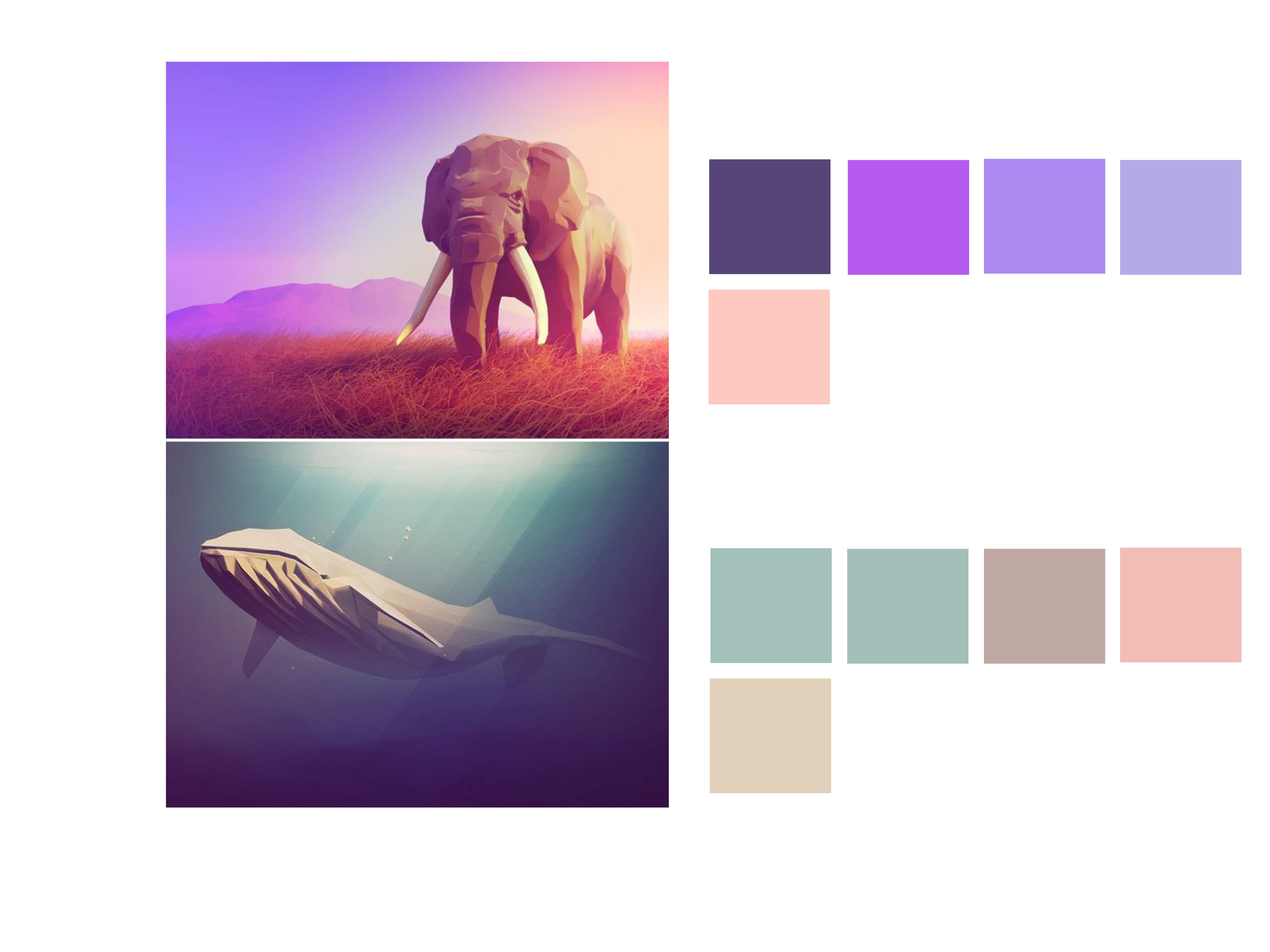
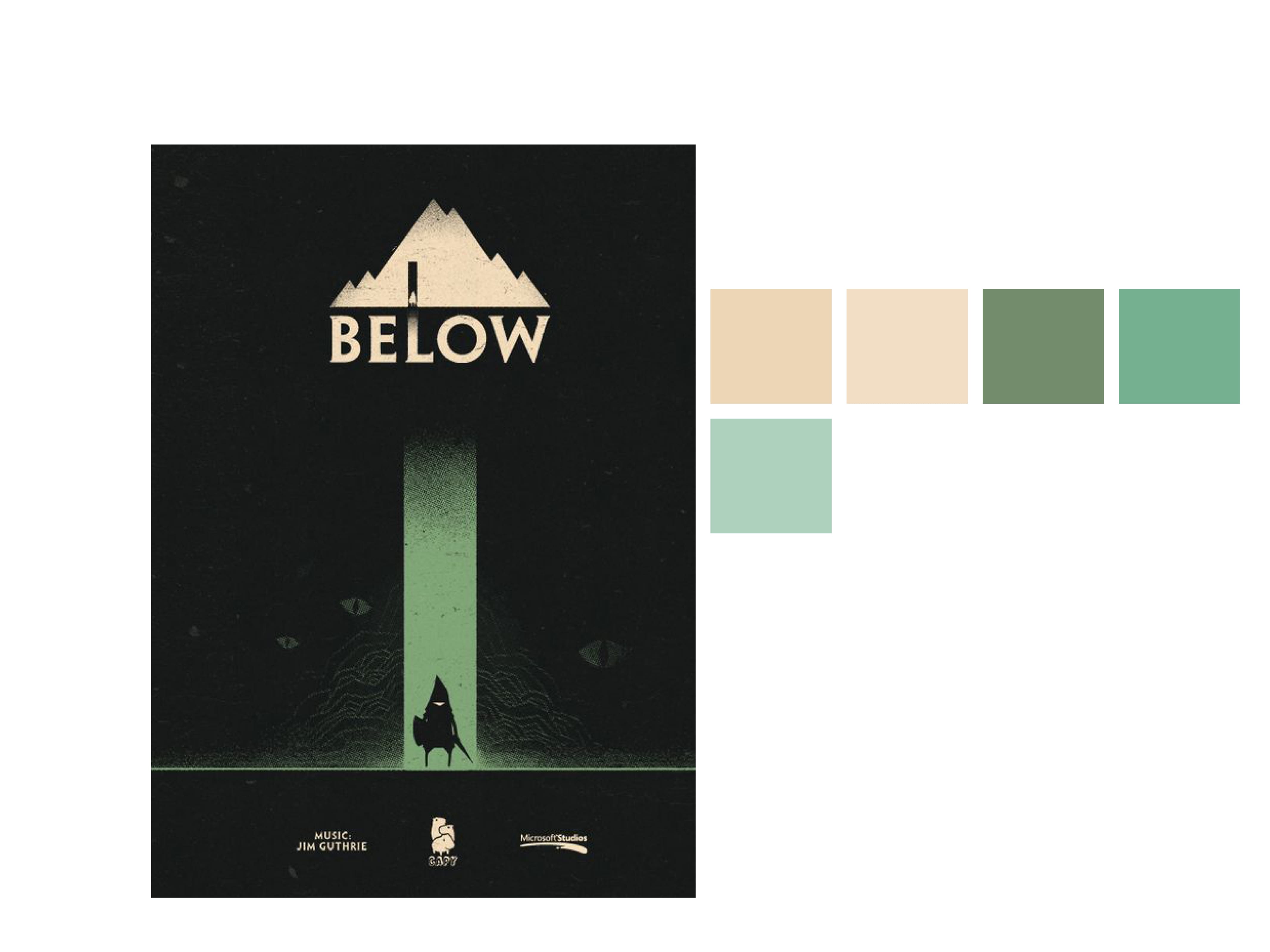
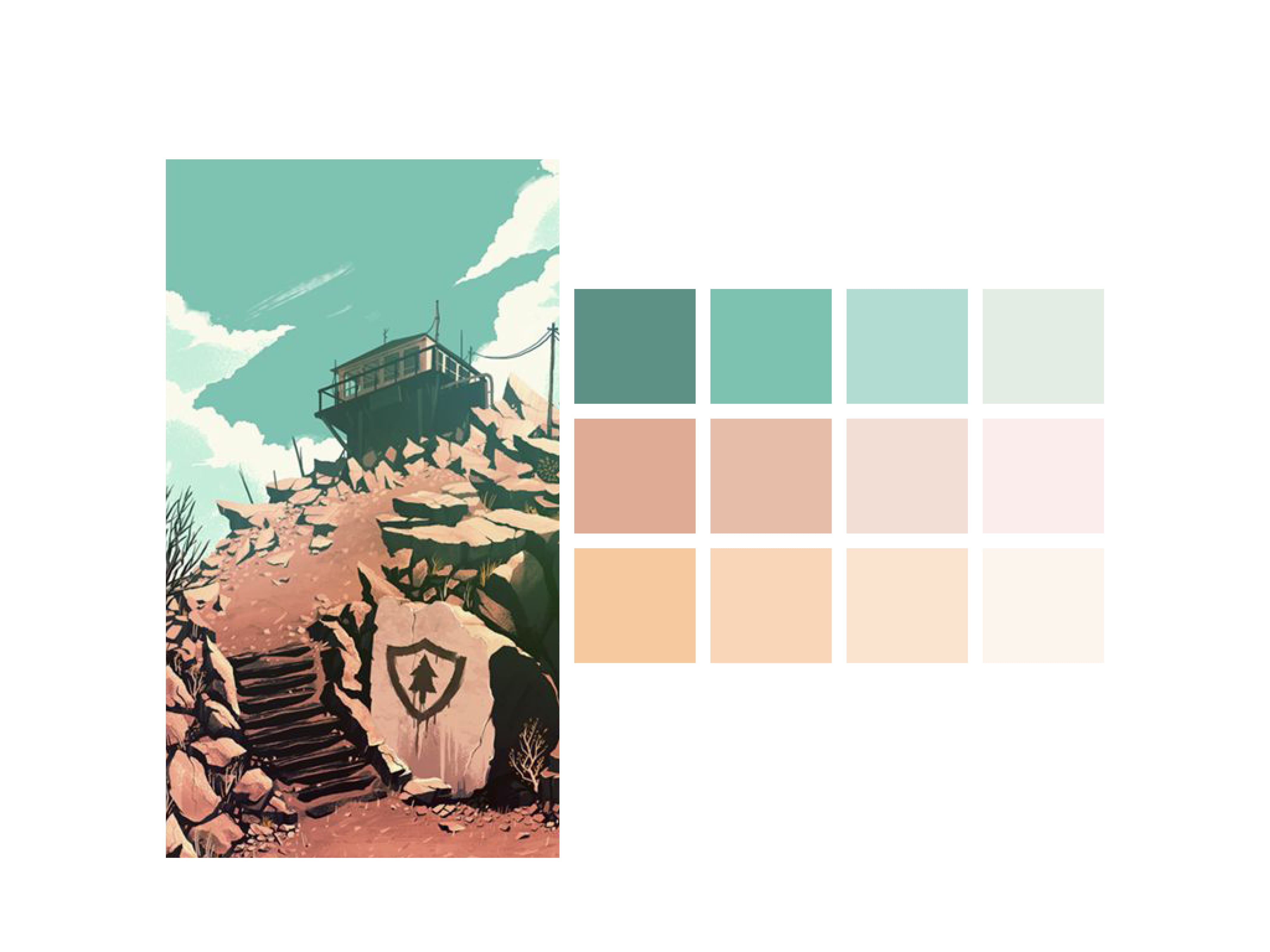
Skyrim is set in the fantasy world of Nirn, Skyrim itself takes place in a large continent knows as Tamriel. The setting for Skyrim is fantasy heavy, with a lot of nature: moutains, rivers, etc. The art direction for the game focused heavily on this and so it was used as the basis for character design.

Nord_Female_Hair
Nord_Male_Hair


maxresdefault


Understanding the theme’s that the game is exploring allows artists to work with an idea as opposed to a blank canvas. Narrowing down the specific genre is important to allow informed decisions which can evolve into final artwork, as opposed to constant iteration which have no belonging within the game world being created. Before starting any character art and development I feel as though further developing my ideas on landscapes and the overall aesthetics of the game and genre will make character development easier and more informed for my game.


Bibliography – 

https://en.wikipedia.org/wiki/The_Last_of_Us#Sales

Typography for Entropia

Creating the initial brand and name for my company I took it upon myself to research typography and the importance of said type, this was vital in being able to create a concise brand with high attention to detail by seeing how it’s done in industry. The same thing applies to creating a game and any other medium which requires Type to convey a message, which is why I’m further researching typography which can be applicable to Entropia my proposed IP for Campfire Studios.

I decided to look at free fonts relating to the theme’s my game will deal with. Entropia as mentioned before will be focused around a sole survivor of an unspecified pandemic whereby the world is in a post-apocalyptic state, the games theme’s will highlight the beauty of nature reclaiming what was once dominated by people along with various other elements. The focus however will mainly be nature reclaiming the world, using this knowledge I decided to look for natural/nature fonts.

I used the website http://www.fontspace.com and just searched the key term, Nature Fonts. I found 4 good examples which all have strengths of their own, I aim to evaluate them and decide on at least 2 to try and apply them to work on my game poster.

Untitled-1

The 4 fonts I picked all have different qualities to them which I like, the first font Instinto is very reminiscent to me of the font used in the game The Last of Us. It’s clear, concise and bold, it feels like a stamp marking the authority of the game without the need to look fancy or try too hard, it’s also easily legible on any background which is a huge benefit without the need to take too much extra consideration on the overall look of the poster.

The 2nd font in the list is Ashes-Ashes, it has a rough look to it which is somewhat burnt out, it could be thematically appropriate for the game and some of the themes within it which is why I chose it. The negatives to a font like this are that it’d have to fit with the poster of the game, the visual themes within the poster will have to reflect why I chose this font meaning extra consideration will have to be given towards my concept art and sketches for the game.

The 3rd font is called Rustic, overall I prefer the look and feel of this font to the others. The font is made to look similar to foliage and flowers but it’s still concise and gets the message across. The font will also look good with the idea I had for the poster where a person is emerging from a crumbling city where plants and tress are growing in the city. This font is the most likely contender to be used as my final choice, but without a comparison I’m still undecided.

The final font is called Logs, it uses a similar theme to Rustic however it looks far too cartoony and out of place for its application, I chose it at first for some variation in typography, but in comparison to the others it looks the most out of place.

The next step to take with the typography is to apply it to some concept art and see whether it flows as an overall piece or whether it looks jarring. If any of  the fonts works then I wont have the need to do further research, however if not I’ll look at further examples which may be more applicable.

Bibliography:-

http://www.fontspace.com/lj-design-studios/instinto

http://www.fontspace.com/icedragon/ashes-ashes

http://www.fontspace.com/intellecta-design/rustic

http://www.fontspace.com/character/sketch-logs

Workshop 2 – Colour Palettes

During the second workshop of Semester B I followed a tutorial on Colour Palettes and the importance of complimentary colours within design. For this exercise I started by visiting Pinterest and found images which I liked, from there the exercise continued in Adobe Illustrator and Indesign.

I found the exercise to be more informative than I first thought, and I found myself breaking down every image I liked to it’s Complimentary Colours and Shades. Overall I feel as though the exercise is a good skill to practice, not only does it look visually appealing and professional but it also changes mundane work to something you don’t mind examining further.


Colour palette Colour palette2 Colour palette3 Colour palette4 Colour palette5 Colour palette6 Colour palette7 Colour palette8


A link to higher resolution versions of these images is below.

Colour palette


Development Plan (Industry Research)

When setting out in writing my brief for the semester I had a rough idea of what I wanted to create, however at first I didn’t know how to break it down into individual components. Understanding every aspect of the brief, to me, feels like a vital part in creating an end product at the best possible standard.

There was an initial learning curve involved for some terminologies for my brief and the emphasis on certain components. A few things I learnt after research which I didn’t know prior, were small components which felt insignificant but they all play an integral role in the branding of any company. These include: Typography Research, Working with colour palettes, sticking to and working with a permanent name (For company and IP) and constantly re-working ideas. It might seem blatantly obvious that idea development is integral to creating a product however many times in the past I have never critically evaluated or reworked ideas, I feel as though this is a good skill to foster to be able to progress as a designer and to ensure a project has the best possible outcome if the choices of development have justification behind them.

Development Plan

The development plan below details a time scale for different elements I’ll work towards in order to create a final completed brief. Certain areas will require more time dedicated to them depending on the complexity and workload required. I feel as though a time plan will help to organise a project of this magnitude and should also be a useful skill to learn for other briefs/modules in the future.


Week 1 – Research/Project Planning Stage

  • Name for the IP
  • Name for the Company
  • Research on inspirations
  • Look at survival games & horror games
  • Progression with the Logo/Overall Branding
  • Research websites and output formats from similar companies


Week 2 & 3 – Concept art and further ideas development

  • In-depth game research (What is expected of a protagonist, how will the game work? what is inspiring about other games of a similar nature?)
  • Rough sketches (Concept art, Environments, Character art, Item art, HUD’s, etc.)
  • Work towards finalising and completing the Logo
  • Experiment with branding packages (How does the logo look? What can be improved?)
  • Highlight a particular element of the game, stick with it and use it as a point of reference for further work on concept art.


Week 4- Concept and Promotional Art 

  • Finalised Logo (Reach a point where I feel only minor changes are needed)
  • Typeface evaluation, new choices from old, variations and how well it works
  • Further Character concept art, overall game aesthetics, further environment exploration
  • Screenshots of sketches, evaluate likes and dislikes
  • Further develop environments, showcase significant features from the game


Week 5 & 6 – Advertising 

  • Experiment with poster design (Change concept art into more polished versions, play with the sketches and try to create promotional advertisement material)
  • Create mock up websites (evaluate other websites, what elements work? How can I make informed choices about my own website?)
  • Finalised Company colour palette
  • Examples of merchandise and other outputs including the logo


Week 7 onwards – Polishing Output Formats

  • Have a finalised web output (Document the constant progression of ideas, what works/doesn’t etc.)
  •  Have a finalised poster (Include the company’s brand, and the smaller aspects of the brief, integrate into a final professional document)
  • Create mock-up documentation for my proposed company (Does the brand work? what can be changed?)
  • Finalised corporate branding package (finalised logo usage on documentation, merchandise, office items etc.)


Research & Source Material

Below are a few YouTube videos I will use to guide me through creating: concept art, character designs, environment art and general help towards illustrating my own vision for my project.


Workshop 5 – Presentation

During workshop 5 the group was asked to present their work and the research that had gone in to creating their letter forms. Using the skills learnt in the workshop prior I decided to use Indesign to create the presentation. My presentation mainly consisted of the same research that my blog had been keeping, so transferring and adapting it wasn’t difficult.

Presentation valyrian ting-1       Presentation valyrian ting-2

 Fantasy ting          Presentation valyrian ting-4

Valyrian Font       Uppercase

  Upper and Lower Case       Presentation valyrian ting-8

For my practical example piece of work I decided to pick a book cover, but I wasn’t too impressed with the overall result. After playing with different ideas I decided that I’m going to make a full alphabet and put it to use on a real product for my final hand in.