Further Logo Development

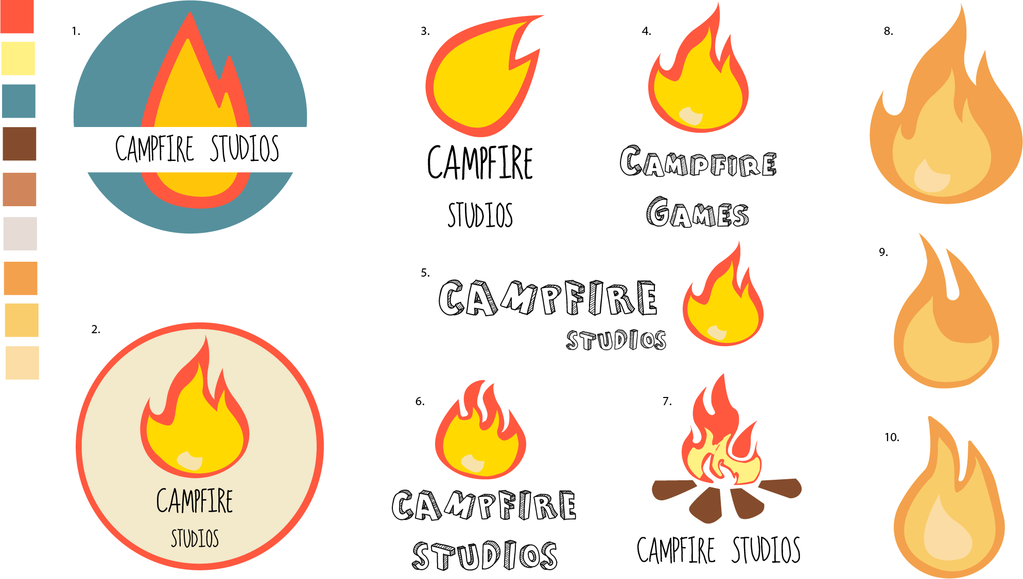
After the presentation during the week 5 workshop, the general consensus behind my current iterations and development was that more variations were needed. Before the presentation I felt as though I had reached my final stages of logo development, but after a more critical approach in evaluating my own work I felt as though I hadn’t fully scratched the surface on what it takes to create a finalized logo.

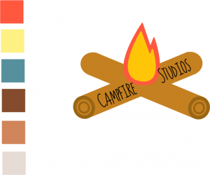
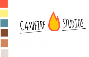
The different variations were all informed by prior iterations of the logo and were all thematically similar with slight changes in either the typeface, colour palette and composition as well as the shape of the flame.

The initial colour palette I started with felt quite harsh to look at with some variants of the logo, so I wanted to find a more subdued colour which still looked good with the flame, after experimenting with Adobe Illustrators Built in colour guide I found a new set of three complimentary colours which I applied to designs: 8, 9 and 10.

Overall I feel as though I underestimated how complex designing a good logo could be, and so I feel like more designs are needed before reaching a final conclusion. The current rendition I prefer the most is design 8, from here I’ll further explore what I can do with it and see where it takes the end conclusive design


CAMPFIRE VARIANTS

First Character Sketches

For my first character sketches I wanted to create some different types of animals, and illustrations I could later apply to a story, the very first 2 characters I made were a cobra and a bee. After thinking more about my story and what I wanted, these two sketches felt out of place and not applicable in the slightest to the story I wanted to tell. Regardless of the fact that Ithese characters wont be used I still feel as though what I’ve learnt with regards to the software will be useful for the later character illustrations.

OTHER THING

Logo Development (Final)

The first logo below was more of a direct translation towards my company name, compared to prior iterations it plays more with the idea of a literal campfire. Overall I feel as though this logo is weaker compared to previous versions, the design for the logs takes too much away from the central focus of the fire, it’s also quite distracting from the typeface too, which I feel works very well with the basic block colours of the fire.


new campfire

After evaluating what I disliked with the previous logo I decided I wanted to keep the fire and the typeface relatively similar, the type by itself felt very weak and looked out of place, however with even the small inclusion of the underlining the piece overall looks visually stronger.
As it currently stands this logo is my final piece I aim to use for the branding of the company. I feel as though it stays true to an imagined colour palette and general aesthetic I chose from the start also it  feels visually appropriate to the IP I propose to create.

new campfire 2


Workshop 3 – Further Logo Development

During my third workshop I decided to further explore logo variations, I tried to apply previous versions to some documentations and the shape and size of the logo wasn’t compatible with some of the output formats.

The element I decided to keep from my first logo was the typography, I felt as though this captured the feeling of the company I was going for, it felt rough and cartoony, similar to the proposed IP I would be creating. The new element to this logo was a vector created of a fire, I took inspiration from a camp-fire safety website, the symbol looked fun and something I could use an iteration of in my own work. After playing around with it though it felt too out of place and I personally didn’t like it.

I decided rather than keeping the features of the flame I would try removing them and play with the idea of typography around it. The new logo is a potential design out of more that I’ll make which I feel could be used or at least altered to be a final logo for my company. The next step I’ll take with my logo will be taking features from my first logo and trying to integrate them further with my new logo.


The inspiration for my fire sprite came from the website:

Fire

fire     Untitled-1


Logo Variations

After designing my first logo I wanted to continue on with the theme and idea of “Campfire Studios”. The very first logo I designed had a few elements I liked and wanted to further explore, but there were still a few things that bugged me, primarily the mountain not being central and the font feeling out of place and too confined within the bubble, taking this into account I made further alterations to it.

brand mock up

The second version I made I decided to add a banner which sits underneath the original circle frame, I felt as though this was a good addition for the logo, it felt thematically appropriate for the idea of camp-fires and  in my opinion just compliments the image overall. Another thing I changed was the font, I wanted something which felt more organic and appropriate with the image as a whole, the original font used felt too formal for the rough nature of the wilderness/camp-fire.


The final rendition of the logo I decided to add a few more features to make use of the empty white space, I slightly altered the position of the banner and made it smaller, and I also added some clouds to the mountain top, overall I feel as though this logo is almost finalised and can see it being used for the branding of my imagined company and  IP

v.2.1