Campfire Studios – Final Logo and Variations

After a lot of development and constant iterations I reached my final design. My reasoning behind choosing this design in particular is because of its strong visual appearance throughout wherever the logo is placed. Unlike other logo variations the font is consistently legible, whether it’s on a black background, or if there’s no colour for the logo it works wherever it’s placed.

The factors I took into consideration more so than a visually appealing design was it’s practicality. Whilst most of the people I received feedback from preferred other designs I feel as though my choice with this particular logo type was justified solely because it meets the criteria of a logo and it’s the most consistently practical and operational design regarding: font, legibility and colour scheme.

The alternative versions I created were simply to showcase how the existing logo on white would transfer across different backgrounds, I also added a greyscale filter to 2 of the designs to showcase how printed documentation may look without coloured ink. Overall I feel as though I have now reached a strong visual identity I can carry forwards and begin to assemble to rest of the branding portfolio with.


white one


greyyy yoooo

Black and white

Untitled-2

Logo development – Finalized Design

In my previous logo development blog post I explored a multitude of designs, with different colour palettes, typography and fire vectors. During that blog post I favoured one design above the rest and so I decided to further adapt it and use it to create some more designs which felt thematically appropriate.

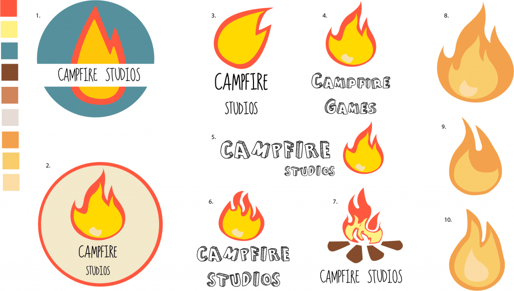
After trying new fonts and playing with some ideas I had before I feel as though designs 3 & 4 are appropriate for my logo and branding of my company. The font used feels easy to look at, similar to the fire in the regards of the soft colour and smooth edges, the colour of the fire also works well with just solid black whereas other iterations try to include the same colour as the fire and it feels visually weaker with, and without the black.

I struggled to pin down my opinion to just one design, so I decided to ask friends and other designers which they preferred, the general consensus was actually between 1 & 5, both of which received around 10 or more people picking between the two. After trying those logo’s on documentation, making them larger and smaller, both of them failed the test of where they were appropriate, design 5 in this instance worked better on documents where it was larger, but when shrunk the black lines in the font made it look bold and too loud.
Design 1 also looked good at the size it was in this document, however when it was made larger or smaller it had the issue of taking up too much space, or becoming illegible.

Whilst design 4 didn’t have as many people comment on it, I feel as though after trying to apply other logo variations to documentation it’s  the most coherent design, which is applicable to most of the places I’ve tried to use it.

Overall I feel as though design 4 is the one I will choose as a finalized piece, the new typeface is visually stronger and the flame between both words works better than in previous renditions, also the new colour scheme feels a lot better to look at, the previous palette felt too harsh with the reds and yellows and the new subdued version is easier to look at.


final final

Workshop 6 – Picture Book Research

During the workshop this week I was working on research for the picture book brief, the brief outline is to create 12 pages or more including illustrations and a typeface which compliments the style and aesthetic of the book. The aim of the picture book is to make a serious subject matter digestible and appropriate for children, these subject matters can be current in media and the news, or could cover other topics for children to make them understand serious issues from a young age like: Global Warming, Terrorism  and Online Safety.

Overall I feel as though the picture book brief is a great way of working to a project with a more unique age group compared to other modules set prior.

The research I did this week was primarily just what I found and liked the look of on Pinterest.

2d641c1980c3c728abd317b16bb525e0 51a6ec224e616d38887ac2b807f7102a (1)
1657bd4793f8c54c395a2fcb0ab0ad7b c455be19db5bd8f6932c1b9af921f492


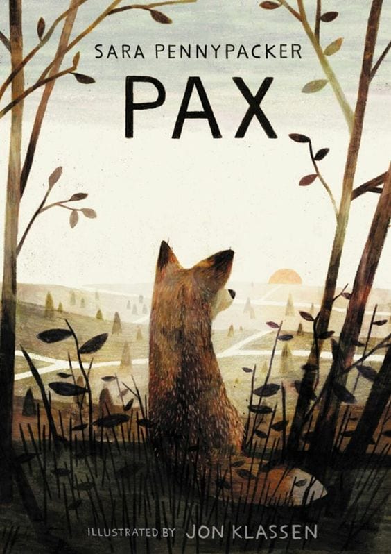
The general aesthetics and feel of these books is something similar to what I’d like to mirror, I like the usage of both collage and flat, but vibrant colours to illustrate themes for children. It’s my personal belief that so long as the visual representations of the themes within the book are engaging and vibrant then anything can be made digestible for children regardless of the topic.


Module 2 – Semester B, Picture Book Brief

During the lecture this week (week 6) we were introduced to our new brief and given some examples of work that should inform our own product, the project is to create a picture book which tackles serious matters and explains it in an easy, effective way for children ages 6+

In the lecture we looked at a few examples of picture books which tackled serious problems but made them applicable to children. The works from authors and illustrators like: Neil Gaiman, Maurice Sendak, Davide Cali, Serge Bloch and David Mckee were all highlighted in how they illustrate or write in a way which makes complex issues digestible for a younger audience.

One thing I took away from this lecture is that just because a demographic may include only a young age group it doesn’t mean that the subject matter has to reflect that. Author Neil Gaiman made a valid point when talking to a critic about his reimagining of Hansel & Gretel, I think if you are protected from dark things then you have no protection of, knowledge of, or understanding of dark things when they show up.” (BrainPickings, 2015). Overall I feel as though any subject matter can be explained to children and it doesn’t always need to be sugar coated.

From here I will further research the authors and illustrators that were referenced in the lecture, as well as using Pinterest to find inspirations and ideas to inform my own work.


Bibliography:

Neil Gaiman Reimagines Hansel & Gretel, With Stunning Illustrations by Italian Graphic Artist Lorenzo Mattotti. Available from:
https://www.brainpickings.org/2014/10/28/neil-gaiman-hansel-gretel-lorenzo-mattotti/  [22 February 2016].


Further Logo Development

After the presentation during the week 5 workshop, the general consensus behind my current iterations and development was that more variations were needed. Before the presentation I felt as though I had reached my final stages of logo development, but after a more critical approach in evaluating my own work I felt as though I hadn’t fully scratched the surface on what it takes to create a finalized logo.

The different variations were all informed by prior iterations of the logo and were all thematically similar with slight changes in either the typeface, colour palette and composition as well as the shape of the flame.

The initial colour palette I started with felt quite harsh to look at with some variants of the logo, so I wanted to find a more subdued colour which still looked good with the flame, after experimenting with Adobe Illustrators Built in colour guide I found a new set of three complimentary colours which I applied to designs: 8, 9 and 10.

Overall I feel as though I underestimated how complex designing a good logo could be, and so I feel like more designs are needed before reaching a final conclusion. The current rendition I prefer the most is design 8, from here I’ll further explore what I can do with it and see where it takes the end conclusive design


CAMPFIRE VARIANTS