Creating my Typeface

After doing enough research I settled on the idea of creating a fantasy font/typeface. The idea I settled on is related to Game of Thrones, I wanted to create my own take on the font used in the show which is called “Valyrian”. Examples of the font already exist online, so rather than just copying from others, I borrowed certain forms that are commonplace and made my own variations.

  Valyrian FontUppercase

Upper and Lower Case

The letter forms I created borrow from old styles of traditional handwriting, similar to something you’d expect to see on a scroll or something similar. Overall I’m really pleased with the traditional look to it. Using illustrator a lot more in depth has also been challenging but fun. Although the brief requirements are only 6 characters I’m thinking about creating a whole alphabet  so I can use it on a final product without it being complete gibberish.

Typography Research – Valyrian/Fantasy Fonts

Another area of research I chose for typography and different fonts was from fantasy and fictional places. Although only fictional, a lot of research has taken place for fonts to hold true in terms of their design and how “real” they are, in films and TV. A lot of consultation is had to verify even fictional languages and how they look and whether the language is believable or not.
One TV program in particular which interests me is Game of thrones, the medieval and fantasy setting is something I love and wanted to explore more in depth.
A language used in Game of Thrones is called ‘High Valyrian’. Valyrian takes it’s roots from real fonts and scripts from a bygone human age, primarily Latin and Celtic Script, knowing this helps my own research towards creating a new font.

fraszka _kochanowskiego     RMEzoVo


Other notable examples of fantasy writing are the obvious, Elvish, and Tolkin inspired typographies, these fonts are useful as a basis for designing your own fantasy font, looking at the forms and how similar they are despite being from completely different fantasy realms. The general consensus is that during the time setting of most fantasy films, most writing is similar.

dream_eng

Workshop 4 – Presentation Prep Task

During week 4 I was tasked with creating a presentation using Indesign and different graphic design techniques, the aim of this task was to show how to create a professional presentation using appropriate software to graphic design, as opposed to other platforms.

The task was relatively straightforward however it was nice to get to grips with software more relevant to the subject area. First off I started by creating an image of my name in Indesign, making sure that all the settings for print we’re correct before making refinements and trimming the printed document. After doing this we photographed the image.

Picture of Text


After photographing our poster the task was to make further refinements to show a progression throughout the presentation, from here the document was transferred over to the computer, and further refinements were made by cropping the image and removing the opposing background.

[Untitled]-1


Once the background was removed I had to insert the final images into indesign and create the presentation to match the brief.

Presentation


Workshop 3 – Vector Graphics

During the workshop this week I followed an instructional document on how to create vector graphics in Adobe Illustrator. Having not used illustrator much before it wasn’t a familiar platform, however the results achieved from it were second to none and the quality of the vectors are far superior to other raster graphics I always created prior.

lINC ARC

Overall I feel a lot more comfortable with the software and will make use of it for further experimentation before making my final design

Typography Research

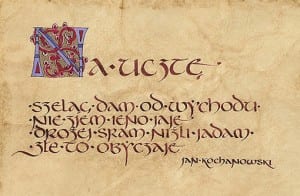
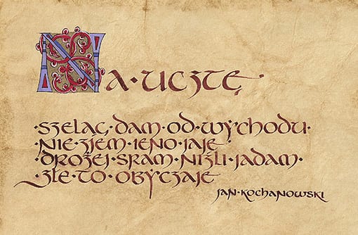
When the module brief for the first semester was given to me, I knew straight away what area of typography stood out the most to me, using this I decided to start doing research on what I found to be interesting.

The main areas of intrigue for me are: old English/Latin scripture, Stone Engravings and traditional typography (traditional as in: old, clear and sleek in terms of its design).

The reason I love Latin and old script stems from countless movies and video games I’ve seen/played, the intrigue of civilisations and an era that has passed still stands out to me, hence my love for old script.

As mentioned prior, films and games were where my initial intrigue for Latin came from, as such, things like Indiana Jones, and the Uncharted franchise along with other fantasy films/TV Series.

xetc-uc-drakesring-ring-flat-wood.jpg.pagespeed.ic.F1Z0cl99wpSicParvisMagna

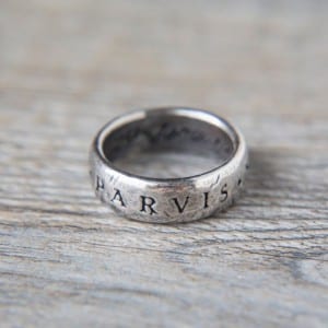
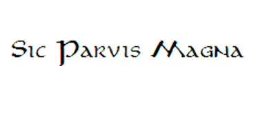
The quote “Sic Parvis Magna” is used in Uncharted and was supposedly engraved into a ring by Sir Francis Drake, whether it be fiction or not the idea really stood out to me which is why I chose to research it. The  Latin used stands for ‘Greatness from small beginnings’ and it holds a place very close to me. The typography itself is a type of serif, which has a nice handwritten/hand engraved look and aesthetic to it.

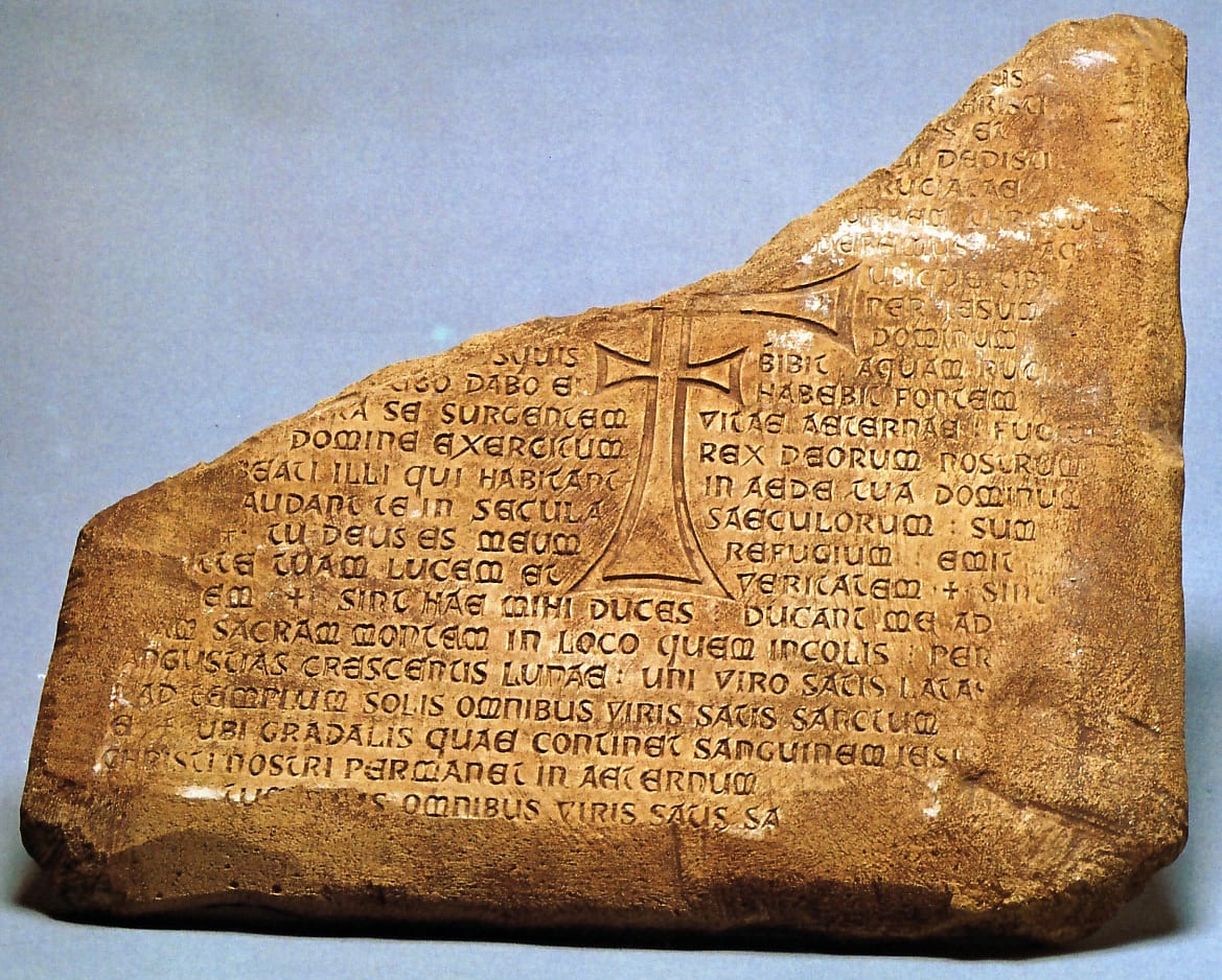
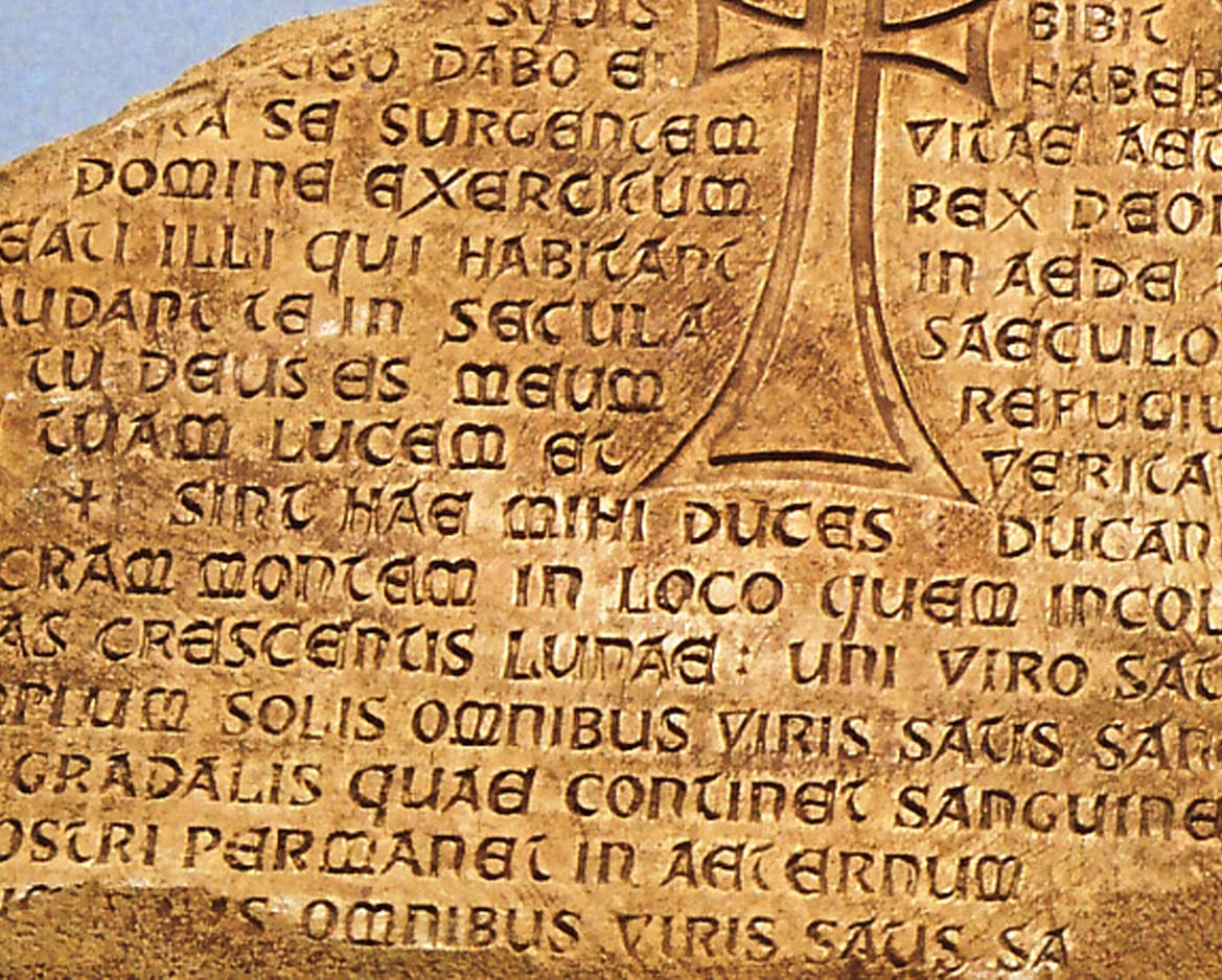
Another piece of media which has inspired my love for history/historical texts is Indiana Jones, in particular the last crusade. Although my love for this area of typography purely comes from fiction, I still feel as though I’m passionate enough to want to pursue it hence my research.

GrailTablet-TSWA                         5656

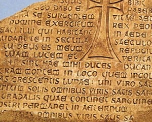
The grail tablet is a fictional historical artefact from Indiana Jones, and is written in Latin Psalms. these are just a couple of examples of text and scripture which appeals to me, as I further update my blog I’ll post more of my findings and examples of my own work towards a similar effect like this.