Adobe Muse – Website Mock-Up

After I had created the logo and finalised my design I decided I wanted to try and apply the graphic I made to a functioning website, in order  to see how well it worked in a practical application. To create the website I decided that rather than code from scratch I would use Adobe Muse. Muse is a great tool to make a quick professional website, with operational buttons and hyperlinks along with having support for the files I created like the SVG files and Vectors which have transparent backgrounds.
After experimenting with some basic layouts I decided I wanted to keep the theme of using circles as a throwback to my very  first logo. Whilst the website is very much bare bones at the moment  it’s a great start to document the progress I’ve made with it, so far I have the index page, and a page linking to merchandise, the merchandise page will show some previous logo iterations and concept art for the game which can be bought.

For this website I aim to make all pages operational and link them to my work on the project. The development button links to this blog, the Entropia button will link to concept art for the game, and Awards and Review will link to a mock up page of the accolades the game has achieved.

Overall despite the website being in early stages of development I feel as though it’ll be a nice addition to other output formats which can be used to navigate through the project as a whole.
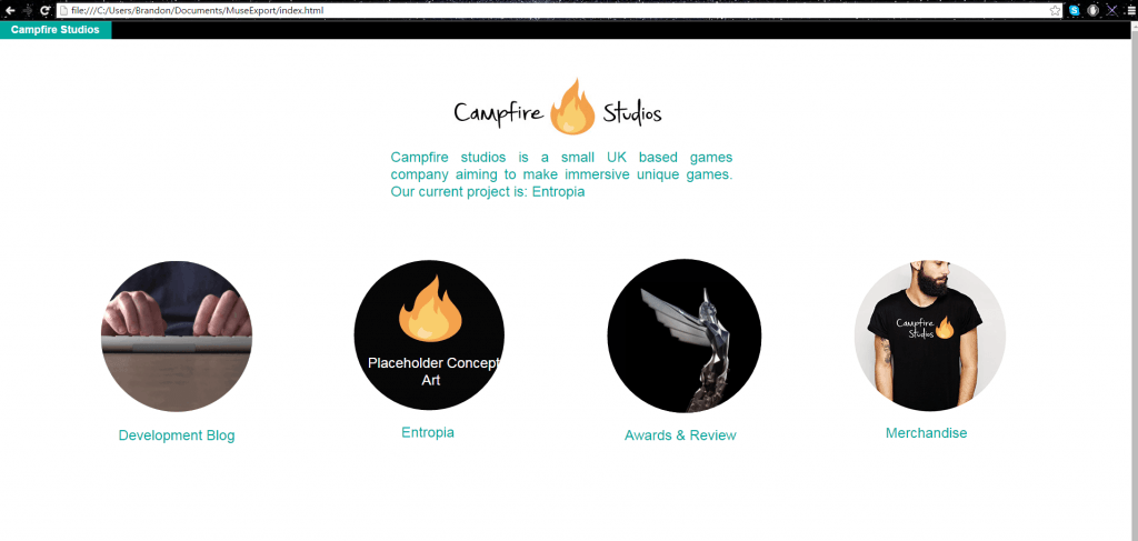
 

screenshot


Picturebook Development Plan

During the workshop of week 6 the group was given a new brief simply called “Picturebook Brief” the brief requires us to create a minimum of 8 pages regarding themes which children may find hard to deal with, the idea behind this is to get us to think about how we can deal with diffcult subject matter, and make it applicable through illustration and Typography making the topic more digestible for children.

Before setting out and creating the brief there was an obvious learning curve of what’s expected from us, and how we can tackle this. There was obviously an emphasis on some components which at first seemed somewhat commonplace and easy to overlook, however paying close attention to what’s expected, I now know that there should be a lot of attention paid to Typography and Colour, focusing on these two elements gives the book more visual coherence and overall makes the end product a lot better.
During the early stages of the brief I will focus on colour palettes and typography research, this should help inform the end product and make it a lot more professional. One final element I will look at will be the ability to rework and change ideas, a lot of the time designers think what they’re doing is final and good enough to submit as an end product, this is something I want to avoid unless I’m 100% certain of my own ideas.

Development Plan

The development plan for this brief will detail a time schedule of all the elements I’m working towards and when I want them completed by. I feel as though time plans are a good tool to use and stick to so as you understand how to spend on each component.


Week 6 – Research/Project Planning Stage

  • Name for the PictureBook
  • Research on inspirations (Artists, Authors)
  • Look at examples I want to influence my work on
  • Progression with the Design/Overall Branding

Week 7 & 8 – Concept art and further ideas development

  • In-depth picturebook research (What conventions do I follow, examples of how to compose a narrative for kids, how to make the end product look/feel thematically appropriate? )
  • Rough sketches (Concept art, Character art)
  • Experiment with Typography (how does it look/feel with supporting illustrations)


Week 9- Further Illustration Exploration 

  • Finalised Title (Reach a point where I know what I can improve for the cover/title)
  • Typography evaluation, new choices from old, variations and how well it works
  • Further Character concept art, Settings for the book, Environments Etc.
  • Upload Sketches – Evaluate Likes/Dislikes
  • Further develop environments, showcase potential settings for the character


Week 10 & 11 -(Easter) Final Tweaks

  • Finalised Illustrations (What character am I using? What Environments/Themes?)
  • Room for improvements (Are the sketches representing of the book enough positively? Room for tweaks?)
  • Finalised Colour Palettes

Week 10 onwards – Polishing final output

  • Have a finalised booklet 8/10 pages
  •  Character development finalised uploaded to blog separately
  • Colour Palette and supporting work uploaded to blog
  • create final Pdf for the semester, uploading both projects.


Research & Source Material

https://uk.pinterest.com/search/pins/?q=illustration&rs=typed&0=illustration%7Ctyped

Campfire Studios – Final Logo and Variations

After a lot of development and constant iterations I reached my final design. My reasoning behind choosing this design in particular is because of its strong visual appearance throughout wherever the logo is placed. Unlike other logo variations the font is consistently legible, whether it’s on a black background, or if there’s no colour for the logo it works wherever it’s placed.

The factors I took into consideration more so than a visually appealing design was it’s practicality. Whilst most of the people I received feedback from preferred other designs I feel as though my choice with this particular logo type was justified solely because it meets the criteria of a logo and it’s the most consistently practical and operational design regarding: font, legibility and colour scheme.

The alternative versions I created were simply to showcase how the existing logo on white would transfer across different backgrounds, I also added a greyscale filter to 2 of the designs to showcase how printed documentation may look without coloured ink. Overall I feel as though I have now reached a strong visual identity I can carry forwards and begin to assemble to rest of the branding portfolio with.


white one


greyyy yoooo

Black and white

Untitled-2

Logo development – Finalized Design

In my previous logo development blog post I explored a multitude of designs, with different colour palettes, typography and fire vectors. During that blog post I favoured one design above the rest and so I decided to further adapt it and use it to create some more designs which felt thematically appropriate.

After trying new fonts and playing with some ideas I had before I feel as though designs 3 & 4 are appropriate for my logo and branding of my company. The font used feels easy to look at, similar to the fire in the regards of the soft colour and smooth edges, the colour of the fire also works well with just solid black whereas other iterations try to include the same colour as the fire and it feels visually weaker with, and without the black.

I struggled to pin down my opinion to just one design, so I decided to ask friends and other designers which they preferred, the general consensus was actually between 1 & 5, both of which received around 10 or more people picking between the two. After trying those logo’s on documentation, making them larger and smaller, both of them failed the test of where they were appropriate, design 5 in this instance worked better on documents where it was larger, but when shrunk the black lines in the font made it look bold and too loud.
Design 1 also looked good at the size it was in this document, however when it was made larger or smaller it had the issue of taking up too much space, or becoming illegible.

Whilst design 4 didn’t have as many people comment on it, I feel as though after trying to apply other logo variations to documentation it’s  the most coherent design, which is applicable to most of the places I’ve tried to use it.

Overall I feel as though design 4 is the one I will choose as a finalized piece, the new typeface is visually stronger and the flame between both words works better than in previous renditions, also the new colour scheme feels a lot better to look at, the previous palette felt too harsh with the reds and yellows and the new subdued version is easier to look at.


final final

Module 2 – Semester B, Picture Book Brief

During the lecture this week (week 6) we were introduced to our new brief and given some examples of work that should inform our own product, the project is to create a picture book which tackles serious matters and explains it in an easy, effective way for children ages 6+

In the lecture we looked at a few examples of picture books which tackled serious problems but made them applicable to children. The works from authors and illustrators like: Neil Gaiman, Maurice Sendak, Davide Cali, Serge Bloch and David Mckee were all highlighted in how they illustrate or write in a way which makes complex issues digestible for a younger audience.

One thing I took away from this lecture is that just because a demographic may include only a young age group it doesn’t mean that the subject matter has to reflect that. Author Neil Gaiman made a valid point when talking to a critic about his reimagining of Hansel & Gretel, I think if you are protected from dark things then you have no protection of, knowledge of, or understanding of dark things when they show up.” (BrainPickings, 2015). Overall I feel as though any subject matter can be explained to children and it doesn’t always need to be sugar coated.

From here I will further research the authors and illustrators that were referenced in the lecture, as well as using Pinterest to find inspirations and ideas to inform my own work.


Bibliography:

Neil Gaiman Reimagines Hansel & Gretel, With Stunning Illustrations by Italian Graphic Artist Lorenzo Mattotti. Available from:
https://www.brainpickings.org/2014/10/28/neil-gaiman-hansel-gretel-lorenzo-mattotti/  [22 February 2016].