Workshop 7 – Further Website Development and Merchandise Mock Ups

During the workshop this week I decided to make further progress and development with my branding brief, more so with the website itself. I decided to add some of my designs to the merchandise page, and experiment with the layout some more. After focusing quite heavily on how the website would fundamentally operate I realised that I lost sight of the actual theme and aesthetic I was going for, so I decided to start from scratch and create a new merchandise page.

When thinking about the design I wanted the page to be a constant scroll rather than having it link to numerous other pages, it keeps the flow of  content and organisation consistent it also  allows the user to look at multiple designs without needing to leave the page.
Overall I like how the website is coming along and being more coherent to an overarching theme, the placement of the logo is the same on each page and the colour scheme with the Turquoise/Blue compliments the orange flame which just makes the overall theme visually appealing.

Untitled


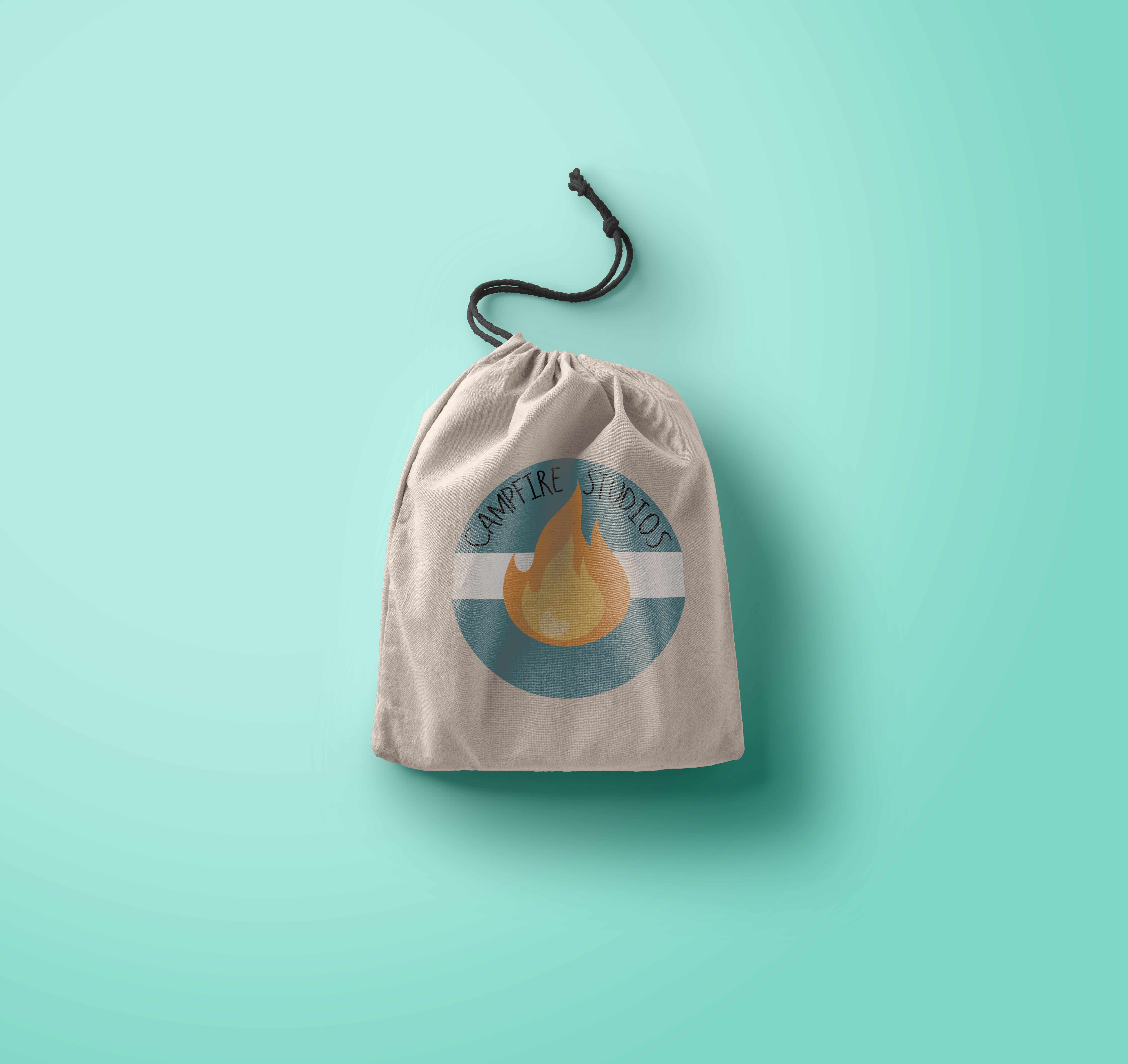
Also during this workshop I decided to make another mock-up of where my logo could be applicable, for this mock-up rather than a T-Shirt I decided to apply it to a rucksack. the PSD files used in my mock-ups all come from https://www.piexeden.com it’s a fantastic website where free PSD files can be downloaded, and you can convert your standard SVG files into an operational design.

preview


Logo Design Applications

After creating my finalised logo I decided I wanted to try and apply it to some mock-up merchandise, to do this I downloaded copyright free PSD files and added my logo to some T-shirts. The logo’s are vector files which means the applications for them are limitless, I was able to shrink the logo down and make it applicable to t-shirts and other various outputs without a degrade in the overall quality of the type or graphic.

I created 2 designs for both male and female, using 2 previous iterations of my logo so the development wasn’t wasted. Overall I feel as though seeing my designs in a practical format makes them visually stronger than just by themselves, it’s also a nice exercise to run alongside development, it can inform design choices but it also give an indication as to whether the logo works or not.


design 2
T-shirt-mock-up-vol01
design 1
design 2

Adobe Muse – Website Mock-Up

After I had created the logo and finalised my design I decided I wanted to try and apply the graphic I made to a functioning website, in order  to see how well it worked in a practical application. To create the website I decided that rather than code from scratch I would use Adobe Muse. Muse is a great tool to make a quick professional website, with operational buttons and hyperlinks along with having support for the files I created like the SVG files and Vectors which have transparent backgrounds.
After experimenting with some basic layouts I decided I wanted to keep the theme of using circles as a throwback to my very  first logo. Whilst the website is very much bare bones at the moment  it’s a great start to document the progress I’ve made with it, so far I have the index page, and a page linking to merchandise, the merchandise page will show some previous logo iterations and concept art for the game which can be bought.

For this website I aim to make all pages operational and link them to my work on the project. The development button links to this blog, the Entropia button will link to concept art for the game, and Awards and Review will link to a mock up page of the accolades the game has achieved.

Overall despite the website being in early stages of development I feel as though it’ll be a nice addition to other output formats which can be used to navigate through the project as a whole.


screenshot


Campfire Studios – Final Logo and Variations

After a lot of development and constant iterations I reached my final design. My reasoning behind choosing this design in particular is because of its strong visual appearance throughout wherever the logo is placed. Unlike other logo variations the font is consistently legible, whether it’s on a black background, or if there’s no colour for the logo it works wherever it’s placed.

The factors I took into consideration more so than a visually appealing design was it’s practicality. Whilst most of the people I received feedback from preferred other designs I feel as though my choice with this particular logo type was justified solely because it meets the criteria of a logo and it’s the most consistently practical and operational design regarding: font, legibility and colour scheme.

The alternative versions I created were simply to showcase how the existing logo on white would transfer across different backgrounds, I also added a greyscale filter to 2 of the designs to showcase how printed documentation may look without coloured ink. Overall I feel as though I have now reached a strong visual identity I can carry forwards and begin to assemble to rest of the branding portfolio with.


white one


greyyy yoooo

Black and white

Untitled-2

Logo development – Finalized Design

In my previous logo development blog post I explored a multitude of designs, with different colour palettes, typography and fire vectors. During that blog post I favoured one design above the rest and so I decided to further adapt it and use it to create some more designs which felt thematically appropriate.

After trying new fonts and playing with some ideas I had before I feel as though designs 3 & 4 are appropriate for my logo and branding of my company. The font used feels easy to look at, similar to the fire in the regards of the soft colour and smooth edges, the colour of the fire also works well with just solid black whereas other iterations try to include the same colour as the fire and it feels visually weaker with, and without the black.

I struggled to pin down my opinion to just one design, so I decided to ask friends and other designers which they preferred, the general consensus was actually between 1 & 5, both of which received around 10 or more people picking between the two. After trying those logo’s on documentation, making them larger and smaller, both of them failed the test of where they were appropriate, design 5 in this instance worked better on documents where it was larger, but when shrunk the black lines in the font made it look bold and too loud.
Design 1 also looked good at the size it was in this document, however when it was made larger or smaller it had the issue of taking up too much space, or becoming illegible.

Whilst design 4 didn’t have as many people comment on it, I feel as though after trying to apply other logo variations to documentation it’s  the most coherent design, which is applicable to most of the places I’ve tried to use it.

Overall I feel as though design 4 is the one I will choose as a finalized piece, the new typeface is visually stronger and the flame between both words works better than in previous renditions, also the new colour scheme feels a lot better to look at, the previous palette felt too harsh with the reds and yellows and the new subdued version is easier to look at.


final final