Workshop 8 – Revisiting Typography

During the 8th workshop I decided to revisit my typeface a little bit before the week 12 deadline. I had an idea of creating a full working typeface in order to create a product for my final hand in. The idea I had was to create a scroll with my letters on it addressed to a character from Game of Thrones which is what the font is from.

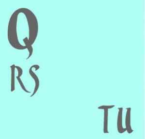
I created a few more letters and generally started to get a feel for an overall theme with my type. Because I only made 6 letters prior it felt incomplete and almost as if there was nothing aesthetically pleasing about it, so I created the letters Q, rs, tu.

random play

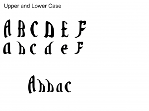
These letters in comparison to my others felt a lot better, visually speaking I like the smoother curves and more prominent and sharp flicks.

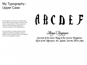
Uppercase


Upon creating my new letters I feel as though I’m going to revise the letter forms I’ve already made in order to keep it more thematic.
Workshop 7 – Continuation into Einstein Brief

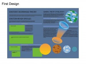
The workshop this week was a continuation on the Einstein brief from the last workshop. This week I decided to focus solely on the A2 Poster. I chose the A2 poster first so I had a lot of room to play with ideas and develop a general theme I wanted to use. The general theme I wanted to stick with was wormholes and how they work as illustrated by my graphics.

Presentation valyrian ting9


At first I really liked the overall look I was going with, I thought it illustrated quite nicely how a wormhole worked, and gave a simplistic understanding to a complex scientific theory, however the information was too cluttered, the page didn’t have much flow and I just generally grew to dislike it. Another slight error I made with this work was the file format too, the graphics I created were a PNG and Not a vector, so the overall image quality is blurry and pretty awful.

Workshop 6 – Einstein Brief

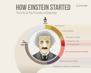
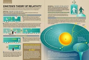
During workshop 6 the group was given a new brief to create an infographic regarding Einstein and his theory of relativity. In order to get a feel for infographics and the type of content I’d need to create I searched for some online.

header

theory-relativity


Upon searching for Einstein infographics I had a rough Idea of what direction I wanted to take with it, the design on the right was visually appealing and something I wanted to work towards.

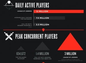
Other infographics which captured my attention although not relevant to Einstein were ones for gaming which showed facts and figures to give some perspective into how popular the game was.

1c4252300-101112-riotgames-lol-infographictease.nbcnews-ux-2880-1000

In the example above really liked the overall aesthetics,  this made me further look into colour wheels and what colours compliment others.


Workshop 5 – Presentation

During workshop 5 the group was asked to present their work and the research that had gone in to creating their letter forms. Using the skills learnt in the workshop prior I decided to use Indesign to create the presentation. My presentation mainly consisted of the same research that my blog had been keeping, so transferring and adapting it wasn’t difficult.

Presentation valyrian ting-1       Presentation valyrian ting-2

 Fantasy ting          Presentation valyrian ting-4

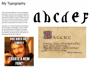
Valyrian Font       Uppercase

  Upper and Lower Case       Presentation valyrian ting-8

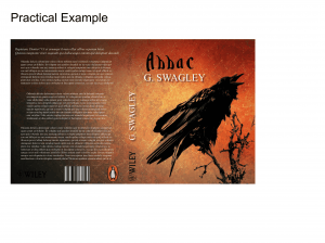
For my practical example piece of work I decided to pick a book cover, but I wasn’t too impressed with the overall result. After playing with different ideas I decided that I’m going to make a full alphabet and put it to use on a real product for my final hand in.


Typography Research – Valyrian/Fantasy Fonts

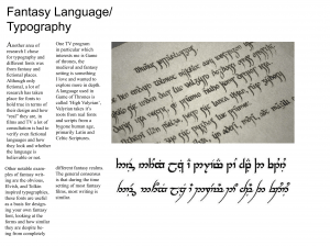
Another area of research I chose for typography and different fonts was from fantasy and fictional places. Although only fictional, a lot of research has taken place for fonts to hold true in terms of their design and how “real” they are, in films and TV. A lot of consultation is had to verify even fictional languages and how they look and whether the language is believable or not.
One TV program in particular which interests me is Game of thrones, the medieval and fantasy setting is something I love and wanted to explore more in depth.
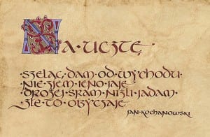
A language used in Game of Thrones is called ‘High Valyrian’. Valyrian takes it’s roots from real fonts and scripts from a bygone human age, primarily Latin and Celtic Script, knowing this helps my own research towards creating a new font.

fraszka _kochanowskiego     RMEzoVo


Other notable examples of fantasy writing are the obvious, Elvish, and Tolkin inspired typographies, these fonts are useful as a basis for designing your own fantasy font, looking at the forms and how similar they are despite being from completely different fantasy realms. The general consensus is that during the time setting of most fantasy films, most writing is similar.

dream_eng