Initial Picture Book Draft

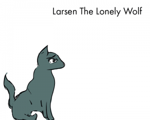
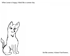
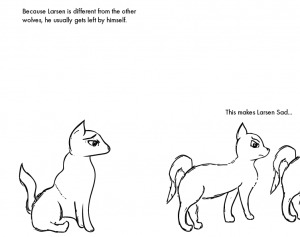
The initial sketches of the picturebook involved 3 different poses of wolves, with 3 different emotions highlighted through the face/eyes. Whilst the picture book at this current stage is very primitive I feel as though it’s a great start for further development. On the first page I also experimented with a colour for the main wolf, this will later be used to distinguish the most prominent character from the others. The font used at this current stage is Futura, I feel as though it makes for easy reading, and is legible regardless of what background I put it on.
Whilst the setting or some of the theme’s may change throughout the process of creating this book I feel as though it’s good to reflect on the very early stages regardless, it helped me a lot throughout the branding brief and I feel it’ll do the same for this brief too. Overall I’m confident with the progress and development at an early stage.
page 1-01

page 2-01

page 3-01


Workshop 7 – Further Website Development and Merchandise Mock Ups

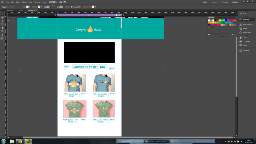
During the workshop this week I decided to make further progress and development with my branding brief, more so with the website itself. I decided to add some of my designs to the merchandise page, and experiment with the layout some more. After focusing quite heavily on how the website would fundamentally operate I realised that I lost sight of the actual theme and aesthetic I was going for, so I decided to start from scratch and create a new merchandise page.

When thinking about the design I wanted the page to be a constant scroll rather than having it link to numerous other pages, it keeps the flow of  content and organisation consistent it also  allows the user to look at multiple designs without needing to leave the page.
Overall I like how the website is coming along and being more coherent to an overarching theme, the placement of the logo is the same on each page and the colour scheme with the Turquoise/Blue compliments the orange flame which just makes the overall theme visually appealing.

Untitled


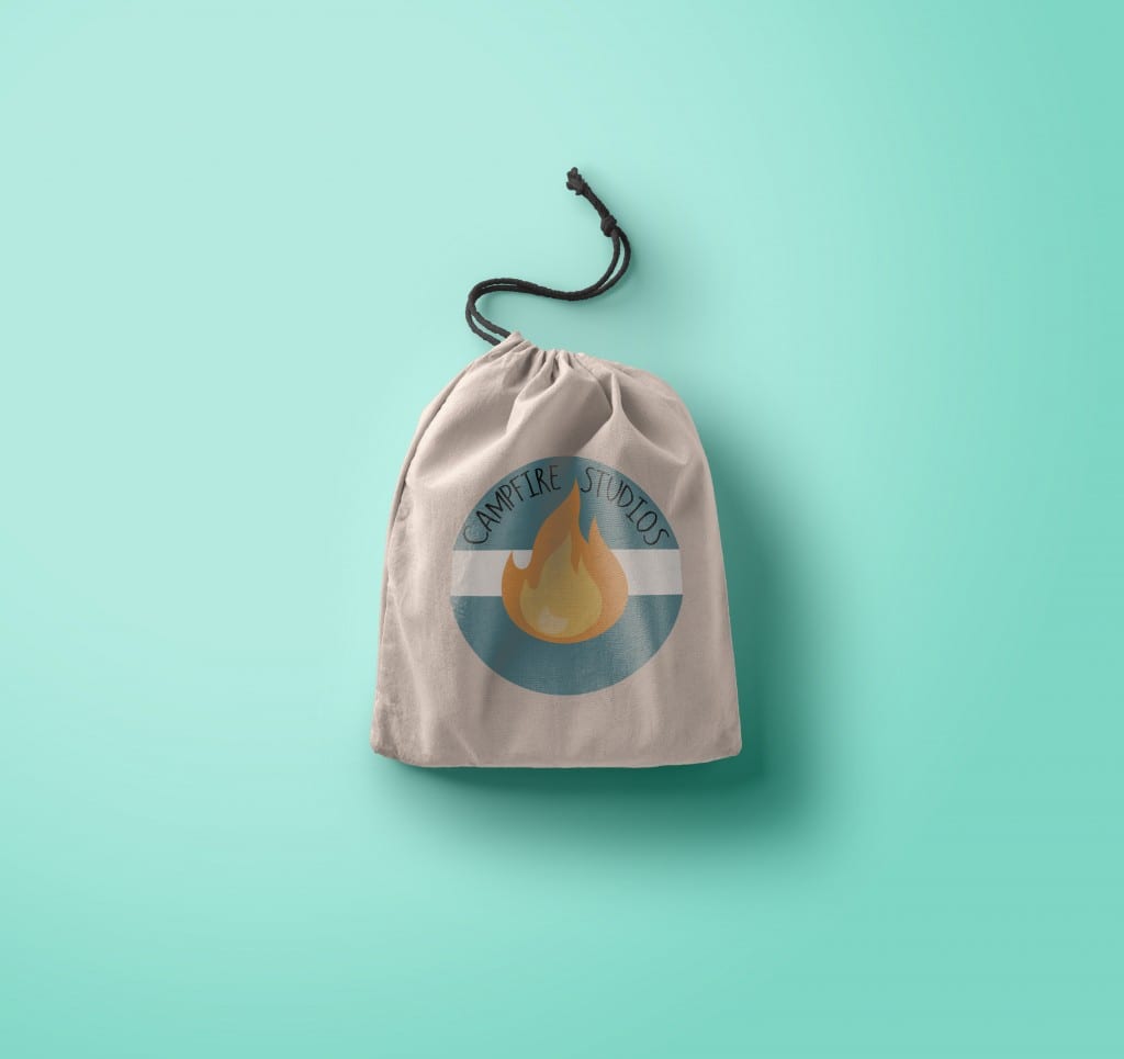
Also during this workshop I decided to make another mock-up of where my logo could be applicable, for this mock-up rather than a T-Shirt I decided to apply it to a rucksack. the PSD files used in my mock-ups all come from https://www.piexeden.com it’s a fantastic website where free PSD files can be downloaded, and you can convert your standard SVG files into an operational design.

preview


Research for Picturebook

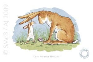
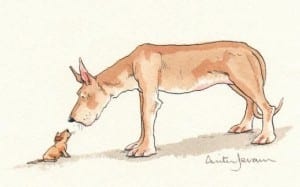
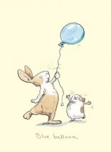
After researching some illustrators briefly, I decided to narrow my focus in finding an artist whose style I liked and wanted to inform my own work. After searching through examples on pinterest and google image search, I came across an Illustrator called Anita Jeram. Jeram is an illustrator of children’s books and some of her work focuses on simplistic flat colours with heavy hand-drawn characters, the style I found was something similar I wanted to replicate which I felt was achievable despite my own abilities within illustrating to be lacking.

aj9102_large
book 1
f2bd7607a9d76f31f341a3a77a157ebe


Overall the illustrations seem simplistic, whilst maintaining an element of design which can be conveyed easily into telling a narrative for children, so I feel as though this is the most appropriate for the style I’m trying to achieve.

Initial Character Development

For the second brief of Semester B, we were tasked with creating a children’s book dealing with difficult themes, yet making it digestible and not too heavy for children. For this brief I played around with some different character designs, my first was a snake, but after choosing my theme I found it difficult to apply the character I designed.
The next sketches I made were some general facial expressions along with some sketches of wolves, to make these I drew them by hand, and scanned them with Adobe Capture. Capture allowed me to turn hand-drawings into instantly editable vectors compatible with Adobe Illustrator, from here I tidied them up and made supporting graphics to go along with them.


Untitled-11-01


Logo Design Applications

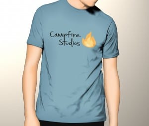
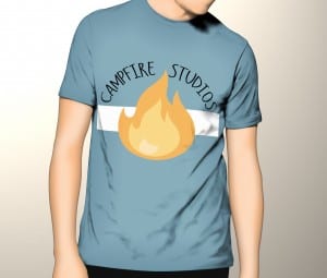
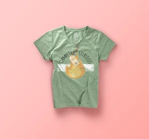
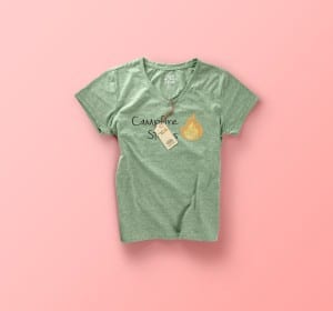
After creating my finalised logo I decided I wanted to try and apply it to some mock-up merchandise, to do this I downloaded copyright free PSD files and added my logo to some T-shirts. The logo’s are vector files which means the applications for them are limitless, I was able to shrink the logo down and make it applicable to t-shirts and other various outputs without a degrade in the overall quality of the type or graphic.

I created 2 designs for both male and female, using 2 previous iterations of my logo so the development wasn’t wasted. Overall I feel as though seeing my designs in a practical format makes them visually stronger than just by themselves, it’s also a nice exercise to run alongside development, it can inform design choices but it also give an indication as to whether the logo works or not.


design 2
T-shirt-mock-up-vol01
design 1
design 2