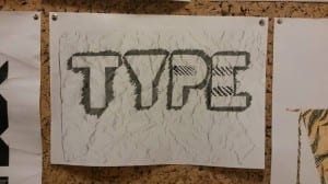
During my second workshop I took a step back from technology and the usage of digital design, instead I was taught how stencils and traditional graphic design methods can still be used to give a variety of different effects. During this workshop I used a basic stencil and decided to modify it slightly. The original stencil was a flat bold cut out of the word “TYPE” instead of keeping it as that I decided to cut minor slithers of paper out from the ‘P’ and ‘E’ overall I was quite pleased with the outcome. Another method I applied to the image was a crumpled image effect, to do this I took the original stencilled piece, screwed up the image, and then photocopied the image. This process made the final result a lot better than previous iterations and is something I’m pleased with.
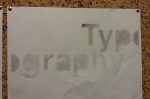
Another piece of work I created during the workshop was again stencil based, but this time I wanted a simple effect, something which I knew from the start wouldn’t need many iterations if any at all. For this piece I decided to use a different template, one which simply reads “Typography” For this stencil I wanted to have a descending opacity per individual letter. For the effect I wanted, I simply scribbled lightly over the individual letters with a pencil and used my finger to smudge the lead, each letter I gradually reduced the amount of pencil I applied to give a descending opacity effect.

