Picture Book First Draft

After all the illustrations had been drawn and converted to vectors I created a mini storyboard on how to apply them for the picture book, the layout below is how I want the story to progress, although it’s currently very early in terms of completion, I believe this will be the final story layout with only minor details that may change along the way.
The illustrations I made turned out a lot better than I initially expected, and although they looks somewhat rough, I feel as though this style will benefit the story I aim to make with it. The next stages are to work out a colour palette and add supporting graphics to progress from this current stage.

page 1-01


page 3-01

page 4-01 page 5-01page 7-01page 6-01page 2-01

Corporate Branding Packages

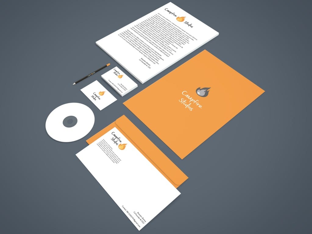
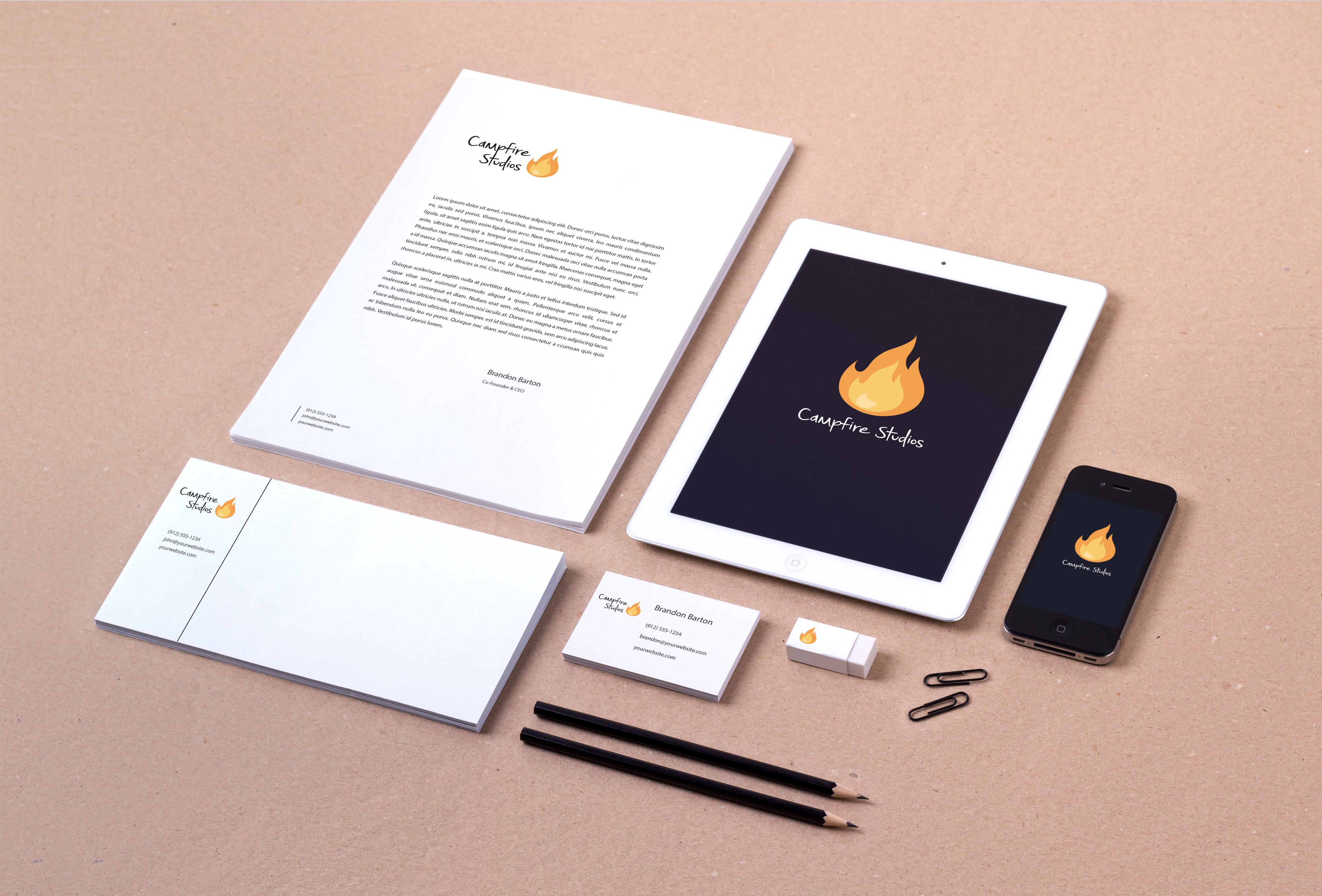
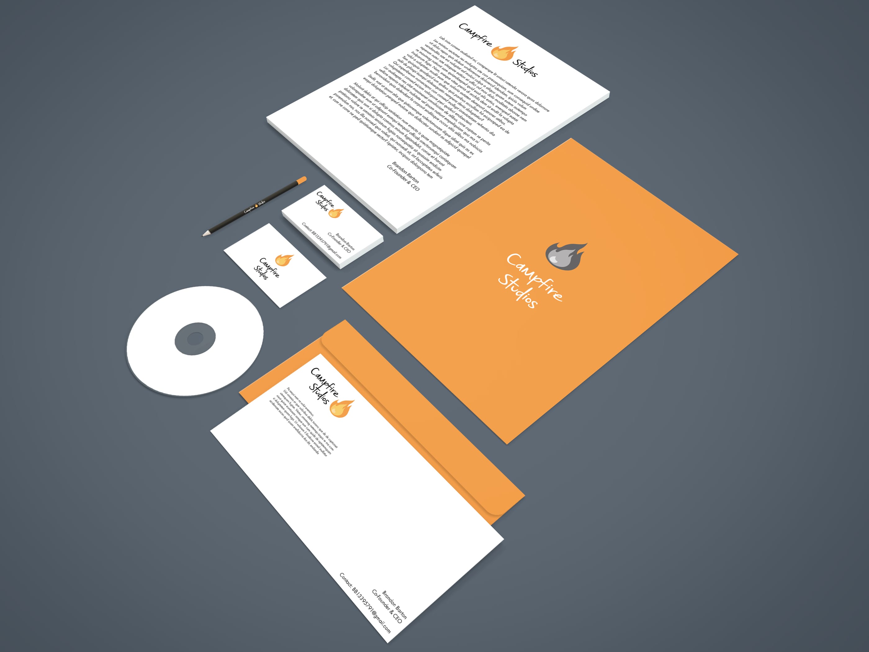
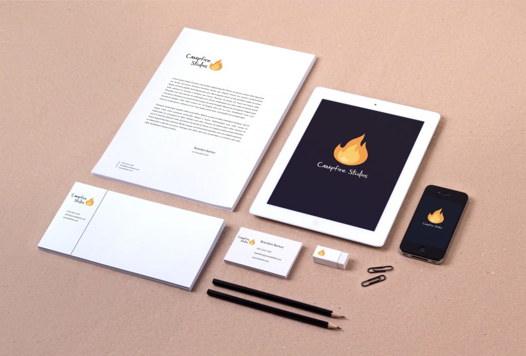
After finalising my logo I wanted to see how well it functioned as part of an entire package you would expect a company to use. I downloaded a free PSD mock up whereby you could apply your own vector graphics to a pre-made design to see how strong it’s visual appearance is, along with the practicality of the design itself .

Overall I feel as though the logo I chose is extremely versatile in how it can be displayed, when choosing my design initially I had no context of how it’d look on paper so to speak, so creating these mock up branding packages is a good exercise to check the visual appearance of the brand and logo I was creating.

Another interesting thing I found out along the way is that just because I settled on a finalised logo it didn’t make other variants redundant, if anything it made them more applicable across different output formats.

Branding Identity MockUp Vol8

The second branding package implemented a greyscale version of one of my logo’s and also implemented more of the orange which is present in the logo itself, overall I like the aesthetic of this package a little more through the implementation of colours and not just plain white paper, also experimenting with different logo versions is a great skill to practice when detailing how the brand/logo can be applied to different outputs.

I left the disk in this image blank simply because the digital art I’ll be creating for my IP hasn’t been finalised yet, when it has I will apply it to the disk to highlight the main goals of my company.


Branding-Stationery Mockup Vol

Initial Picture Book Draft

The initial sketches of the picturebook involved 3 different poses of wolves, with 3 different emotions highlighted through the face/eyes. Whilst the picture book at this current stage is very primitive I feel as though it’s a great start for further development. On the first page I also experimented with a colour for the main wolf, this will later be used to distinguish the most prominent character from the others. The font used at this current stage is Futura, I feel as though it makes for easy reading, and is legible regardless of what background I put it on.
Whilst the setting or some of the theme’s may change throughout the process of creating this book I feel as though it’s good to reflect on the very early stages regardless, it helped me a lot throughout the branding brief and I feel it’ll do the same for this brief too. Overall I’m confident with the progress and development at an early stage.

page 1-01

page 2-01

page 3-01


Workshop 7 – Further Website Development and Merchandise Mock Ups

During the workshop this week I decided to make further progress and development with my branding brief, more so with the website itself. I decided to add some of my designs to the merchandise page, and experiment with the layout some more. After focusing quite heavily on how the website would fundamentally operate I realised that I lost sight of the actual theme and aesthetic I was going for, so I decided to start from scratch and create a new merchandise page.

When thinking about the design I wanted the page to be a constant scroll rather than having it link to numerous other pages, it keeps the flow of  content and organisation consistent it also  allows the user to look at multiple designs without needing to leave the page.
Overall I like how the website is coming along and being more coherent to an overarching theme, the placement of the logo is the same on each page and the colour scheme with the Turquoise/Blue compliments the orange flame which just makes the overall theme visually appealing.

Untitled


Also during this workshop I decided to make another mock-up of where my logo could be applicable, for this mock-up rather than a T-Shirt I decided to apply it to a rucksack. the PSD files used in my mock-ups all come from https://www.piexeden.com it’s a fantastic website where free PSD files can be downloaded, and you can convert your standard SVG files into an operational design.

preview