Workshop week 9 – Finalised Website

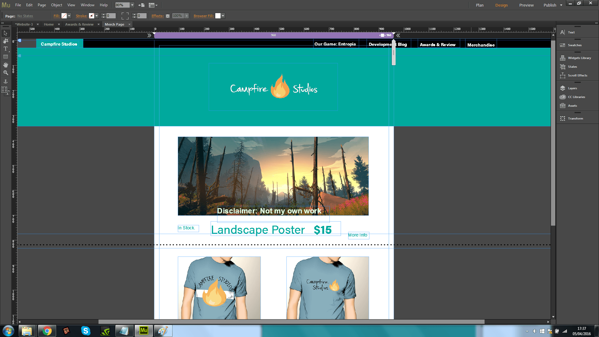
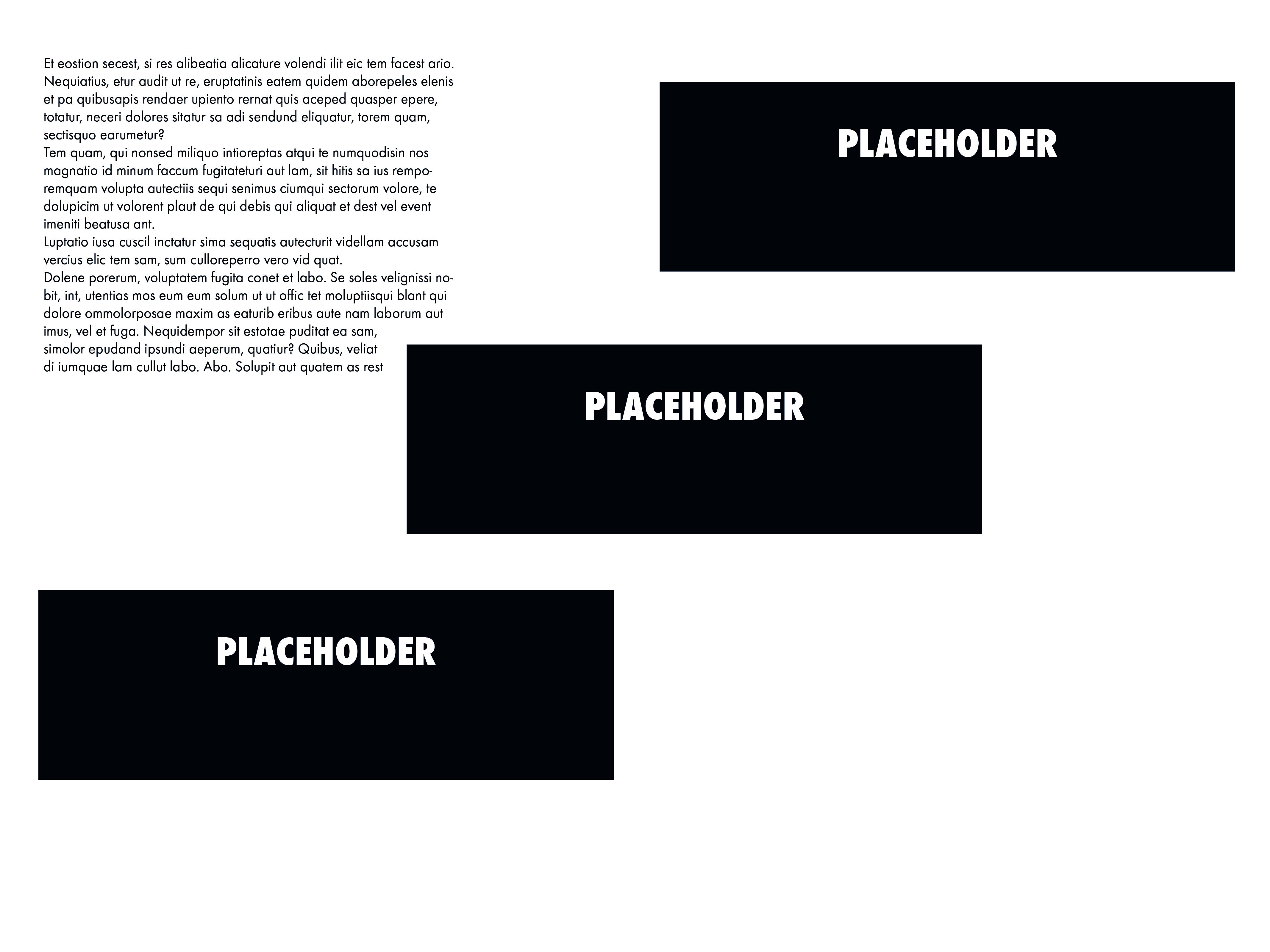
During the workshop in week 9 I decided to complete the rest of my website. The images below are all screenshots of the work I’ve produced in Adobe Muse. As mentioned prior Muse is a relatively new Adobe platform which allows for the creation of HTML websites, without the need for coding and understanding the languages used to create said websites. Muse takes away the learning curve required to make professional looking websites whilst still requiring the user to have a good understanding of design, layout and overall aesthetics to make the website look and operate as a professional output.

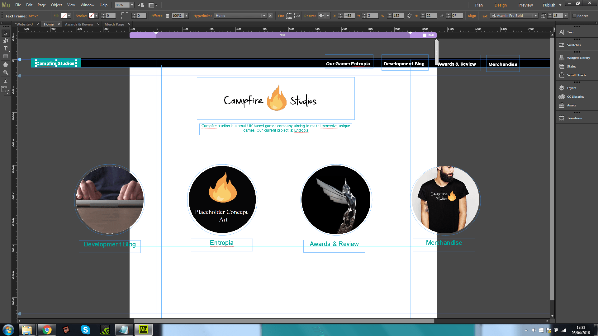
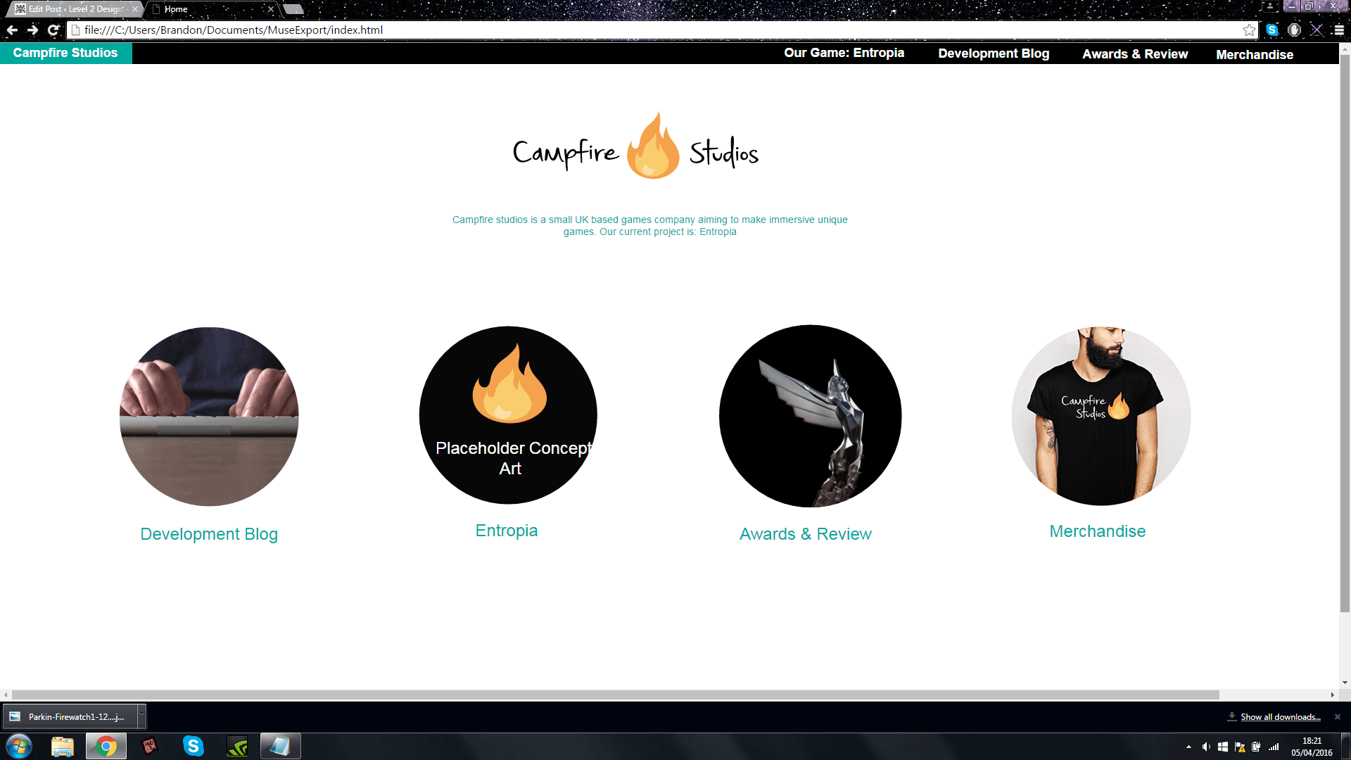
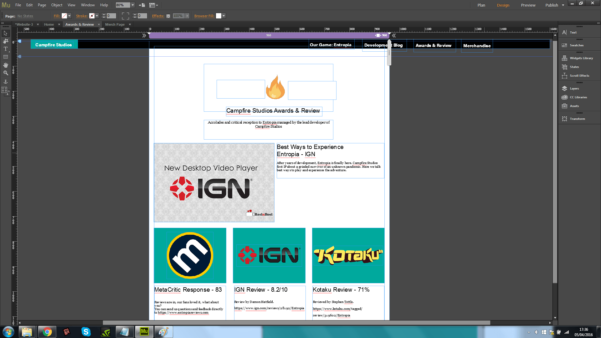
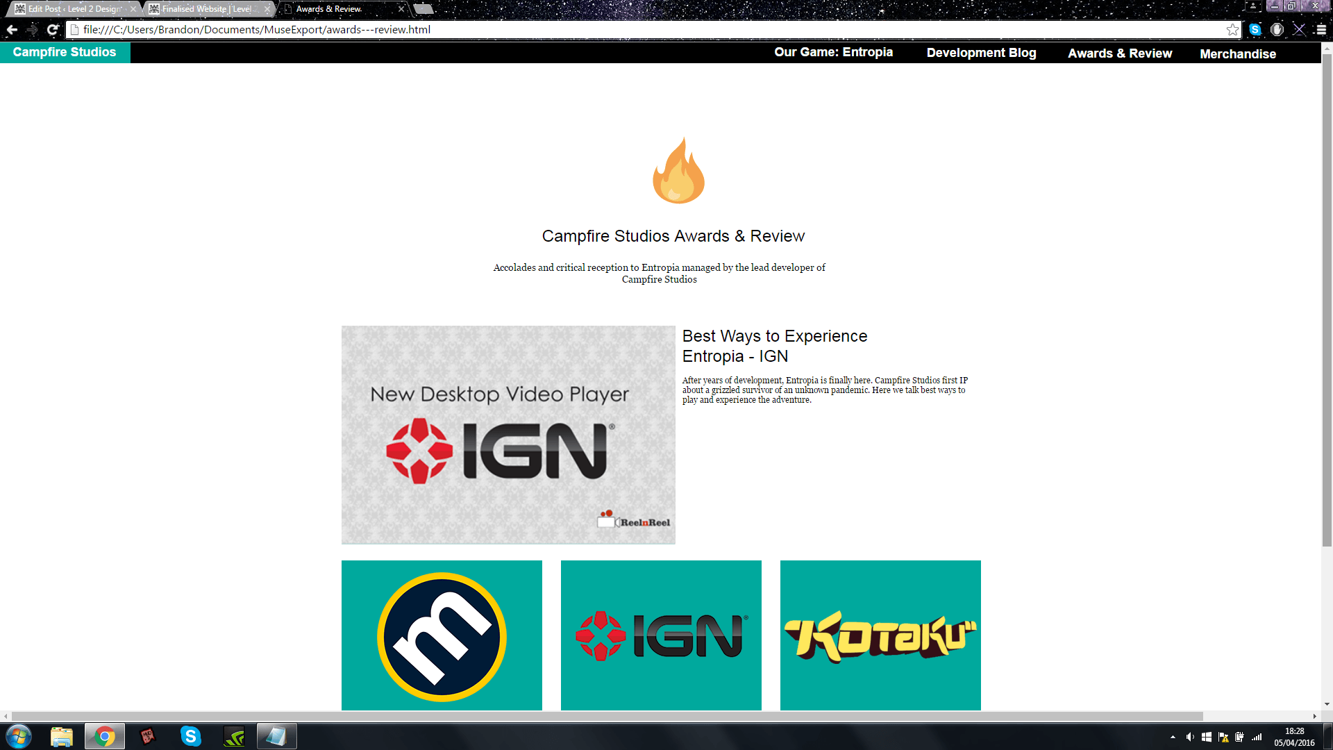
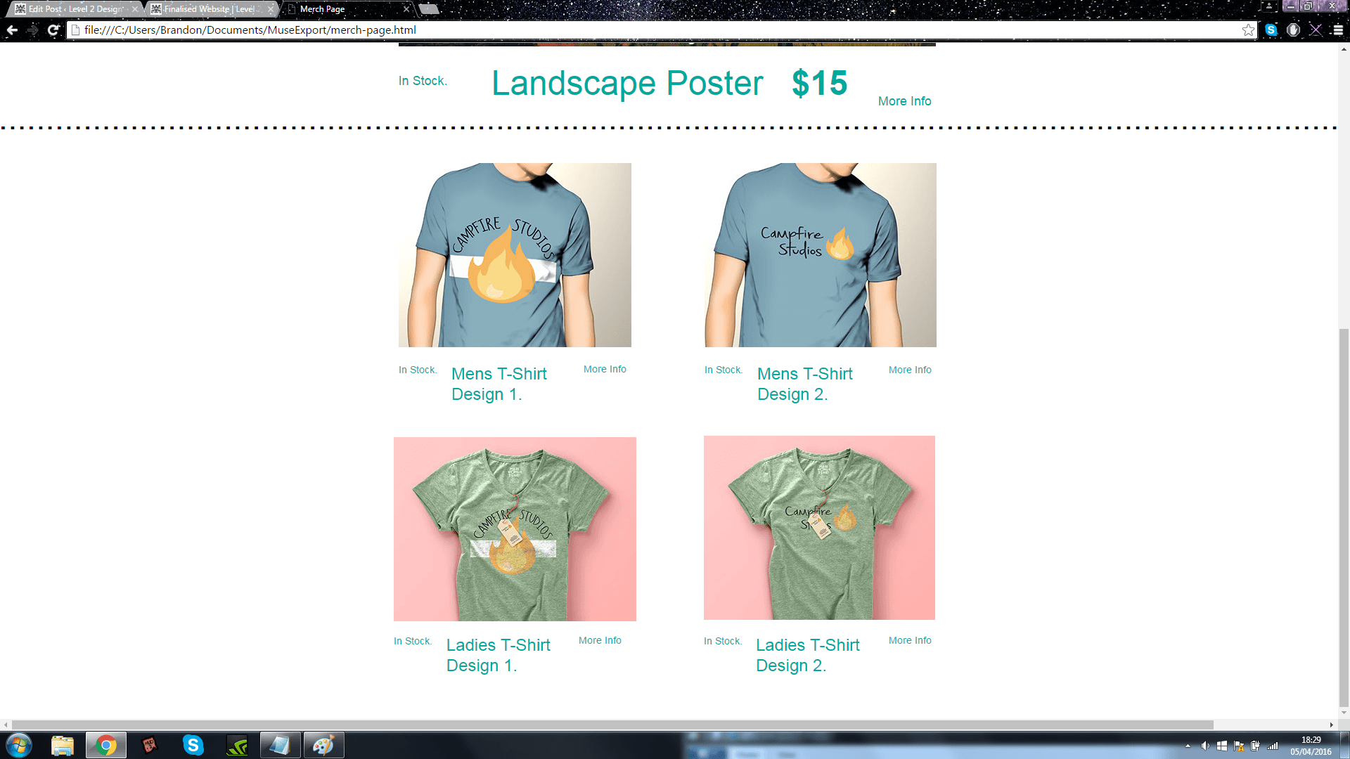
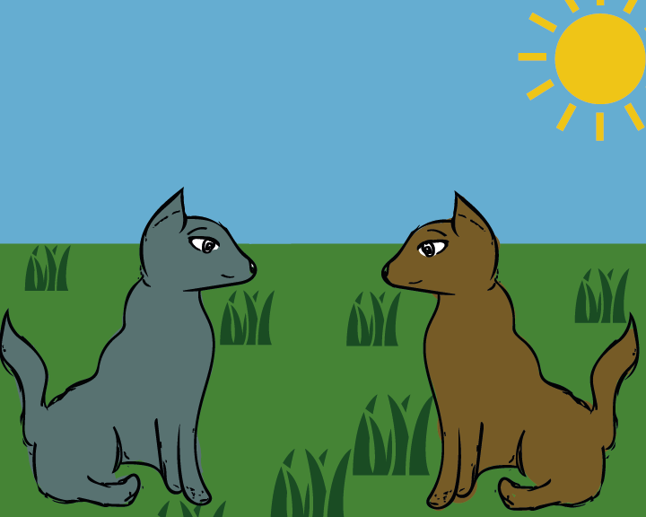
The first page has 4 buttons which all link to different pages or existing work I’ve produced, the Development blog links to my branding brief, Entropia currently links to nothing, Awards and Review is a mock up page which links to some game review websites such as IGN and Kotaku, finally the Merchandise page links to the mock up products I’ve produced.

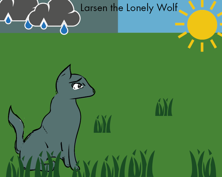
I decided to show comparisons between the Muse document and how it looks within the browser, overall despite the website looking somewhat bland and minimalistic I feel as though it fits the criteria of a website and also fits the rest of the brief in terms of it’s design and output, other  ideas for further expansion include: Linking Entropia button to concept art and sketches, add artwork to my website so it’s not so bland, also add rollover effects to buttons as a type of interactivity.


page 1 page 1.5 page 2 Untitled page 3 page 4Untitled


Picture Book Draft – Without Text

This is the version of the picture book prior to having text added within indesign. Overall I feel as though the research taken prior towards a decisive colour palette has proven beneficial in order to get started straight away with injecting more life to the book, the theme’s running with blue and grey relating to Loneliness is very prominent I feel, and the other colours used to compliment them adds so much more than just having a plain white background.
Supporting elements on the pages such as the grass, trees and clouds were all copyright free vectors downloaded from http://www.thenounproject.com

page 1 final-01-01
page 2 final-01-01

Page 3 final-01-01

page 4 final-01-01

page 5 final-01-01

page 6 final-01-01

page 7 final-01-01

final page-01-01

Children’s Picture Book – Typography Research

After realising the importance of typography in branding with my first brief, I felt an evaluation and some research would be equally appropriate for a children’s picture book, which is my second brief for Semester B. After doing initial artist research I quickly discovered that the style of type used to compliment the imagery and illustrations is equally as important as the art itself .

After researching fonts, I found that a lot of childrens books use a font called Futura, which is coincidentally the same font used for the body copy of text throughout my branding brief, after applying it to my sketches I knew straight away that it’d be the font of my choice, however I still tried other fonts as comparison, these were:

Please Write Me a Song, PencilPete and CrackedCrayon.

All these fonts were found on  http://www.fontspace.com/category/children

Despite all the experimentation I felt as though these fonts didn’t quite capture the simplistic nature of my picturebook, the style I went for which was clean flat colours, was complimented best by an equally clean font, which in my opinion was Futura Book only.


FONT

final book


Workshop 8 – Corporate Branding Booklet

During the workshop this week I made further progress with my branding brief, in particular the Corporate branding identity booklet. The branding book consists of 16 pages detailing how the brand I have created should be used, this includes: Colour Detailing, Typography and Sizing Instructions.

This booklet is the finalised output format for the overall module and in effect wraps up all the loose ends with the other output formats I have created.


Corporate Branding Identity Details
Corporate Branding Identity Details2
Corporate Branding Identity Details3
Corporate Branding Identity Details4
Corporate Branding Identity Details5
Corporate Branding Identity Details6
Corporate Branding Identity Details7
Corporate Branding Identity Details8
Corporate Branding Identity Details9
Corporate Branding Identity Details10
Corporate Branding Identity Details11
Corporate Branding Identity Details12
Corporate Branding Identity Details13
Corporate Branding Identity Details14


The current document only contains placeholder text and a very sparse amount of imagery, this is currently just to work out a theme and an overall document which has flow and movement, whilst staying informative by detailing the specifics of the brand.

Whilst the branding booklet is still in the early stages of development I feel as though this as my final output format ties the brief up as a whole. After this is complete my aim is to make some concept art and finalised sketches for my game.

Overall I feel as though there is some strong development, and sticking to a coherent theme makes the overall product have more visual strengths and strengthens the brand as a whole.

Colour Research for Picture Book

After researching the artist who I wanted to influence my own work I decided that the next logical step from here was to research a colour palette and how to apply it to my character illustrations. The style for the picture book that I’m aiming to achieve is flat basic colours for the characters, and simple block colours for a background. Because the theme of my book is Loneliness, I researched colours which were associated with this.

“The meanings of blue are often associated with serenity, calm and spirituality. But colour symbolism can be strangely contradictory and Blue is no different. Blue also brings to mind sadness and loneliness for many.” Colour-Wheel-Artist [2008]
(http://color-wheel-artist.com/meanings-of-blue.html)

The obvious colour I associated from Loneliness was Blue/Grey, and to justify this I found some research online, however these are only 2 colours out of a potential big range for the book. Using the colours below I searched for complimentary colours using the software built in to Adobe Illustrator, in doing so I found other colours like shades of Green and Yellow to complete my palette for the Picture Book.

blue2color-01