After realising the importance of typography in branding with my first brief, I felt an evaluation and some research would be equally appropriate for a children’s picture book, which is my second brief for Semester B. After doing initial artist research I quickly discovered that the style of type used to compliment the imagery and illustrations is equally as important as the art itself .
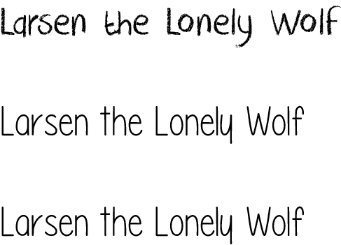
After researching fonts, I found that a lot of childrens books use a font called Futura, which is coincidentally the same font used for the body copy of text throughout my branding brief, after applying it to my sketches I knew straight away that it’d be the font of my choice, however I still tried other fonts as comparison, these were:
Please Write Me a Song, PencilPete and CrackedCrayon.
All these fonts were found on http://www.fontspace.com/category/children
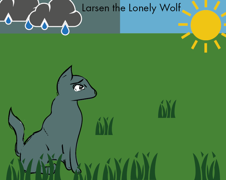
Despite all the experimentation I felt as though these fonts didn’t quite capture the simplistic nature of my picturebook, the style I went for which was clean flat colours, was complimented best by an equally clean font, which in my opinion was Futura Book only.

