Logo Mock-Up (Design 1)

After researching colour palettes I figured I would use the skills I learnt earlier and put them into practical use to create a logo for my branding brief. This logo is just an initial starting point as to get a feel for the general aesthetics of my imagined company and their IP ‘Entropia’

Campfire Brand

For the first image I picked some colours I liked and just started to play around with the themes of nature, wilderness, and cold. I like the idea of playing with Juxtaposition, hence the name Campfire and the central focus on on the red/orange colours.

brand mock up

This image is a rough finalised idea, I like the idea of the logo being circular, I feel as though it wraps the information in a bubble which takes away from the distractions of letting the art run further off the page, also it adds to the central focus of the fire.

Overall I feel as though this logo could use some further development to make it a potential piece of work I’d keep for a final hand in.
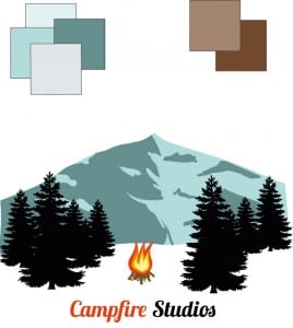


Workshop 2 – Colour Palettes

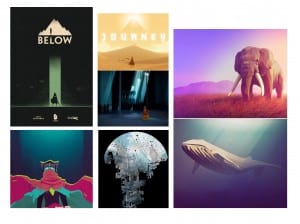
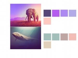
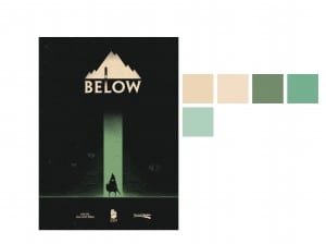
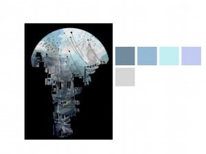
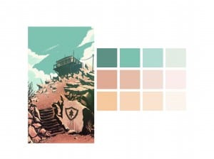
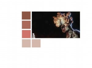
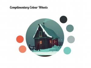
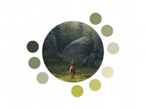
During the second workshop of Semester B I followed a tutorial on Colour Palettes and the importance of complimentary colours within design. For this exercise I started by visiting Pinterest and found images which I liked, from there the exercise continued in Adobe Illustrator and Indesign.

I found the exercise to be more informative than I first thought, and I found myself breaking down every image I liked to it’s Complimentary Colours and Shades. Overall I feel as though the exercise is a good skill to practice, not only does it look visually appealing and professional but it also changes mundane work to something you don’t mind examining further.


Colour palette Colour palette2 Colour palette3 Colour palette4 Colour palette5 Colour palette6 Colour palette7 Colour palette8


A link to higher resolution versions of these images is below.

Colour palette