The first semester for Design was fantastic and challenging in places. I feel as though I’ve come away with a lot more technical know how regarding software, I’m also getting better at critically reviewing my own work, I feel as though reviewing my work and constantly arguing with whether it can be improved helps me to progress as a designer.
Typography –
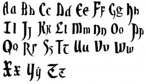
The Typography brief was the one that I personally preferred. I got to use new software I was unfamiliar with and create a functional typeface. During the early weeks of the semester it took a great deal of time and effort to get the results I wanted, however in the end everything worked out well.
The image above is my final typeface, heavily inspired by Valyrian from Game of Thrones. It took a few iterations to get my letter forms to a standard I was happy with, but working meticulously in order to create a realistic font is something that I’m happy with.
For the practical usage my font found it’s place on a T-Shirt and Scroll, overall I feel as though the font can be quite versatile even for products you wouldn’t expect.
InfoGraphic –
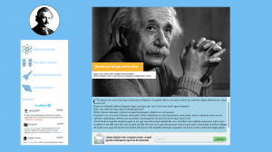
The infographic brief was something that personally took me a bit longer to adapt to. Understanding the direction I wanted to take for the infographic was a big deal for me, I wanted it to be light-hearted, professional and informative at the same time. It was only until I had done some research and looked at other examples that I began to get an overall feel for the content I wanted to make. I started the brief with an A2 poster and eventually worked to create the other outputs when I knew the direction I wanted to take with it.
The focus for me next semester is to get to grips with the content quicker, and evaluate my work better throughout the process of creation.

