Workshop 6 – Einstein Brief

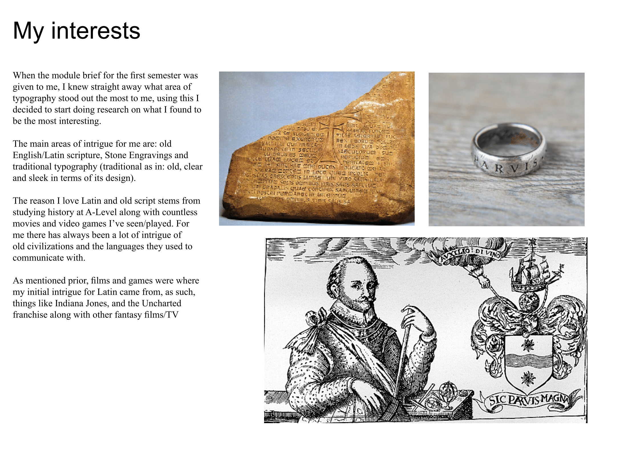
During workshop 6 the group was given a new brief to create an infographic regarding Einstein and his theory of relativity. In order to get a feel for infographics and the type of content I’d need to create I searched for some online.

header

theory-relativity


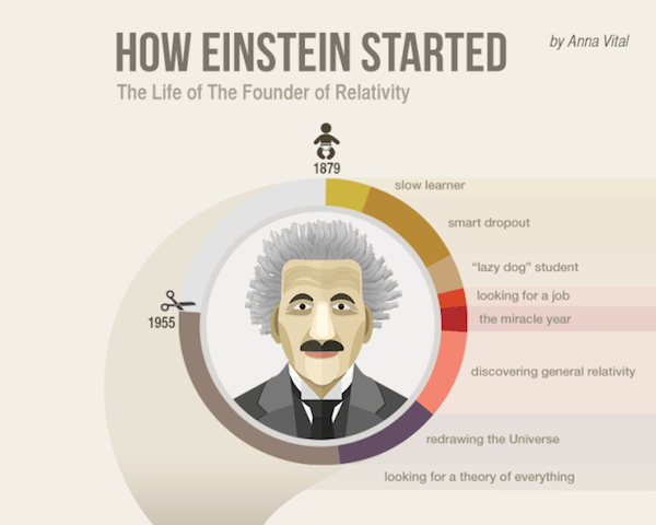
Upon searching for Einstein infographics I had a rough Idea of what direction I wanted to take with it, the design on the right was visually appealing and something I wanted to work towards.

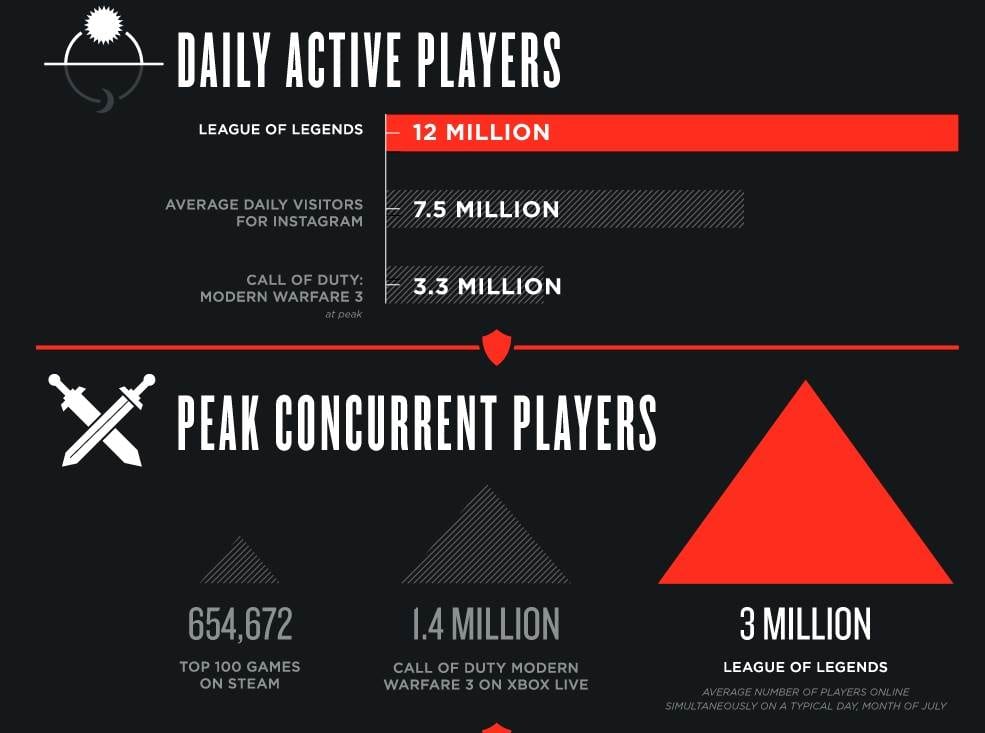
Other infographics which captured my attention although not relevant to Einstein were ones for gaming which showed facts and figures to give some perspective into how popular the game was.

1c4252300-101112-riotgames-lol-infographictease.nbcnews-ux-2880-1000

In the example above really liked the overall aesthetics,  this made me further look into colour wheels and what colours compliment others.


Workshop 5 – Presentation

During workshop 5 the group was asked to present their work and the research that had gone in to creating their letter forms. Using the skills learnt in the workshop prior I decided to use Indesign to create the presentation. My presentation mainly consisted of the same research that my blog had been keeping, so transferring and adapting it wasn’t difficult.

Presentation valyrian ting-1       Presentation valyrian ting-2

 Fantasy ting          Presentation valyrian ting-4

Valyrian Font       Uppercase

  Upper and Lower Case       Presentation valyrian ting-8

For my practical example piece of work I decided to pick a book cover, but I wasn’t too impressed with the overall result. After playing with different ideas I decided that I’m going to make a full alphabet and put it to use on a real product for my final hand in.


Creating my Typeface

After doing enough research I settled on the idea of creating a fantasy font/typeface. The idea I settled on is related to Game of Thrones, I wanted to create my own take on the font used in the show which is called “Valyrian”. Examples of the font already exist online, so rather than just copying from others, I borrowed certain forms that are commonplace and made my own variations.

  Valyrian FontUppercase

Upper and Lower Case

The letter forms I created borrow from old styles of traditional handwriting, similar to something you’d expect to see on a scroll or something similar. Overall I’m really pleased with the traditional look to it. Using illustrator a lot more in depth has also been challenging but fun. Although the brief requirements are only 6 characters I’m thinking about creating a whole alphabet  so I can use it on a final product without it being complete gibberish.

Typography Research – Valyrian/Fantasy Fonts

Another area of research I chose for typography and different fonts was from fantasy and fictional places. Although only fictional, a lot of research has taken place for fonts to hold true in terms of their design and how “real” they are, in films and TV. A lot of consultation is had to verify even fictional languages and how they look and whether the language is believable or not.
One TV program in particular which interests me is Game of thrones, the medieval and fantasy setting is something I love and wanted to explore more in depth.
A language used in Game of Thrones is called ‘High Valyrian’. Valyrian takes it’s roots from real fonts and scripts from a bygone human age, primarily Latin and Celtic Script, knowing this helps my own research towards creating a new font.

fraszka _kochanowskiego     RMEzoVo


Other notable examples of fantasy writing are the obvious, Elvish, and Tolkin inspired typographies, these fonts are useful as a basis for designing your own fantasy font, looking at the forms and how similar they are despite being from completely different fantasy realms. The general consensus is that during the time setting of most fantasy films, most writing is similar.

dream_eng

Workshop 4 – Presentation Prep Task

During week 4 I was tasked with creating a presentation using Indesign and different graphic design techniques, the aim of this task was to show how to create a professional presentation using appropriate software to graphic design, as opposed to other platforms.

The task was relatively straightforward however it was nice to get to grips with software more relevant to the subject area. First off I started by creating an image of my name in Indesign, making sure that all the settings for print we’re correct before making refinements and trimming the printed document. After doing this we photographed the image.

Picture of Text


After photographing our poster the task was to make further refinements to show a progression throughout the presentation, from here the document was transferred over to the computer, and further refinements were made by cropping the image and removing the opposing background.

[Untitled]-1


Once the background was removed I had to insert the final images into indesign and create the presentation to match the brief.

Presentation