Initial Character Development

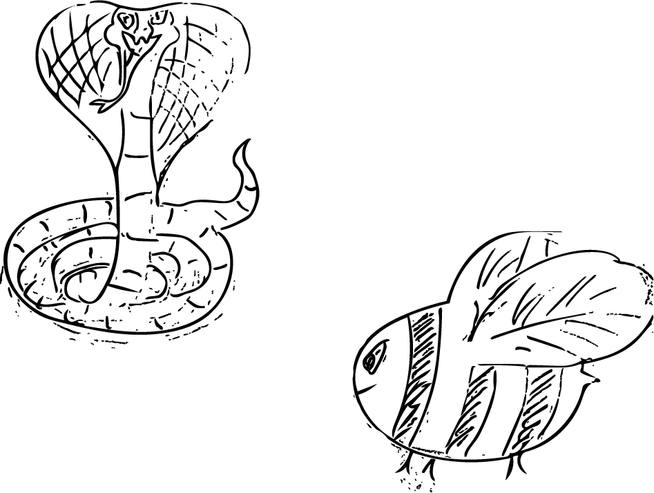
For the second brief of Semester B, we were tasked with creating a children’s book dealing with difficult themes, yet making it digestible and not too heavy for children. For this brief I played around with some different character designs, my first was a snake, but after choosing my theme I found it difficult to apply the character I designed.
The next sketches I made were some general facial expressions along with some sketches of wolves, to make these I drew them by hand, and scanned them with Adobe Capture. Capture allowed me to turn hand-drawings into instantly editable vectors compatible with Adobe Illustrator, from here I tidied them up and made supporting graphics to go along with them.


Untitled-11-01


Logo Design Applications

After creating my finalised logo I decided I wanted to try and apply it to some mock-up merchandise, to do this I downloaded copyright free PSD files and added my logo to some T-shirts. The logo’s are vector files which means the applications for them are limitless, I was able to shrink the logo down and make it applicable to t-shirts and other various outputs without a degrade in the overall quality of the type or graphic.

I created 2 designs for both male and female, using 2 previous iterations of my logo so the development wasn’t wasted. Overall I feel as though seeing my designs in a practical format makes them visually stronger than just by themselves, it’s also a nice exercise to run alongside development, it can inform design choices but it also give an indication as to whether the logo works or not.


design 2
T-shirt-mock-up-vol01
design 1
design 2

Campfire Studios – Final Logo and Variations

After a lot of development and constant iterations I reached my final design. My reasoning behind choosing this design in particular is because of its strong visual appearance throughout wherever the logo is placed. Unlike other logo variations the font is consistently legible, whether it’s on a black background, or if there’s no colour for the logo it works wherever it’s placed.

The factors I took into consideration more so than a visually appealing design was it’s practicality. Whilst most of the people I received feedback from preferred other designs I feel as though my choice with this particular logo type was justified solely because it meets the criteria of a logo and it’s the most consistently practical and operational design regarding: font, legibility and colour scheme.

The alternative versions I created were simply to showcase how the existing logo on white would transfer across different backgrounds, I also added a greyscale filter to 2 of the designs to showcase how printed documentation may look without coloured ink. Overall I feel as though I have now reached a strong visual identity I can carry forwards and begin to assemble to rest of the branding portfolio with.


white one


greyyy yoooo

Black and white

Untitled-2

First Character Sketches

For my first character sketches I wanted to create some different types of animals, and illustrations I could later apply to a story, the very first 2 characters I made were a cobra and a bee. After thinking more about my story and what I wanted, these two sketches felt out of place and not applicable in the slightest to the story I wanted to tell. Regardless of the fact that Ithese characters wont be used I still feel as though what I’ve learnt with regards to the software will be useful for the later character illustrations.

OTHER THING

Logo Mock-Up (Design 1)

After researching colour palettes I figured I would use the skills I learnt earlier and put them into practical use to create a logo for my branding brief. This logo is just an initial starting point as to get a feel for the general aesthetics of my imagined company and their IP ‘Entropia’

Campfire Brand

For the first image I picked some colours I liked and just started to play around with the themes of nature, wilderness, and cold. I like the idea of playing with Juxtaposition, hence the name Campfire and the central focus on on the red/orange colours.

brand mock up

This image is a rough finalised idea, I like the idea of the logo being circular, I feel as though it wraps the information in a bubble which takes away from the distractions of letting the art run further off the page, also it adds to the central focus of the fire.

Overall I feel as though this logo could use some further development to make it a potential piece of work I’d keep for a final hand in.