Colour Research for Picture Book

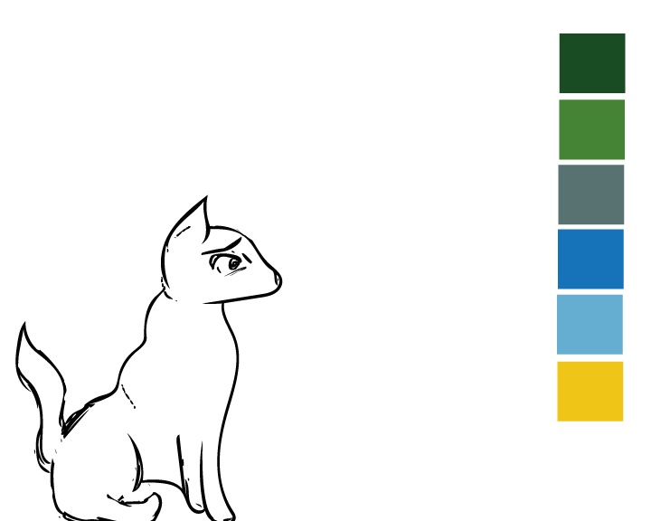
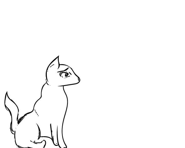
After researching the artist who I wanted to influence my own work I decided that the next logical step from here was to research a colour palette and how to apply it to my character illustrations. The style for the picture book that I’m aiming to achieve is flat basic colours for the characters, and simple block colours for a background. Because the theme of my book is Loneliness, I researched colours which were associated with this.

“The meanings of blue are often associated with serenity, calm and spirituality. But colour symbolism can be strangely contradictory and Blue is no different. Blue also brings to mind sadness and loneliness for many.” Colour-Wheel-Artist [2008]
(http://color-wheel-artist.com/meanings-of-blue.html)

The obvious colour I associated from Loneliness was Blue/Grey, and to justify this I found some research online, however these are only 2 colours out of a potential big range for the book. Using the colours below I searched for complimentary colours using the software built in to Adobe Illustrator, in doing so I found other colours like shades of Green and Yellow to complete my palette for the Picture Book.

blue2color-01


Picture Book First Draft

After all the illustrations had been drawn and converted to vectors I created a mini storyboard on how to apply them for the picture book, the layout below is how I want the story to progress, although it’s currently very early in terms of completion, I believe this will be the final story layout with only minor details that may change along the way.
The illustrations I made turned out a lot better than I initially expected, and although they looks somewhat rough, I feel as though this style will benefit the story I aim to make with it. The next stages are to work out a colour palette and add supporting graphics to progress from this current stage.

page 1-01


page 3-01

page 4-01 page 5-01page 7-01page 6-01page 2-01

Corporate Branding Packages

After finalising my logo I wanted to see how well it functioned as part of an entire package you would expect a company to use. I downloaded a free PSD mock up whereby you could apply your own vector graphics to a pre-made design to see how strong it’s visual appearance is, along with the practicality of the design itself .

Overall I feel as though the logo I chose is extremely versatile in how it can be displayed, when choosing my design initially I had no context of how it’d look on paper so to speak, so creating these mock up branding packages is a good exercise to check the visual appearance of the brand and logo I was creating.

Another interesting thing I found out along the way is that just because I settled on a finalised logo it didn’t make other variants redundant, if anything it made them more applicable across different output formats.

Branding Identity MockUp Vol8

The second branding package implemented a greyscale version of one of my logo’s and also implemented more of the orange which is present in the logo itself, overall I like the aesthetic of this package a little more through the implementation of colours and not just plain white paper, also experimenting with different logo versions is a great skill to practice when detailing how the brand/logo can be applied to different outputs.

I left the disk in this image blank simply because the digital art I’ll be creating for my IP hasn’t been finalised yet, when it has I will apply it to the disk to highlight the main goals of my company.


Branding-Stationery Mockup Vol

Initial Picture Book Draft

The initial sketches of the picturebook involved 3 different poses of wolves, with 3 different emotions highlighted through the face/eyes. Whilst the picture book at this current stage is very primitive I feel as though it’s a great start for further development. On the first page I also experimented with a colour for the main wolf, this will later be used to distinguish the most prominent character from the others. The font used at this current stage is Futura, I feel as though it makes for easy reading, and is legible regardless of what background I put it on.
Whilst the setting or some of the theme’s may change throughout the process of creating this book I feel as though it’s good to reflect on the very early stages regardless, it helped me a lot throughout the branding brief and I feel it’ll do the same for this brief too. Overall I’m confident with the progress and development at an early stage.

page 1-01

page 2-01

page 3-01


Initial Character Development

For the second brief of Semester B, we were tasked with creating a children’s book dealing with difficult themes, yet making it digestible and not too heavy for children. For this brief I played around with some different character designs, my first was a snake, but after choosing my theme I found it difficult to apply the character I designed.
The next sketches I made were some general facial expressions along with some sketches of wolves, to make these I drew them by hand, and scanned them with Adobe Capture. Capture allowed me to turn hand-drawings into instantly editable vectors compatible with Adobe Illustrator, from here I tidied them up and made supporting graphics to go along with them.


Untitled-11-01