Semester B Evaluation – Module 1 & 2

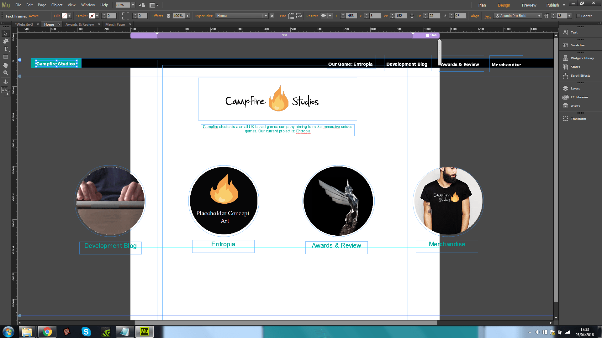
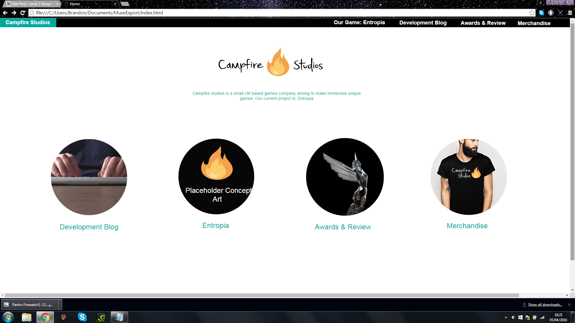
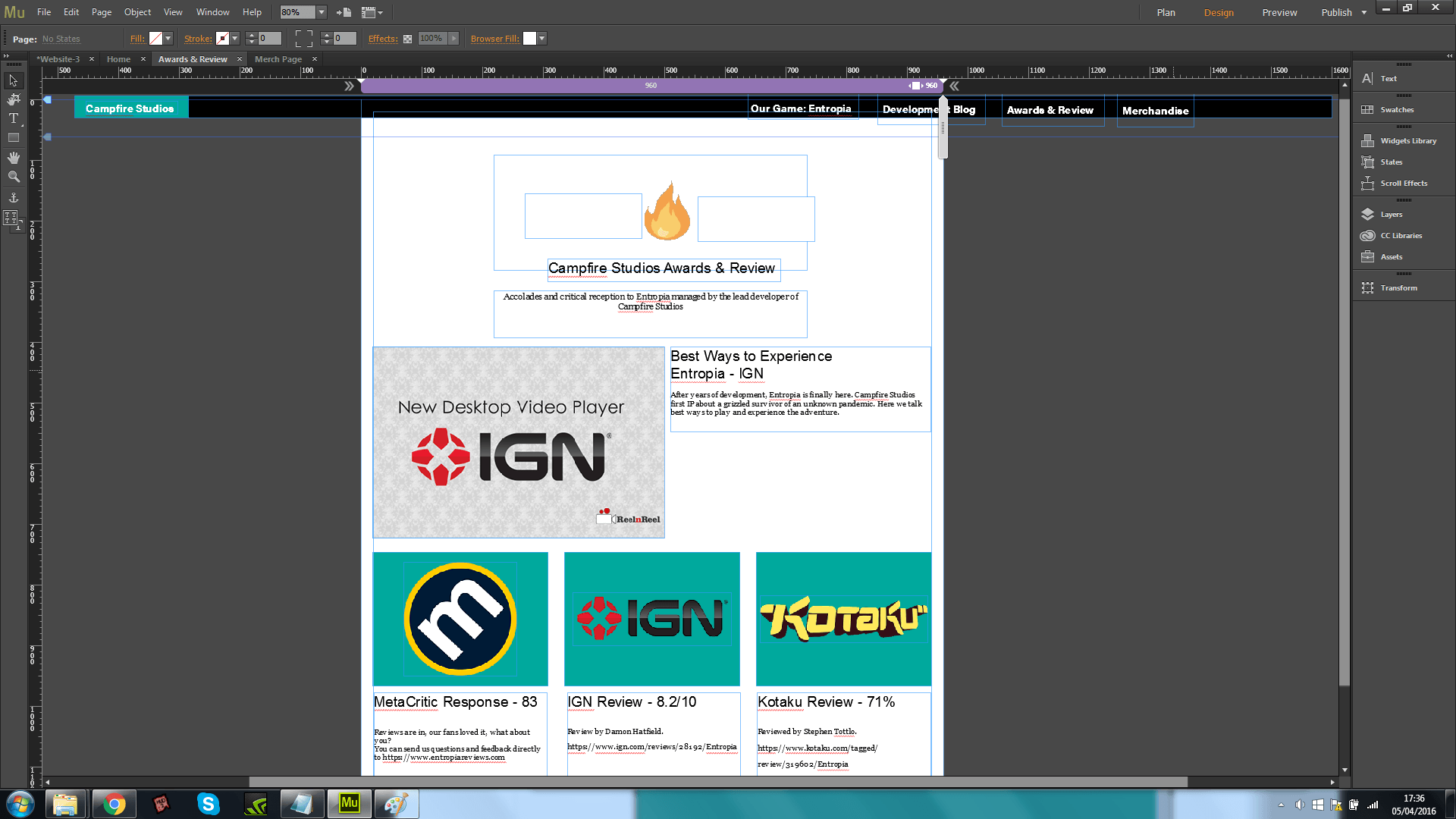
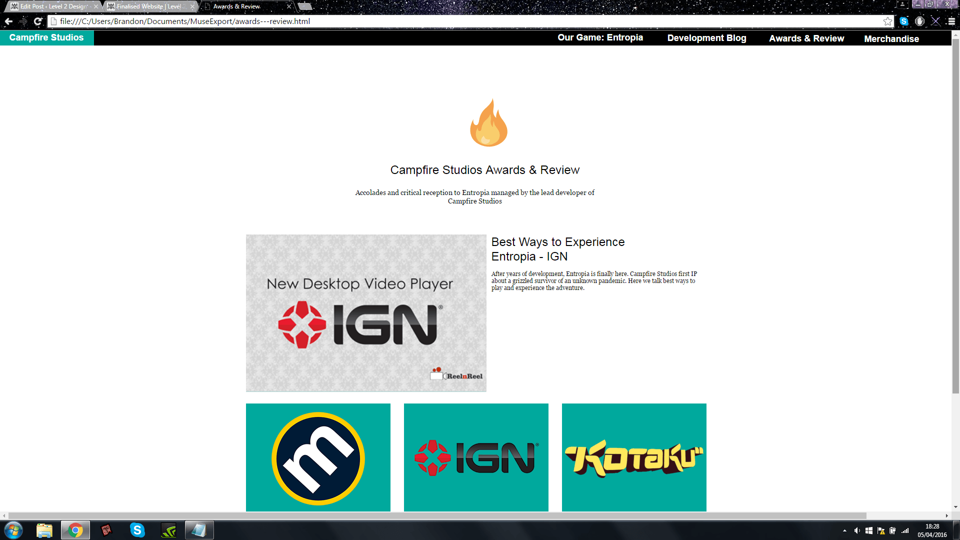
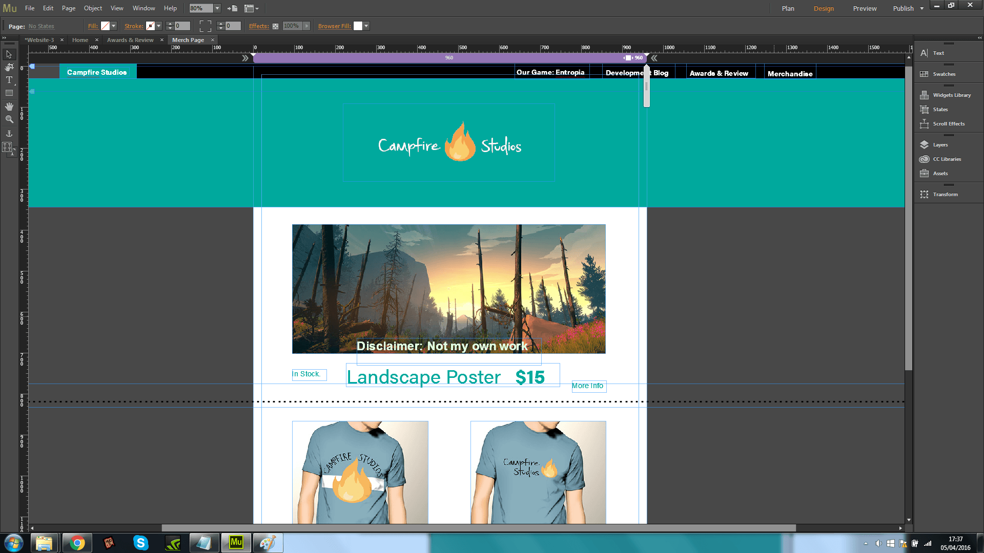
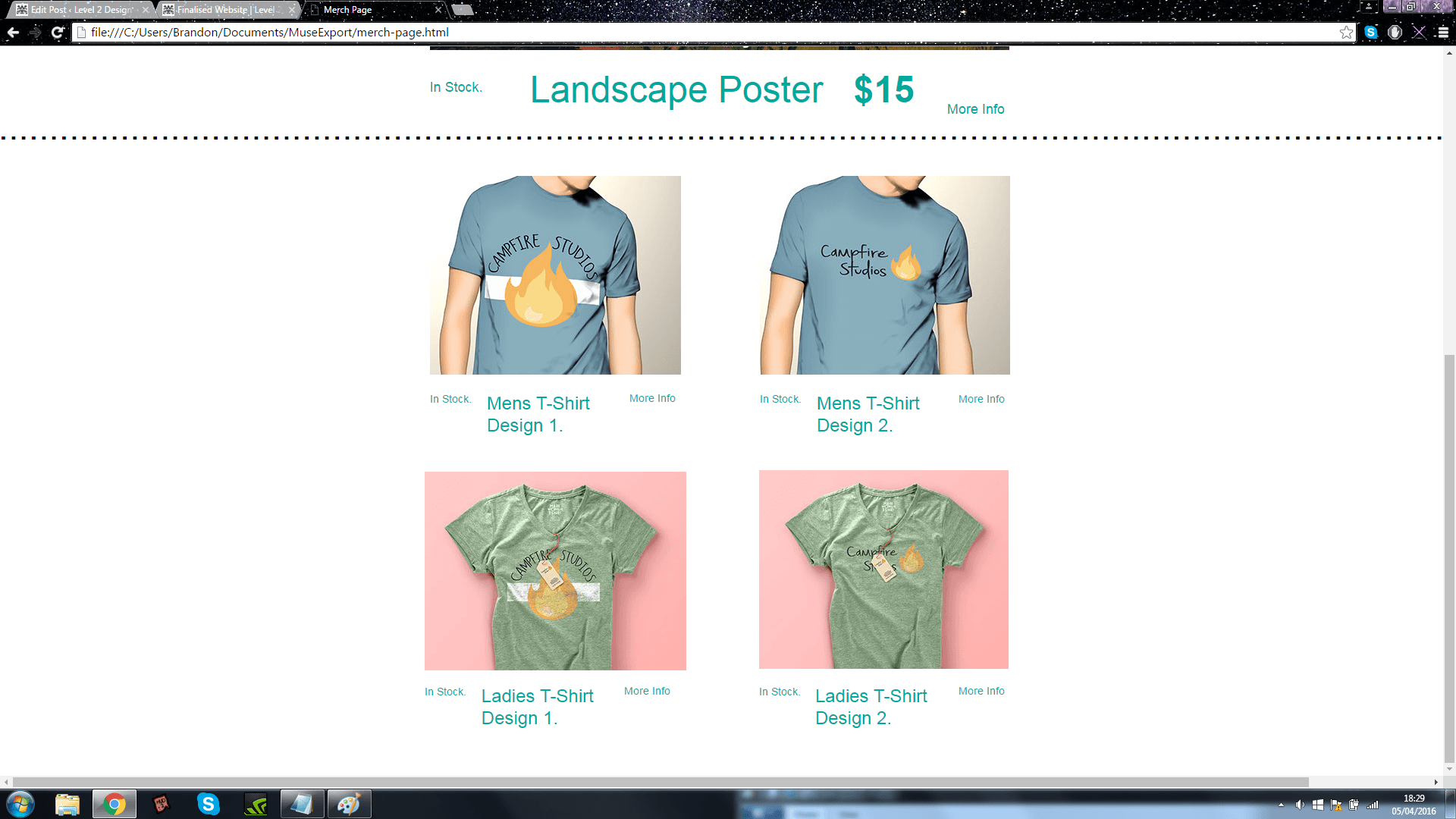
Module 1 – Semester B – Corporate Branding Identity

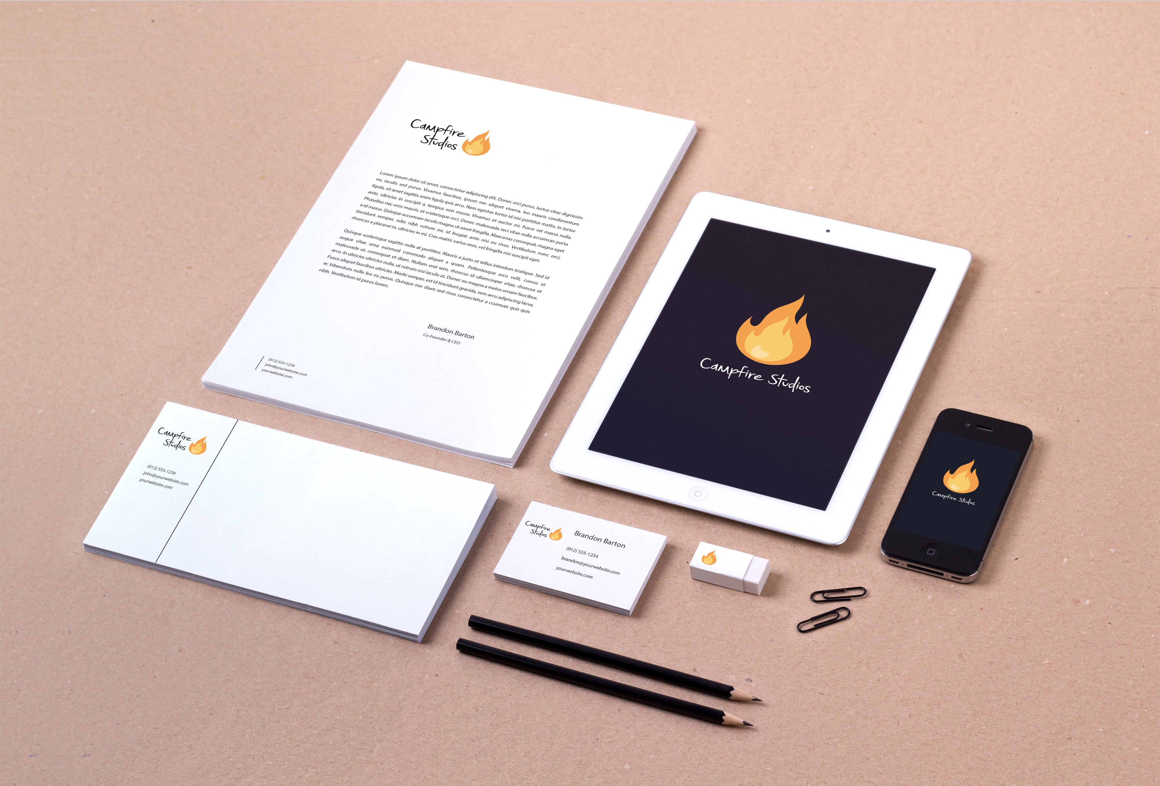
During our first week back in January the first brief was assigned to us, this was to create a fully functioning corporate identity, which included: A logo, Practical Applications, Colour Palettes, Typography analysis and a few other details. Before starting the brief we were given 6 choices of companies to create unique identities for, these all had a different theme and all required special consideration to create an end product where the final outcome was reflective of the brief itself whilst still maintaining originality with careful consideration to the process of creation.
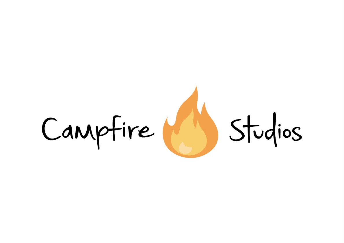
Before starting the brief I asked my tutor whether creating my own brief was acceptable, I was given the green-light and so I decided to create my own corporate identity.

Overall this brief was a lot more challenging than I first thought it would be. My initial thought process going into the brief was that a logo and a brand would be easy to create however 5 weeks in to the project and only then having a good logo soon made me realise that the process is far more intrinsic than I first thought. Because the logo is a key element in the name and image of the brand it was the aspect I spent so long on perfecting.

The progress made from early weeks to looking at the end product is astonishing, however I feel as though a critical analysis of this is good regardless.

Pro’s of Corporate Identity Brief –

  • Learning how to adapt early ideas to create something new at an even higher standard later on
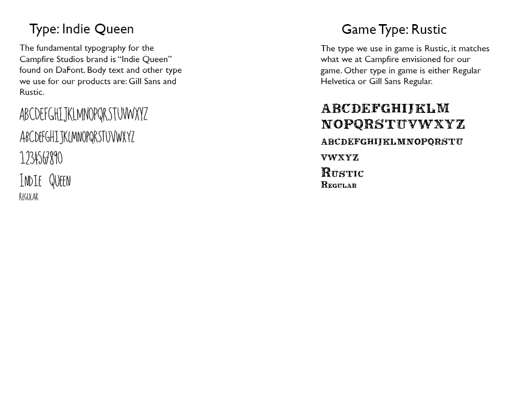
  • Understanding the importance of Typography
  • Studying colour and the impact it can have on a brand
  • Not being afraid to drop an idea if it doesn’t evolve as intended
  • Learning how to use new software adequately

Con’s of Corporate Identity Brief –

  • Focusing on the corporate element didn’t allow for development of the ideas regarding the game
  • Despite the time-frame being big it doesn’t allow for massive amounts of change to the corporate brand to a professional standard


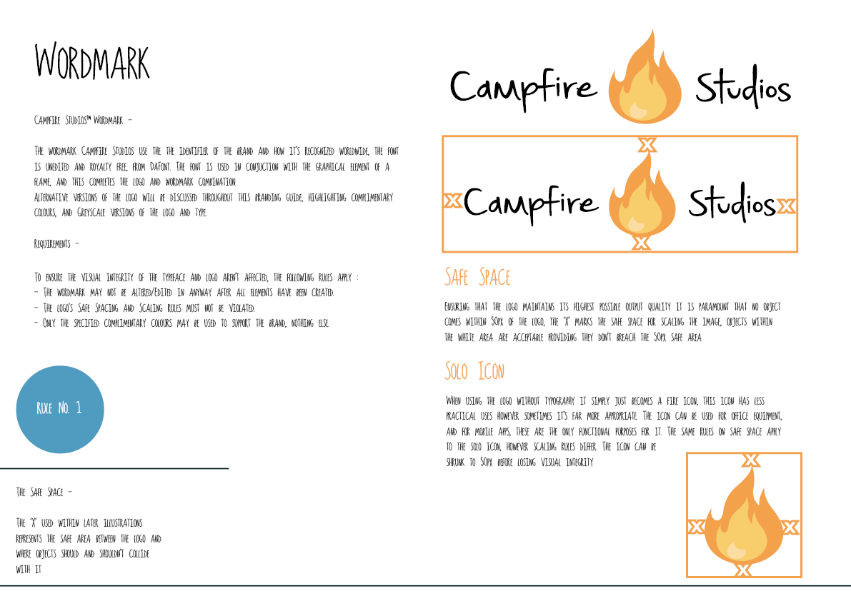
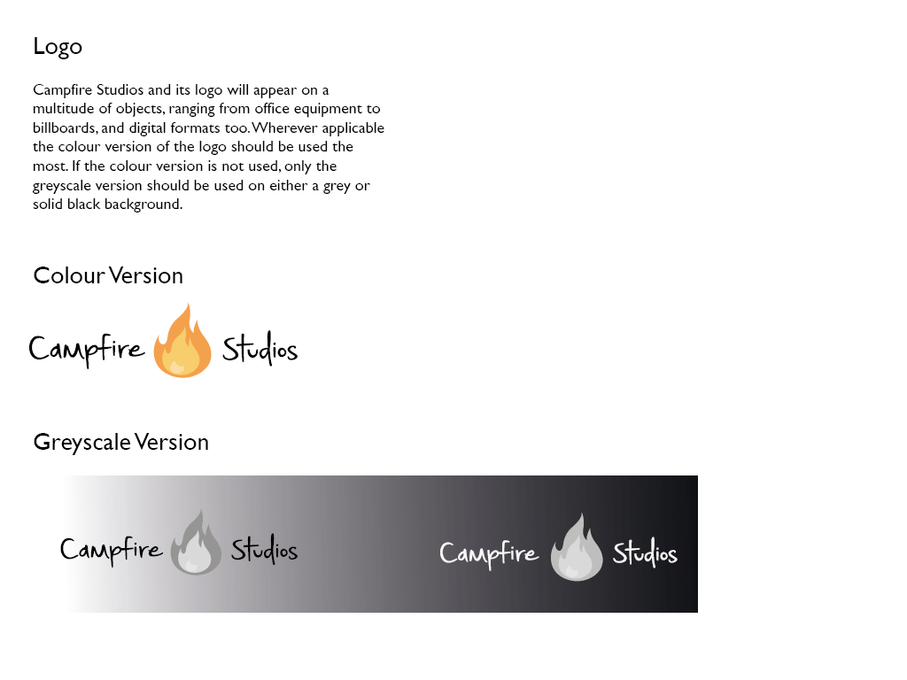
Overall I feel as though the logo I created worked to a professional standard, the applications it found itself on looked to be of high quality and the brand was believable. My only criticism towards it is that the iterations had to change no matter what formats it was put into. On documentation the logo worked best with the font stacked on top of each other with the flame by it’s side, whereas applications on ipad and on business cards it had to change to cater for the differences in size. This complaint albeit small is the aspect that annoys me the most and would improve if possible.

EXP2
Branding Identity MockUp Vol8

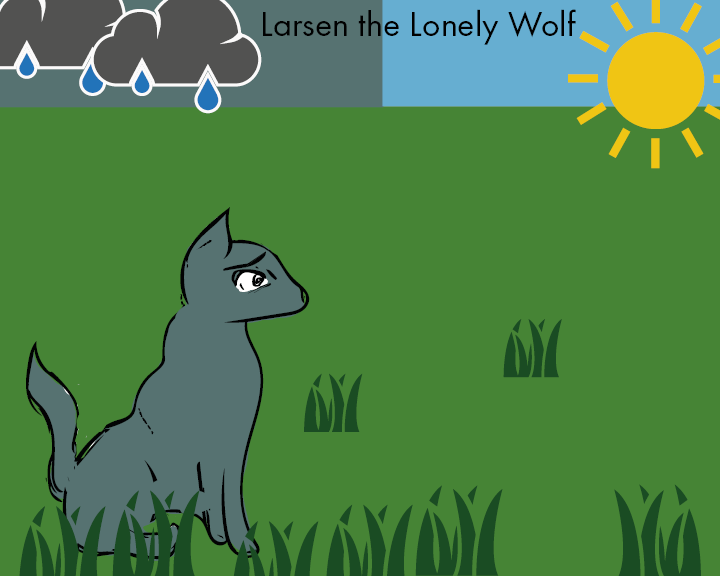
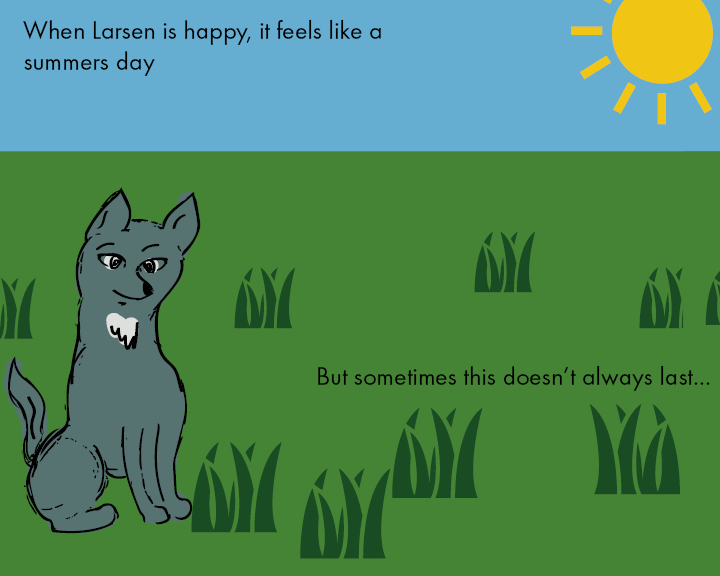
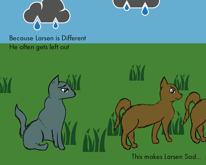
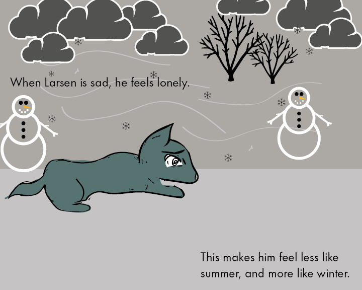
Module 2 – Semester B – Picture Book Brief

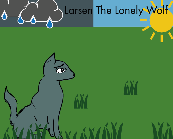
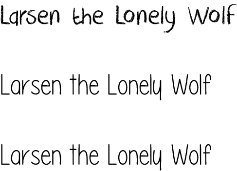
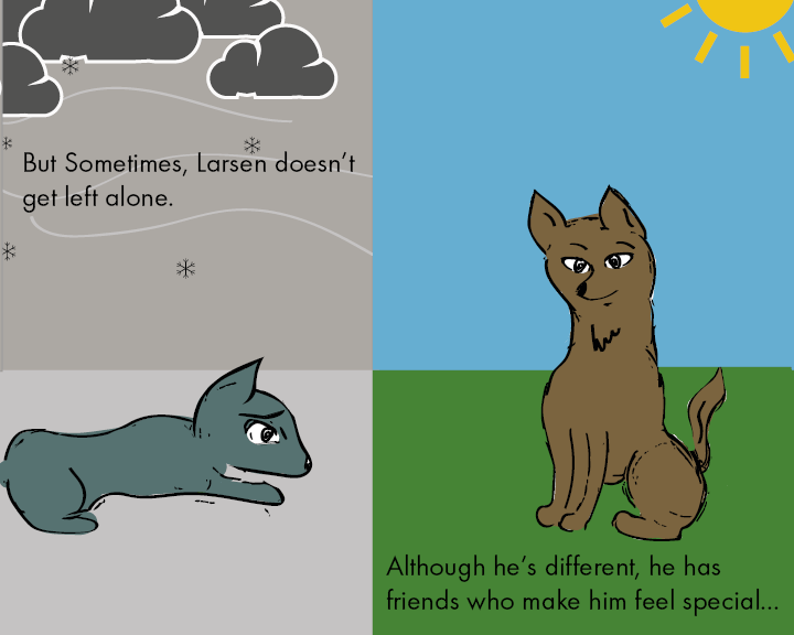
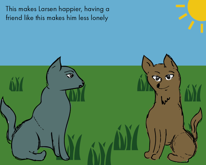
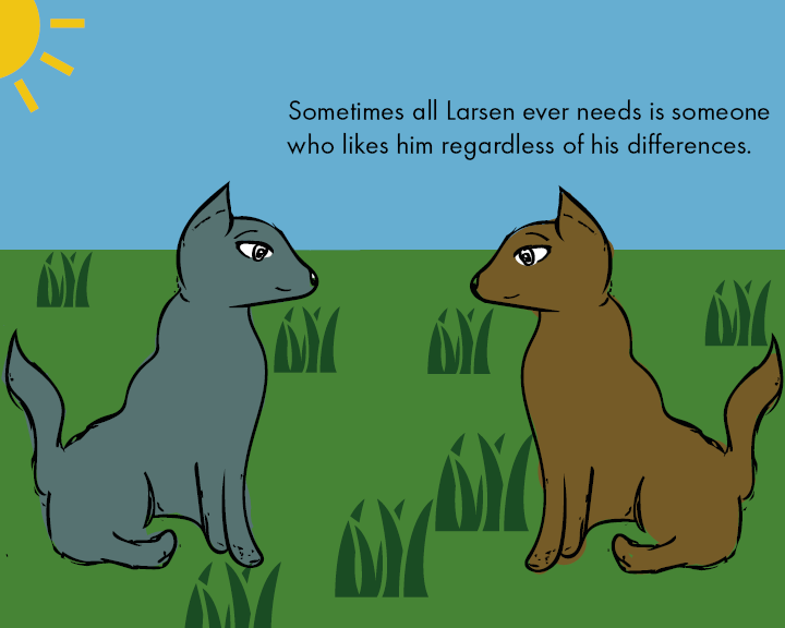
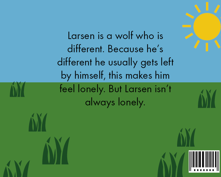
The second brief for semester B was assigned to us in week 6, this brief was to create a picture-book for children aged 5+ and required us to tackle a difficult subject matter whilst still making it digestible for a younger less mature audience. During the early stages of the brief I was clueless as to what to base my ideas around and often found myself focusing solely on the corporate branding identity brief as this appealed to me far more, however once I had spent time at the drawing board I found an illustrator who appealed to me and then my ideas started to flow better.

This brief didn’t appeal massively to me and it made it much harder for me to work at, however I still feel as though the final result is at a high quality standard, despite a few areas where improvements could’ve been made like, Typography, Supporting Graphics, and Narrative the brief as it progress became more enjoyable it was a good experience regardless of whether I’m happy with the end result.

Pros of Picture-Book Brief –

  • Understanding supporting vectors change atmosphere of a narrative
  • Using new software to create high quality vectors
  • How to effectively use colour to make a narrative more engaging

Cons of Picture-Book Brief –

  • Having the mindset of being bad at illustration put me off the project despite it being engaging
  • Limited time for experimentation of ideas
  • Trying new techniques with the software resulted in mediocre final output (Regarding Colour, Typography)

Overall I feel as though the picturebook brief was my weakest module, whilst the final product was of a medium to high quality standard, I feel as though minimal effort given with regards to supporting graphics and the background throughout majority of the book lets down the overall product. The aspects I do like and feel as though are well executed are the illustrations throughout the book and the careful consideration of colour throughout.

page 1 final-01-01

FONT

Corporate Branding Identity Book – Final

After a few iterations and varying designs, I decided to take a different approach in finalising my corporate branding brief. After receiving feedback on my booklets prior I decided to try and give the book more flow and something worth looking at, in doing so I looked at other examples of corporate branding for games and I came away with an end product looking and feeling much more responsive than before.
Overall I feel as though I have taken a lot away from the branding brief, I get a sense of how meticulous you can become over displaying the products you have created, it also feels a lot better explaining to others how to use your own created vision. As a whole this brief in particular has been my favourite as a designer, learning new exciting things and experimenting and challenging my own abilities.


EXP

EXP2

EXP3

EXP4

EXP5

EXP6

EXP7

EXP8

EXP9

Workshop 11 – Final Touches to the Picture Book

The workshop this week marked the relative completion of the picturebook brief, with a few minor tweaks only needed. During the workshop this week I had made significant progress towards the completion 0f the picture book, after finalising a colour palette weeks prior, this week was the final week in making a few slight adjustments towards the end product. Overall I feel as though the picture book has fulfilled its role in what it set out to do. Despite my initial thoughts on how I wanted my book, and how it actually turned out, my vision took a drastic change at one point along the line, however I feel as though the change from how it was envisioned to the final product is positive and something I’m proud of.


final book final book2 final book3 final book4 final book5 final book6 final book7 final book8

Workshop 10 – Research and New Branding Book Iteration

During the workshop this week I decided to make a new iteration of my branding booklet, the content I had prior didn’t feel very professional, nor did it feel very experimental, it was to the book and very bland hence wanting to change it up. I decided to look at other branding booklet examples online and try and get a feel for how creating a branding outline for a video games company differs from standard commercial work. I went to http://www.behance.net and looked at versions submitted by games companies as opposed to generic design companies. There were a lot of good examples of branding booklets, ranging from indie game companies to big corporations like Sony and Microsoft, overall the insight into how different companies operate was very useful and informative for my own design.

Whilst the branding booklet still isn’t finished and needs a lot of work doing in order to make it look and feel more interactive, it feels a lot better compared to the other version I made simply because of the choice of layout and typography I used, also the colours of this book feel much more professional and subdued whereas before it was too vibrant and flashy.


corporate brand 2corporate brand 22corporate brand 23corporate brand 27
corporate brand 28corporate brand 24 corporate brand 26 corporate brand 25corporate brand 210


Bibliography:

https://www.behance.net/gallery/14637893/Child-of-Light-Logotype-Guideline

https://www.behance.net/gallery/12061387/Brand-Identity-Process-Book

https://www.behance.net/gallery/23465727/2013-2015-ePortfolio

Workshop week 9 – Finalised Website

During the workshop in week 9 I decided to complete the rest of my website. The images below are all screenshots of the work I’ve produced in Adobe Muse. As mentioned prior Muse is a relatively new Adobe platform which allows for the creation of HTML websites, without the need for coding and understanding the languages used to create said websites. Muse takes away the learning curve required to make professional looking websites whilst still requiring the user to have a good understanding of design, layout and overall aesthetics to make the website look and operate as a professional output.

The first page has 4 buttons which all link to different pages or existing work I’ve produced, the Development blog links to my branding brief, Entropia currently links to nothing, Awards and Review is a mock up page which links to some game review websites such as IGN and Kotaku, finally the Merchandise page links to the mock up products I’ve produced.

I decided to show comparisons between the Muse document and how it looks within the browser, overall despite the website looking somewhat bland and minimalistic I feel as though it fits the criteria of a website and also fits the rest of the brief in terms of it’s design and output, other  ideas for further expansion include: Linking Entropia button to concept art and sketches, add artwork to my website so it’s not so bland, also add rollover effects to buttons as a type of interactivity.


page 1 page 1.5 page 2 Untitled page 3 page 4Untitled