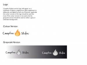
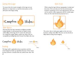
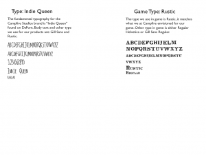
During the workshop this week I decided to make a new iteration of my branding booklet, the content I had prior didn’t feel very professional, nor did it feel very experimental, it was to the book and very bland hence wanting to change it up. I decided to look at other branding booklet examples online and try and get a feel for how creating a branding outline for a video games company differs from standard commercial work. I went to http://www.behance.net and looked at versions submitted by games companies as opposed to generic design companies. There were a lot of good examples of branding booklets, ranging from indie game companies to big corporations like Sony and Microsoft, overall the insight into how different companies operate was very useful and informative for my own design.
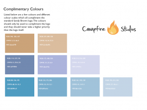
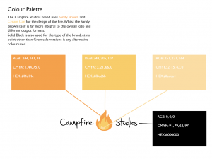
Whilst the branding booklet still isn’t finished and needs a lot of work doing in order to make it look and feel more interactive, it feels a lot better compared to the other version I made simply because of the choice of layout and typography I used, also the colours of this book feel much more professional and subdued whereas before it was too vibrant and flashy.
Bibliography:
https://www.behance.net/gallery/14637893/Child-of-Light-Logotype-Guideline
https://www.behance.net/gallery/12061387/Brand-Identity-Process-Book
https://www.behance.net/gallery/23465727/2013-2015-ePortfolio
