Research for Picturebook

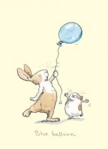
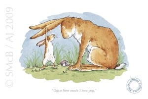
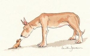
After researching some illustrators briefly, I decided to narrow my focus in finding an artist whose style I liked and wanted to inform my own work. After searching through examples on pinterest and google image search, I came across an Illustrator called Anita Jeram. Jeram is an illustrator of children’s books and some of her work focuses on simplistic flat colours with heavy hand-drawn characters, the style I found was something similar I wanted to replicate which I felt was achievable despite my own abilities within illustrating to be lacking.

aj9102_large
book 1
f2bd7607a9d76f31f341a3a77a157ebe


Overall the illustrations seem simplistic, whilst maintaining an element of design which can be conveyed easily into telling a narrative for children, so I feel as though this is the most appropriate for the style I’m trying to achieve.
Initial Character Development

For the second brief of Semester B, we were tasked with creating a children’s book dealing with difficult themes, yet making it digestible and not too heavy for children. For this brief I played around with some different character designs, my first was a snake, but after choosing my theme I found it difficult to apply the character I designed.
The next sketches I made were some general facial expressions along with some sketches of wolves, to make these I drew them by hand, and scanned them with Adobe Capture. Capture allowed me to turn hand-drawings into instantly editable vectors compatible with Adobe Illustrator, from here I tidied them up and made supporting graphics to go along with them.


Untitled-11-01


Logo Design Applications

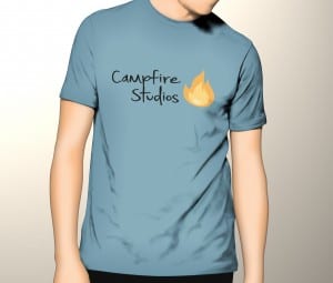
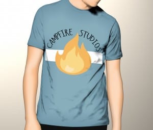
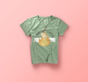
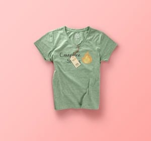
After creating my finalised logo I decided I wanted to try and apply it to some mock-up merchandise, to do this I downloaded copyright free PSD files and added my logo to some T-shirts. The logo’s are vector files which means the applications for them are limitless, I was able to shrink the logo down and make it applicable to t-shirts and other various outputs without a degrade in the overall quality of the type or graphic.

I created 2 designs for both male and female, using 2 previous iterations of my logo so the development wasn’t wasted. Overall I feel as though seeing my designs in a practical format makes them visually stronger than just by themselves, it’s also a nice exercise to run alongside development, it can inform design choices but it also give an indication as to whether the logo works or not.


design 2
T-shirt-mock-up-vol01
design 1
design 2