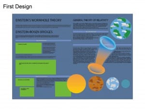
The workshop this week was a continuation on the Einstein brief from the last workshop. This week I decided to focus solely on the A2 Poster. I chose the A2 poster first so I had a lot of room to play with ideas and develop a general theme I wanted to use. The general theme I wanted to stick with was wormholes and how they work as illustrated by my graphics.
At first I really liked the overall look I was going with, I thought it illustrated quite nicely how a wormhole worked, and gave a simplistic understanding to a complex scientific theory, however the information was too cluttered, the page didn’t have much flow and I just generally grew to dislike it. Another slight error I made with this work was the file format too, the graphics I created were a PNG and Not a vector, so the overall image quality is blurry and pretty awful.
